Monochrome café signage with geometric vinyl stripes and illuminated lightbox at MOO London
Anything But Drab

Monochrome interiors are having a major moment, and for good reason. An accomplished black, white and even grey palette can be incredibly slick and surprisingly versatile - creating workspaces ranging from zen to zany.

Despite what its name implies, the monochrome aesthetic is not restricted to variations of just one shade; it can also incorporate natural materials, subtle textures and other neutral tones that complement a clean cut foundation. Beyond the box thinking makes all the difference.

At Glyphics, we've seen firsthand the power of well-executed iterations of this modus operandi. Whether you're designing a new office or revamping an existing one, embracing this look offers classic sophistication which can elevate any environment, when done right. In our experience, it's a style that lends itself to creating a strong identity and productive atmosphere.

Here we explore how we've mastered monochrome design, looking back at some of our most inspiring black and white projects to showcase the beauty of this minimalist approach.

Why Desaturate?

This is the potential power of a monochrome palette for office interiors and broader design:

  • Timeless Elegance: A classic combo, black and white never goes out of style. It's inherently sophisticated while creating a sense of professionalism.

  • Calm and Collected: A limited colour palette reduces visual clutter, encouraging focus and promoting mental concentration. This is particularly beneficial in a busy work environment.

  • Versatility: Neutral tones provide a backdrop against which other design elements can shine. It's easy to incorporate pops of colour, textures and natural materials to add personality and warmth.

  • Brand Identity: Monochrome can boldly reinforce your company's visual language, particularly if your company colours include black, white or grey.

  • Adaptability: The achromatic look works well in a variety of office settings, from sleek and modern spaces to more traditional environments.

Glyphics - The Black & White Collection

Centtrip: Financial Finesse
Centtrip black manifestation entrance glass panel
3D acrylic Centtrip reception sign in crisp white lettering
A view from the bottom of the inside of a phone booth
Architectural ceiling detail with spotlight in Centtrip office
Pictures of plants in the communal space of the Centtrip offices
Lush indoor plants softening monochrome office interior
Close up of the 2 T of the Centtrip logo
Close-up of acrylic lettering detail on Centtrip signage
Picture of a framed concrete wall
Exposed concrete wall with industrial-style artwork in office
Centtrip lounge room with glass partitions and branded high gloss black manifestation, for safety and privacy
Centtrip black manifestation entrance glass panel
A view from the bottom of the inside of a phone booth
Pictures of plants in the communal space of the Centtrip offices
Close up of the 2 T of the Centtrip logo
Picture of a framed concrete wall

The Client

Centtrip, a leading fintech innovator in intelligent treasury management, needed an office that didn’t just house their team - it had to embody their brand values: sophistication, precision, and innovation.

The Vision

Working alongside Maris Interiors, who led the interior concept, we were tasked with creating signage that would seamlessly slot into a sleek black-and-white design language. Think polished concrete floors, glass partitions, and premium finishes with a monochrome scheme forming the backbone — modern, confident and luxurious.

The Experience

This wasn’t about building a monochrome box. Textures, plants, and carefully chosen accents of green and clay breathe warmth into the scheme preventing sterility and ensuring balance, while dramatic lighting cues draw the eye and energise the atmosphere. The overall result is a workplace that’s both stylish and inviting.

Our Touch | Subtle Builds With Big Impact

Our signage took a sleek scheme and pushed it further, aligning it fully with Centtrip’s aesthetic with small yet striking details.

  • A 3D acrylic reception sign in crisp white lettering delivers a bold first impression - elevated but understated, to mirror the brand .

  • Glass manifestations in striking black create impact across partitions, alternating between flat matt and ultra-reflective finishes. Swirling printed stripes or sharp diagonal cuts add dynamism - providing privacy, channel light and add subtle drama in every corner.

Together, these bespoke touches don’t just decorate the office - they pull the entire environment together, reinforcing Centtrip’s identity at every turn.

Black and white striped manifestations
Safety manifestation dot in line with the monochrome design scheme
Meeting room walls covered in black matt vinyl shapes that let the light in while providing privacy
Office corridor with matt black glass partitions and natural wood flooring
Glass manifestation with bold white stripes on partition wall
Inside the meeting room the matt black manifestations applied on the external glass walls appear glossy
Boardroom with long white table and monochrome glass partitions
Black and white striped manifestations
Meeting room walls covered in black matt vinyl shapes that let the light in while providing privacy
Inside the meeting room the matt black manifestations applied on the external glass walls appear glossy


The 404 @ MOO: A Monochrome Café

The black and white themed is used in a seating area with an airy backdrop of wall to ceiling white shelving.

The Client

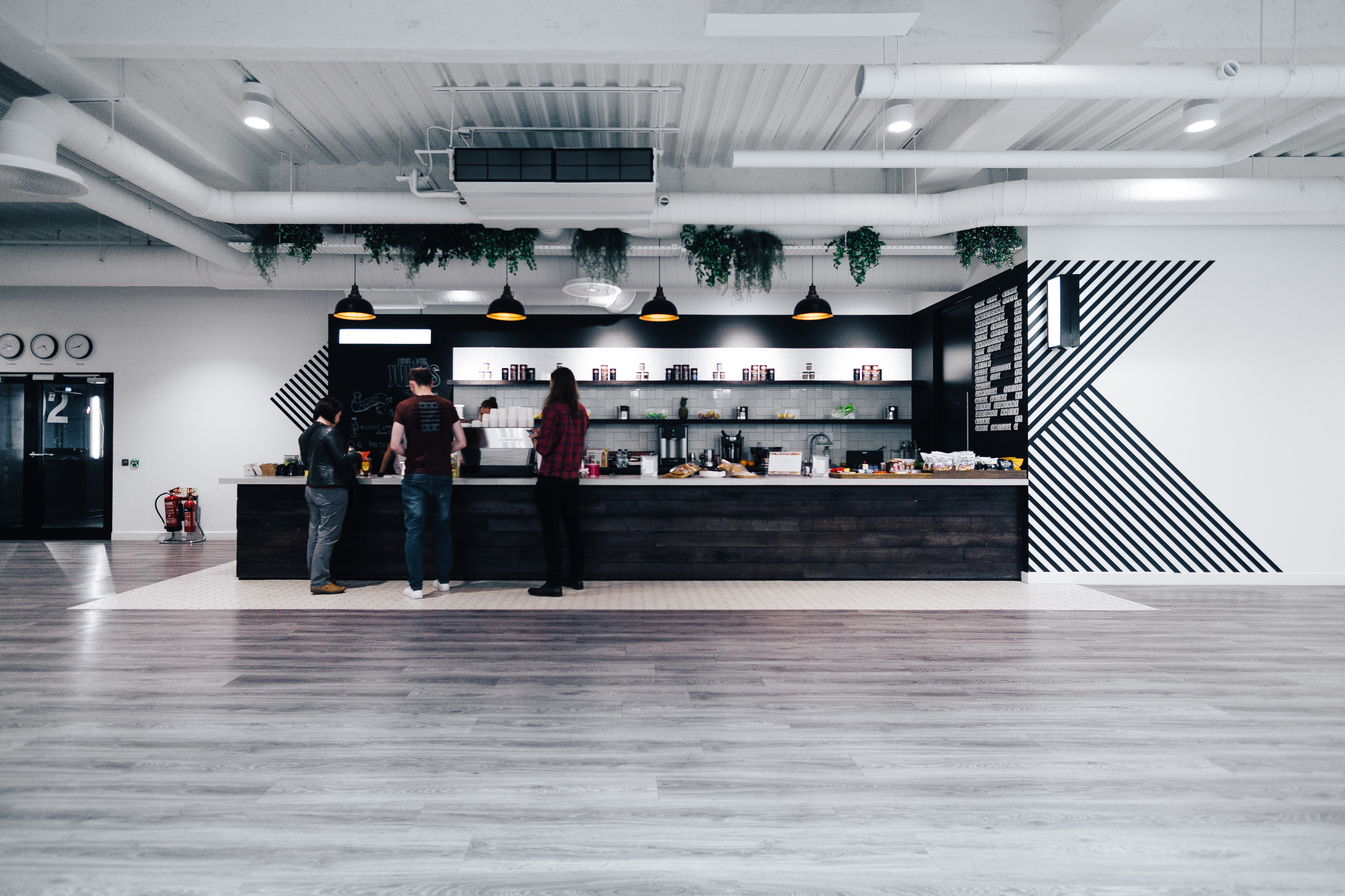
MOO, the print and design company known for its bold creativity, wanted their in-house café to embody the same spirit. It needed to be more than a place to grab a coffee - it had to become a social hub with an identity of its own.

The Vision

MOO’s vast open-plan office provided a striking monochrome backdrop for the café, setting the stage for something modern and memorable. Sleek architecture, whitewashed surfaces, tall ceilings and plenty of natural light, combined with a restrained palette, created the perfect canvas for graphic detailing and playful design elements to stand out.

The Experience

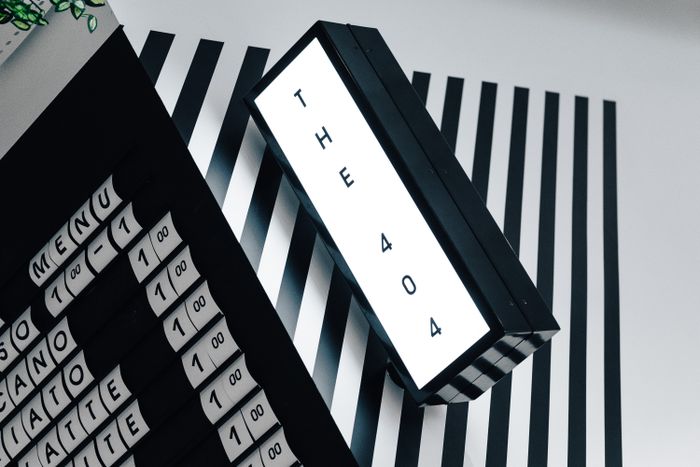
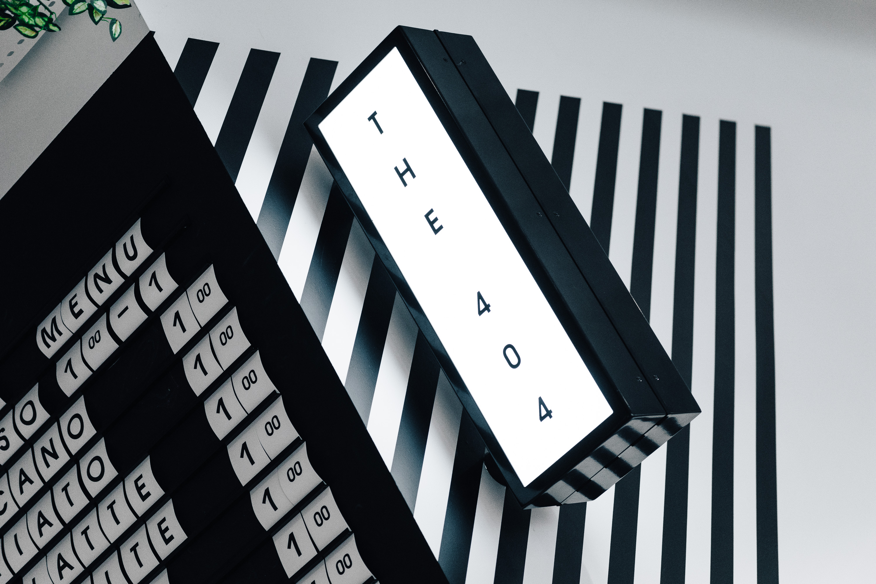
Far from just a café, this space is the life and soul of the office - a magnetic spot that captures attention, draws people in and sparks connection. Dark wood on the counter front and blackboard paint add depth to the airy environment. Illuminated shelving and lightboxes double as statement features, while a sliding menu board with interchangeable letters adds a tactile, interactive touch. Geometric vinyls in bold lines sweep diagonally across walls and floors, creating instant energy and extending the café’s presence further into sight lines.

Our Touch | Balancing function with brand personality

Our signage solution pulls the space together, ensuring it feels distinct within the office yet unmistakably MOO.

  • Geometric vinyls animate surfaces with sharp contrast and dynamic movement, creating a visual buzz.

  • Custom lightboxes mark the café as its own destination, while providing a warm glow.

  • The slider menu board communicates the café’s playful side, adapting daily offerings with ease.

This is coffee taken black and white. Each monochromatic element helps shape the café from a blank-slate backdrop, transforming it, stripe by stripe, into the true hive of activity at MOO
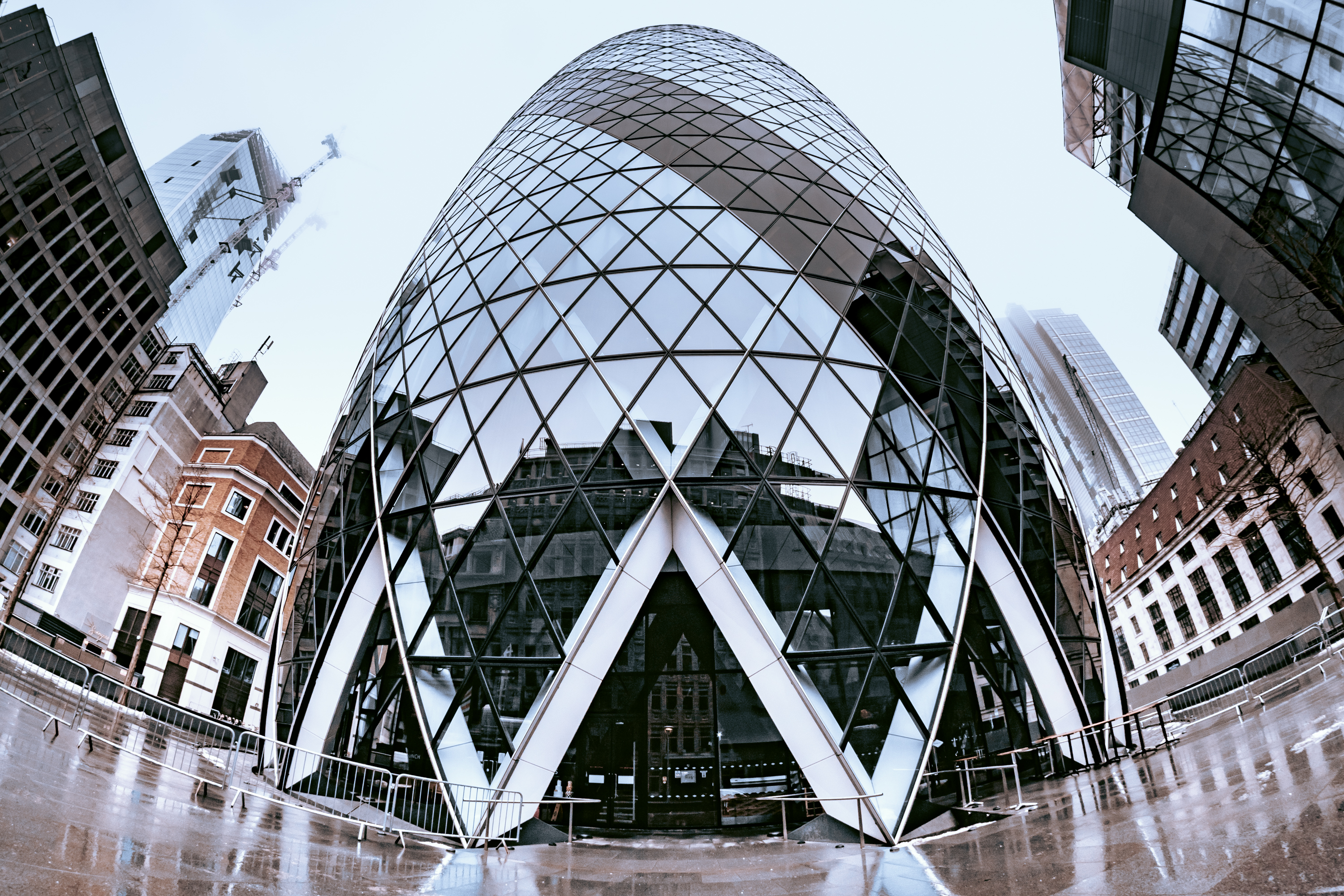
Monochrome café interior with geometric vinyl stripes and signage
Clean black and white stripes
Black and white café design with bold diagonal stripes
Black vinyl applied to a light box hanged from the ceiling
Illuminated projecting café sign at MOO London
Sliding letter menu board and projecting lightbox in monochrome café interior
Clean black and white stripes
Black vinyl applied to a light box hanged from the ceiling


The Gherkin: Elevated Elegance

The Client

Located within one of London’s most iconic skyscrapers, these offices required a signage solution that respected the landmark setting while prioritising both style and safety.

The Vision

Set against The Gherkin’s dramatic architecture and panoramic views, the interiors lean into a sophisticated monochrome palette. Black, white, and metallic accents combine with reflective finishes to create a sense of understated luxury that frames - rather than competes with - the skyline outside.

The Experience

The views are the undeniable showstopper, but the interiors heighten the effect. Polished metal and expanses of glass bounce light across the space, while the restrained palette ensures London’s panorama remains centre stage. Here, monochrome plays a quiet role, reinforcing order and calm while keeping focus on the view.

Our Touch | Safety That's Slick

Deliberately understated, our signs were designed to blend seamlessly into the setting while serving a vital purpose.

  • Minimalist glass manifestations in double white lines that stretch across the cylindrical panelling bring glazing into the mind’s eye without interrupting views.

  • Discreet detailing respects the architecture, enhancing the design rather than competing with it.

  • Considered simplicity ensures the space feels cohesive, polished and professional.

A delicate addition, our window vinyl is proof that practical details can be almost as striking as the skyline itself.

Geometric glass façade of The Gherkin with intersecting steel beams
Minimalist glass partition with double white line manifestation for safety
Illuminated ceiling structure with dramatic monochrome lighting design
Office corridor at The Gherkin with curved glass partitions and subtle manifestations
Panoramic London skyline view through The Gherkin’s glass façade


Monochrome café menu board with sliding letters at BLOK fitness studio
Industrial fitness interior with boxing bags and monochrome finishes
Monochrome café menu board with sliding letters at BLOK fitness studio
Industrial fitness interior with boxing bags and monochrome finishes
Monochrome café menu board with sliding letters at BLOK fitness studio
Industrial fitness interior with boxing bags and monochrome finishes
BLOK: Noir Fitness

The Client

BLOK is a boutique exercise studio that pairs innovative training with a design-led space - where the gym becomes art.

The Vision

This brand's aesthetic leans into raw materials and refined finishes: concrete, tempered steel, and brutalist volumes softened by ambient LED lighting and art installations. The palette stays anchored in monochrome and charcoal tones, with nuanced touches of natural wood and texture to ground things. Neutral but never flat, the BLOK interior is designed to sharpen focus and centre the people that use it.

The Experience

Here, the building itself is part of the performance. Exposed structural elements, heavy finishes and framed views evoke an urban gallery. Graphic details, sharp contrast and bold typographic elements bounce off the monochrome base, energising the backdrop, while intentional lighting and material choices shape mood and movement. The result is a space that feels both gritty and curated, lively yet disciplined.

Our Touch | Details that define

We embedded identity into the fabric of BLOK’s architecture, using signage as a design tool to shape footfall, mark transitions and layer personality into each zone.

  • Illuminated lettering on a concrete monolith - we embedded opal acrylic letters with micro-LEDs to an exterior surface, delivering even illumination at small scale, while making a strong statement.

  • Reflective vinyl and mirror graphics applied to windows, mirrors and circulation zones, these create depth, continuity and visual movement without overpowering.

  • Sliding letter menu board for the café in the welcome area. We produced sliding squares with interchangeable letters to form a large menu board, broadcasting the studio’s hospitable side.

  • Wall plaques, zone signage, engraved plates across corridors, weight racks, WCs and art zones. Small bespoke signs (black anodised aluminium, laser-etched plates, acrylic plaques) provide clarity and consistency.

Every sign was designed to integrate seamlessly with the raw materials and charged atmosphere of BLOK. Together, they define transitions, anchor experiences and elevate the space from a workout environment to a fully immersive brand journey.

Mirror branded with vinyl hashtag signage, reflecting ceiling detail with linear LED lighting in BLOK fitness studio
Slider sign for a small retail section of BLOK
Sliding letter menu board with interchangeable panels in BLOK café
BLOK reception area with industrial design and monochrome finishes
View of external BLOK sign, with small 3D illuminated lettering against concrete monolith
Two white acrylic plaques with black lettering.
Acrylic plaques mounted on raw concrete wall
Closer view of the café menu board at BLOK with sliding interchangeable letters
Mirrored wall with #BuiltByBlok in monochrome vinyl lettering
Two white acrylic plaques with black lettering.


Ozone Coffee: Rustic Roastery
One type of pavement signs made of reclaimed wood and hand painted - from London signage company Glyphics
Wooden sandwich board with hand-painted Ozone Coffee Roasters branding
Facade of Ozone Coffee Roasters London with monochrome signage
Signwriters painting exterior signage at Ozone Coffee Roasters
Hand-painted coffee lettering on brick wall at Ozone Leonard Street
Close-up of monochrome coffee sign painted on textured exterior wall
Double-sided illuminated projecting lightbox with Ozone Coffee branding
Artist’s paint palette used for Ozone Coffee signwriting project
Exterior of Ozone Coffee Roasters building with industrial monochrome finish
One type of pavement signs made of reclaimed wood and hand painted - from London signage company Glyphics

The Client

Ozone Coffee Roasters are dedicated to sourcing, roasting and serving high-quality coffee in spaces that reflect their ethos of craft and community.

The Vision

Their cafés blend industrial character with artisanal warmth - exposed brick and concrete softened by wood, greenery and natural textures. This balance creates an atmosphere that feels both contemporary and welcoming. Here, you can fill your cup with a sense of soul as well as good coffee.

The Experience

Though not strictly monochrome, the design is deliberately pared back to let the brand’s identity shine and create a welcoming space. Textured façades make their presence known on busy streets, while inside holds a quiet confidence - minimal, honest and rooted in sustainability. More than just cafés, Ozone’s locations are cultural anchors, and a muted palette of black, white and natural tones provides a steady foundation for Ozone’s crafted identity.

Our Touch | Craft brought to the kerb

From Leonard Street to London Fields, we’ve carried Ozone’s values across venues - creating signage that feels as honest as their roast, always tuned to the character of its location.

  • Shop-front signwriting - a 10-metre statement piece broadcasting the business name onto the street, executed in Ozone’s own font, stretched across a green-brick façade. Gritty yet chic, it grabs attention while channelling the artisanal nature of the brand.

  • Hand-painted exterior wayfinding extending around corners and side walls at both venues, with white lettering directing people to the caffeine kick they're after. Aside from the obvious function, these artisanal nuggets increase visibility and strengthen local presence.

  • Double-sided illuminated projecting lightbox offers visibility day and night. This sign signals Ozone’s place in the community from afar - adding a touch of urban cool while still complementing the hand-crafted warmth of the brand.

  • Rustic A-boards - placed outside, these sandwich boards extend Ozone’s brand to the street, doubling as wayfinding and creating a welcoming, artisanal first impression.

Paint strokes and quality illumination work together, blending heritage and modernity to create a distinctive draw - pulling people in as the irresistible aroma of coffee drifts out.


Hand-painted Mill Yard signage on timber cladding
Directory panel with branding at Mill Yard retail hub
Hand-painted Mill Yard signage on timber cladding
Directory panel with branding at Mill Yard retail hub
Hand-painted Mill Yard signage on timber cladding
Directory panel with branding at Mill Yard retail hub
Mill Yard: Monotone Retail

The Client

Tucked just off the high street in West Malling, Kent, Mill Yard is a collective of converted outbuildings home to boutique independents - from tearooms to jewellers. Despite its prime location, the hamlet needed stronger visibility and a more unified identity to attract footfall.

The Vision

The brief was to spotlight the space while celebrating its rustic charm. By unifying the mix of retail outlets under one signature brand mark, the aim was to level the playing field for tenants, strengthen community spirit and create a consistent look across the mews.

The Experience

Historic character was the backdrop: black timber cladding, white-rendered walls and barn doors offered plenty of texture. Against this, bold new graphics and a minimalist millstone emblem were introduced. The mix of large-scale wall graphics, hand-painted storefronts and contemporary sign panels strikes a balance between old and new - with a restrained monochrome palette running throughout to ensure rustic countryside setting meets modern retail design.

Our Touch | A common identity

We delivered a cross-section of chic signage to tie the yard together without losing its individuality.

  • Large hand-painted millstone emblems - two big murals were painted at either end of the mews, anchoring the brand across the site.

  • Hand-painted lettering and icons - wayfinding details were painted directly onto wooden barn doors in a rustic stencil style, offering authenticity and charm.

  • Prefabricated plaques used consistently across the site - from the tenant directory to informative pieces like a no parking sign, as well as shopfront signage. Finished in grey or white with bespoke branding, they give each business its own personality within a cohesive framework.

  • Freestanding A-boards - sandwich signs highlighting tenant info are styled to match the monochrome plaques. Dotted about the courtyard, they integrate into the wider site identity while adding a flexible, practical layer of communication.

  • Revived heritage signpost - an old wooden frame was repurposed with a new swinging painted sign, adding character at the site’s entrance.

Collectively, these interventions gave Mill Yard a renewed identity - bringing independent shops together to establish a recognised local retail destination that's become a landmark within the town.

Exterior Mill Yard sign with large hand-painted millstone emblem on timber façade
Square shopfront plaque with bespoke branding for tenant at Mill Yard
Monochrome shopfront signage for Story of My Dress boutique
Hand-painted directional lettering for The Old Mill Tea Room on barn door
Close-up of large painted millstone emblem on whitewashed wall
Prefabricated tenant directory plaque at Mill Yard entrance
Courtyard view of Mill Yard independents with hand-painted signage
Monochrome tenant directory plaque mounted on brick wall
Revived heritage-style swinging sign at Mill Yard entrance
Exterior plaque signage for Honee boutique at Mill Yard
Modern plaque signage for The Little Stove Shop in white with logo
Prefabricated monochrome plaques for The Studio and The Loft with rain droplets


Key Takeaways

Thinking of going monochrome? Here are the essentials to make it work.

  • Texture is Key: Prevent a monochrome scheme from feeling flat by layering materials - wood, fabric, concrete, metal, even plants.

  • Embrace Natural Light: Maximise daylight to enhance spaciousness and create a welcoming atmosphere.

  • Strategic Pops of Colour: Use artwork, furniture or branding to introduce accents that bring personality without breaking the palette.

  • Lighting is Crucial: Invest in adaptable lighting to set moods and highlight focal points.

  • Consider Your Brand: Use a monochrome base to wow - letting your logo or accent colours stand out where they matter most.

  • Don’t Forget the Details: Small elements - from switches to signage - can make a big impact on the overall look.

  • Integrate Natural Materials: Bring in wood, stone or concrete to add warmth and texture to a pared-back scheme.

Monochrome - More Than a Trend

Black and white may be the simplest of palettes, but in the right hands it delivers extraordinary impact. For our clients, it’s never about stripping things back - it’s about sharpening identity and bringing clarity. We’ve seen how a muted palette can unlock focus, add energy and introduce a sense of drama all at once. From offices to cafés to cultural spaces, monochrome proves that less really can be more. The possibilities are endless - come explore them with us.

Latest articles
More articles
Some of our awesome clients
Workspace Group logoCo Space logoOzone Coffee Roasters logoStrong Roots logoThe Hackett Group logoGrabthai logoEtsy logoPlaystation logoThe Croc logoCenttrip logoSadler's Wells logoBP logoHerbert Smith Freehills logoNational Crime Agency logoZSL London Zoo logoNonsense logoInterchange Coworking logo30 St Mary Axe logo
THREE DECADES AS LONDON’S TRUSTED SIGN MAKER
QUALITY BESPOKE SIGNAGE

From independent businesses and private offices to public buildings and cultural centres, we serve organisations across the UK with signs made using both traditional skills and contemporary technologies.

As a company built on testimonials and repeat custom, we nurture strong relationships with our clients from the very start.

Our ordering process is simple and hassle-free:

  1. Contact us through the form to discuss your design needs and receive a quote.

  2. Our team of experts will determine the best materials and construction methods.

  3. Feedback or approve the design and quote.

  4. Relax while we craft your custom sign.

  5. We'll handle installation and ensure everything is to your satisfaction.

Get a quote
Name
Company
Work email
Work phone number
Company size
Number of signs required
When do you need the sign(s)?
Upload relevant design files
Installation address
Job description