Seven Standout Office Branding Projects How Signage Shapes Environmental Design
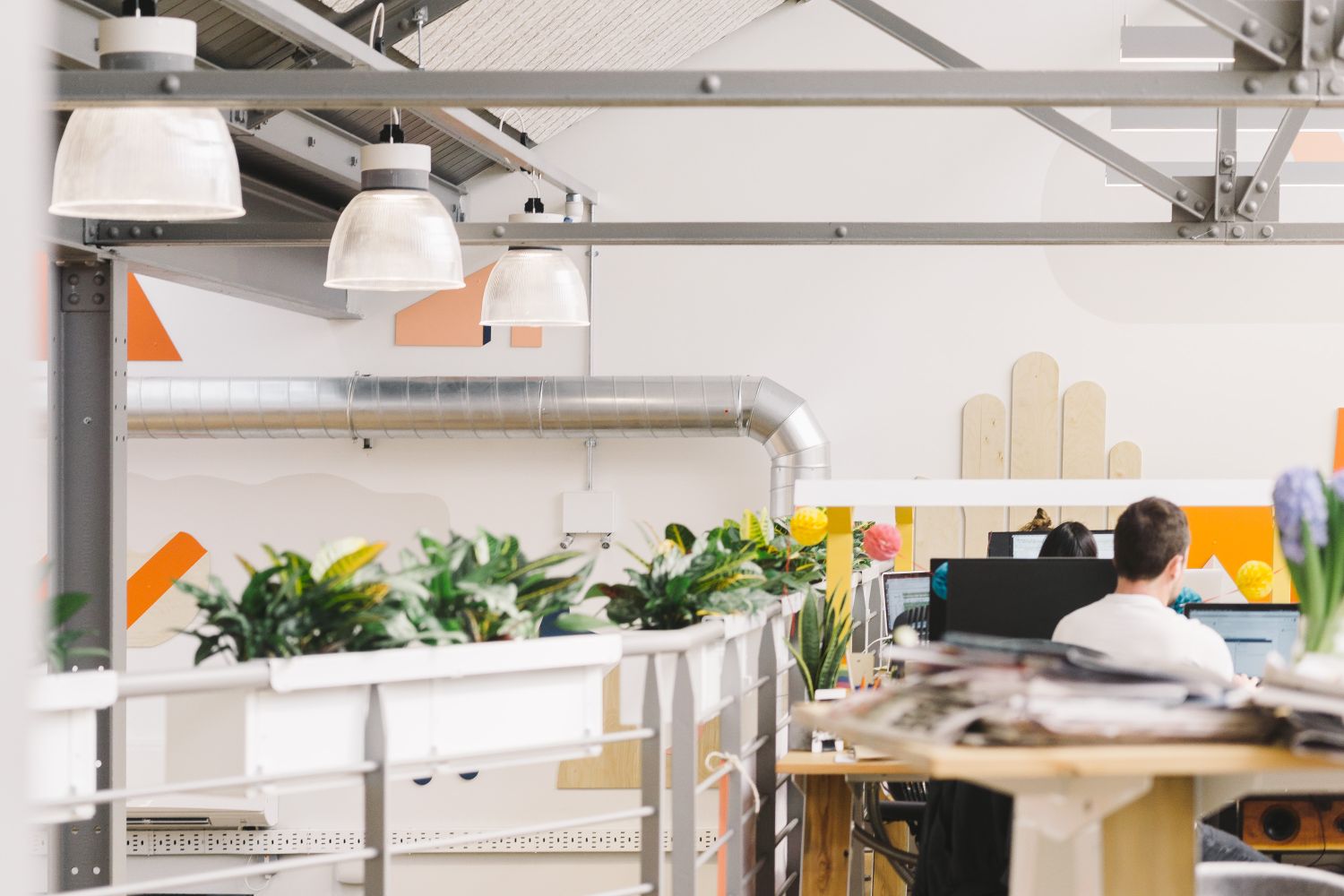
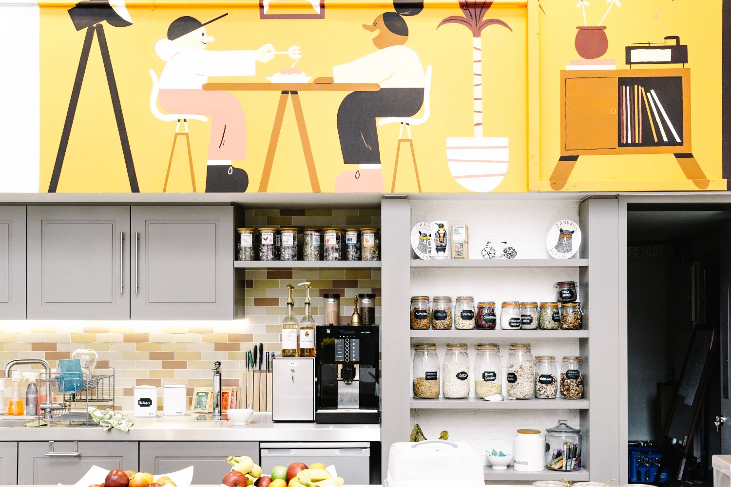
In an era of hybrid working, companies may need less office space than they once did, but the workplace still matters. Whether it serves as a daily base, a cultural anchor or a place to bring people together with purpose, a well-designed office can do far more than house desks, corridors and meeting rooms.
Done right, office design gives physical form to a brand. It can support collaboration, strengthen identity and improve the experience for staff, clients and visitors alike. Unlike shared environments, a branded office can express a company’s spirit, values and ways of working in a way that feels distinct and intentional.
At Glyphics, we’ve helped a wide range of organisations bring their offices to life through signage, wayfinding and visual brand design. Here are seven standout projects that show how these elements can transform a functional workspace into a more meaningful, memorable place to work.
1. The Croc: Bold Office Graphics2. Accurx: Branded Wayfinding3. Centtrip: Monochrome Manifestations4. Etsy: Characterful Signage Design5. Attest: Branding Expansion6. Acast Studios: Large-Scale Graphics7. Block: Brand Layers
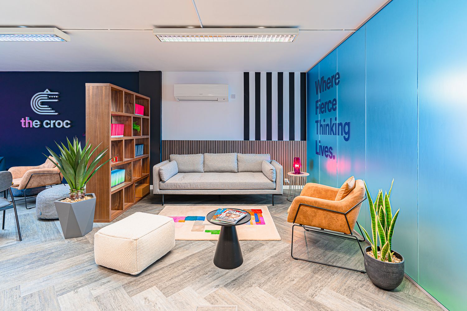
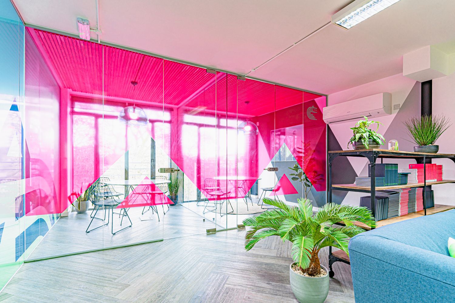
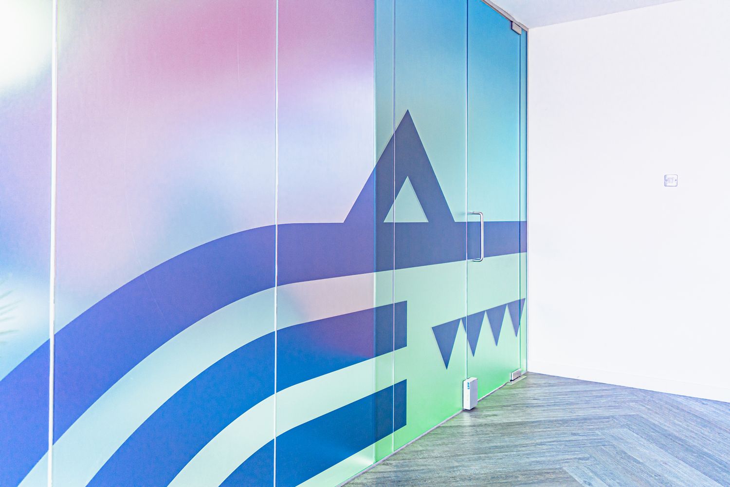
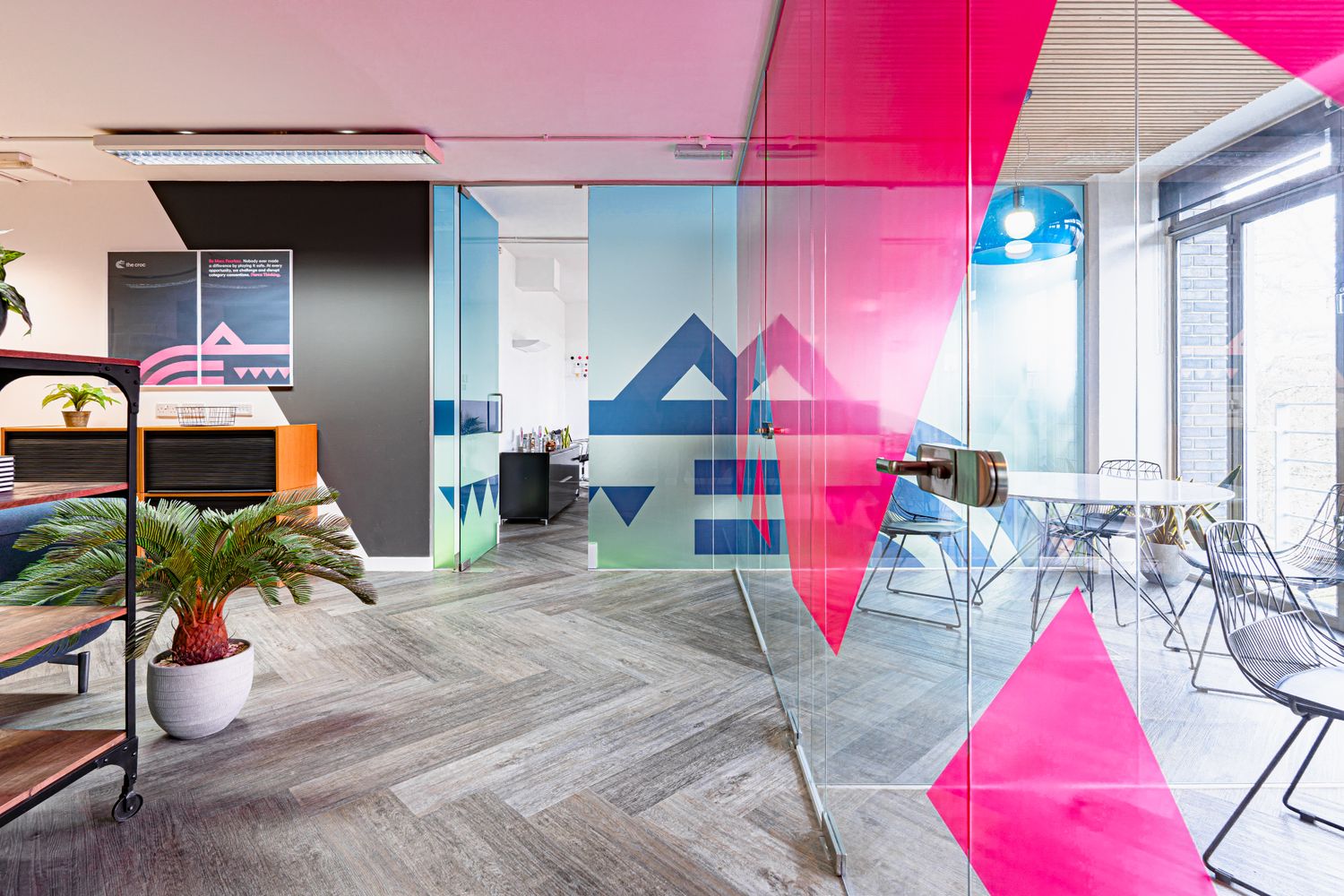
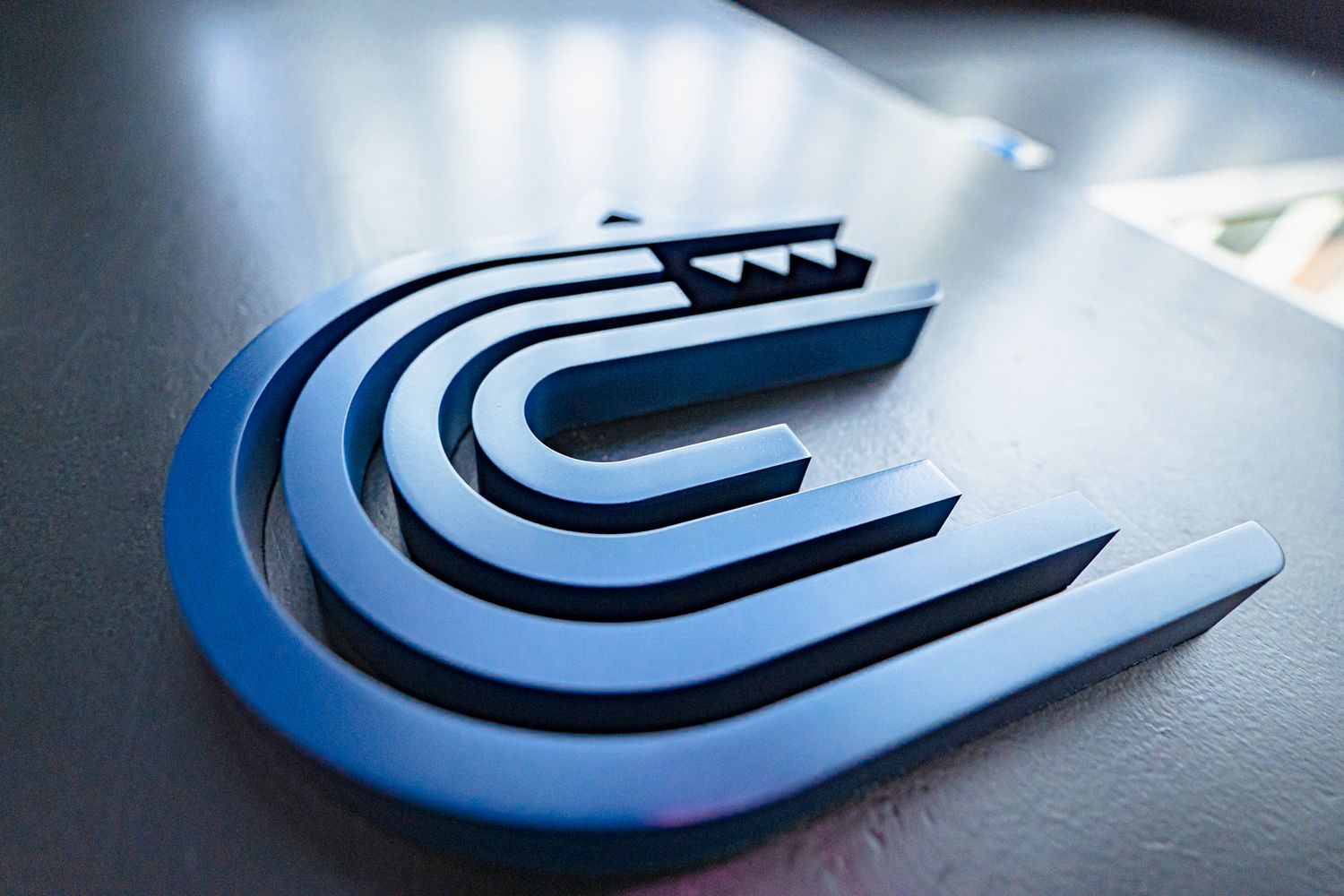
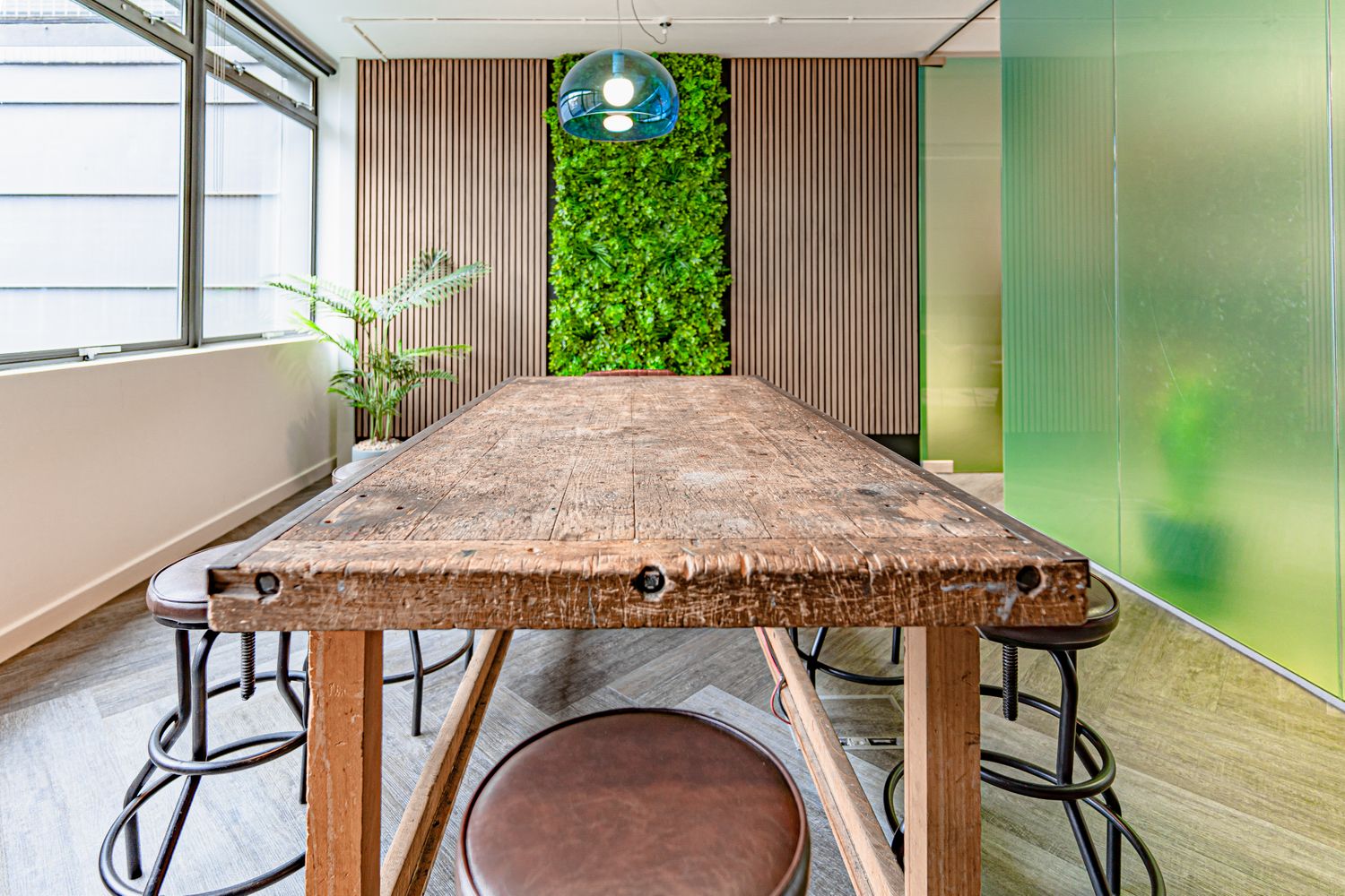
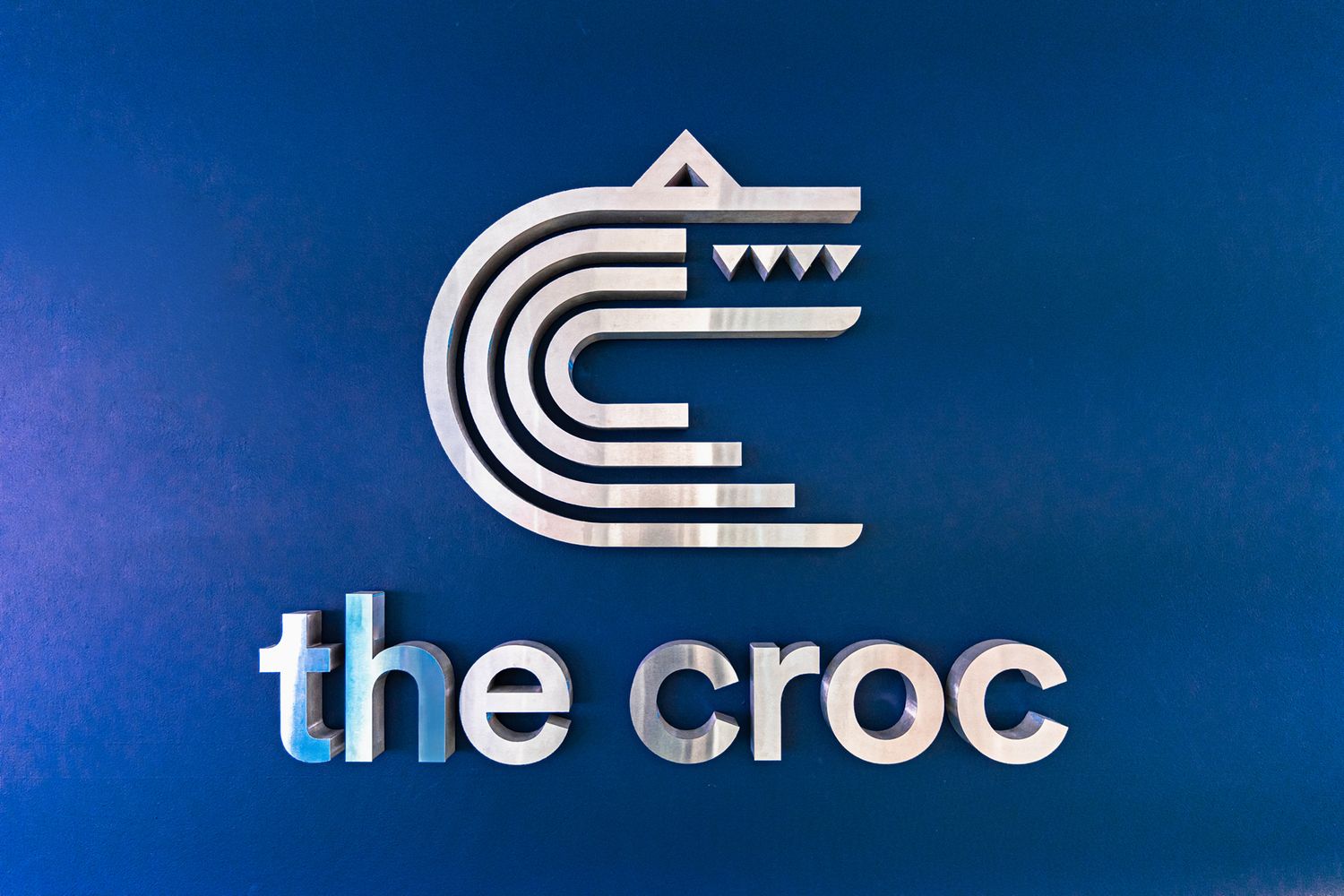
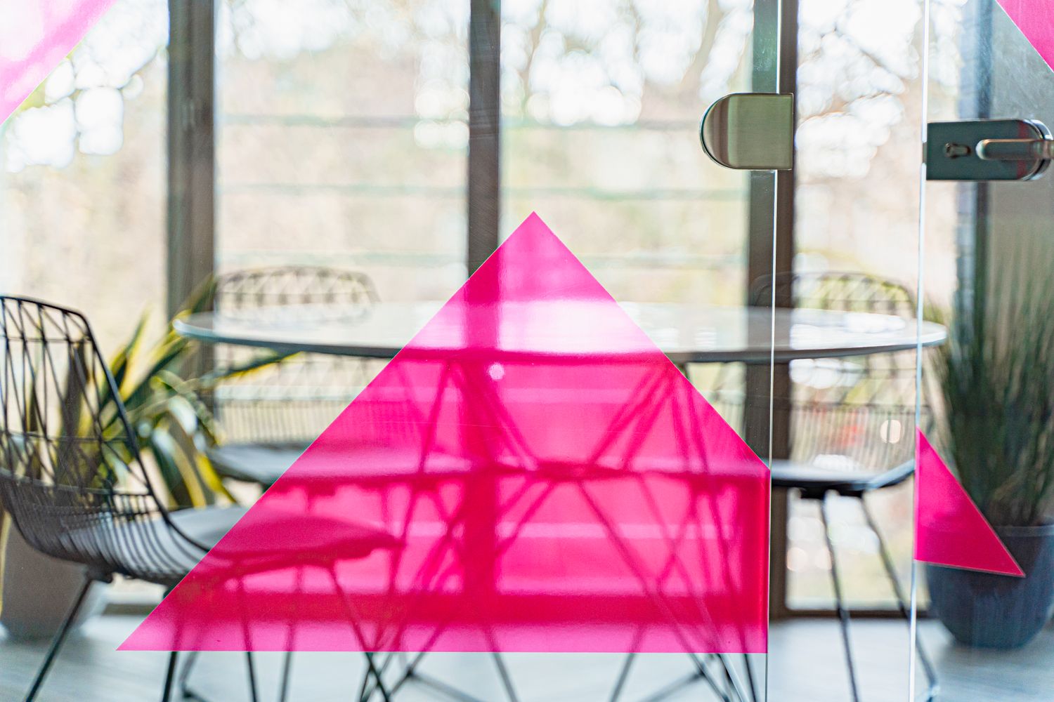
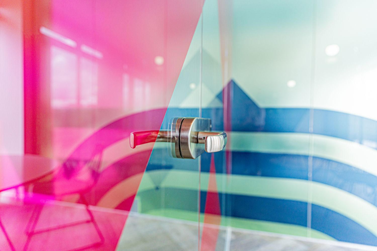
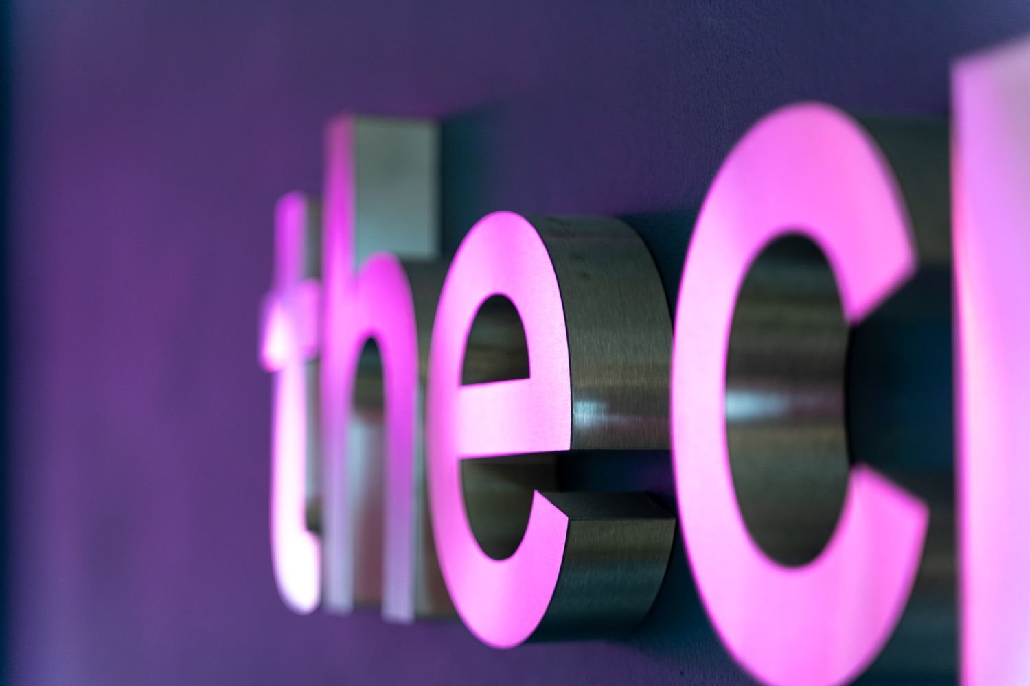
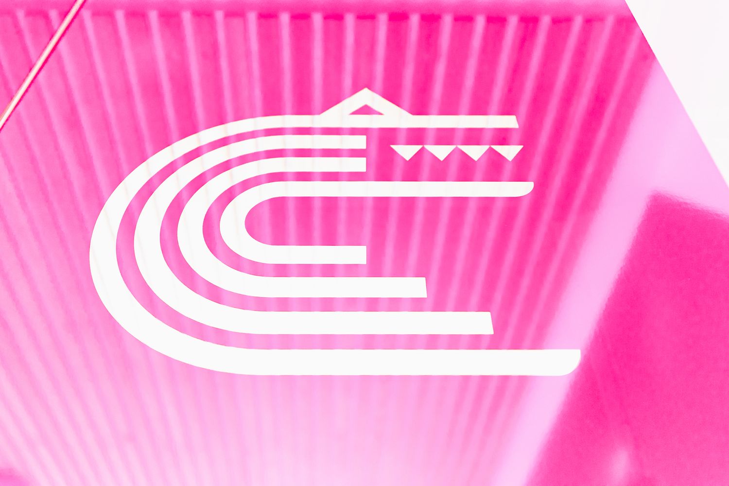
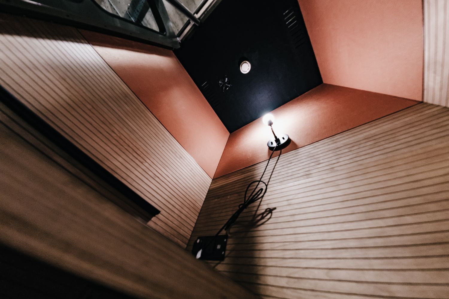
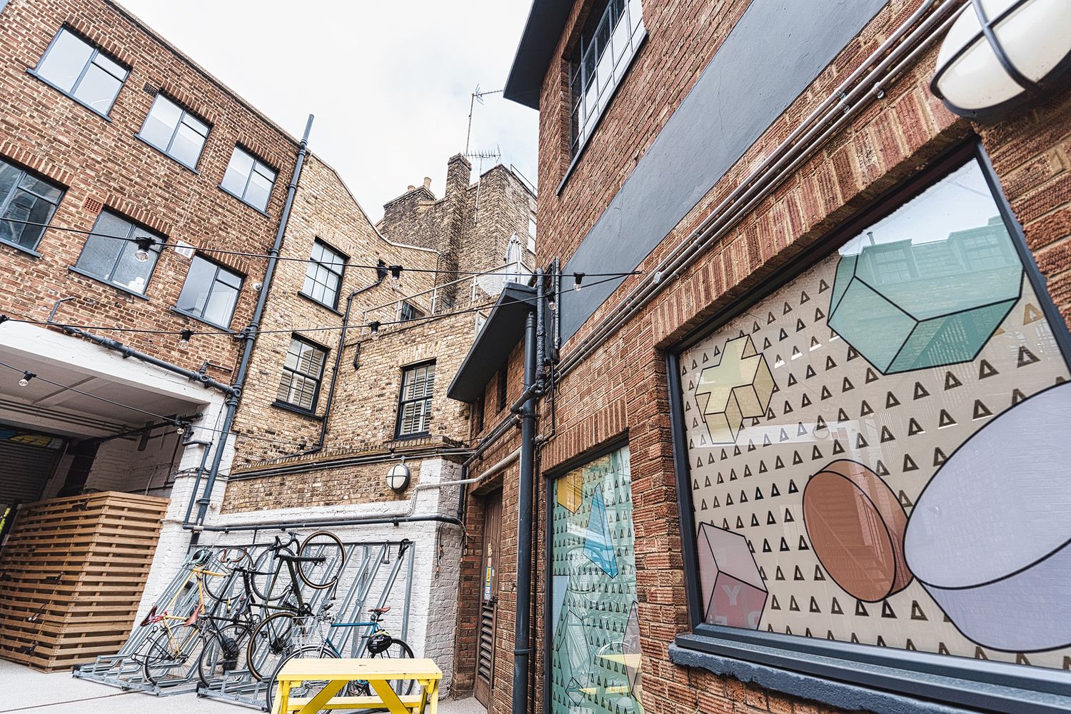
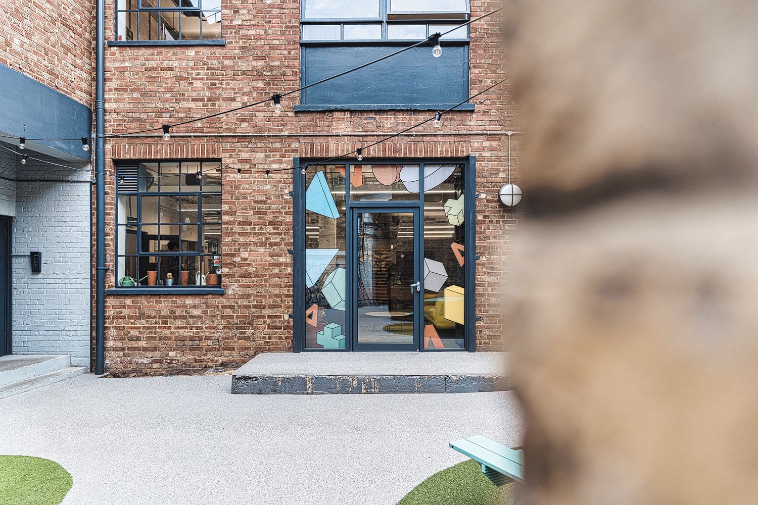
1. The Croc
The Company:
The Croc, a customer experience agency known for award-winning B2B marketing solutions.
The Challenge:
To bring stronger definition, privacy and brand presence into the agency’s refurbished office, while making the most of a glass-heavy interior and the natural light flowing through the space.
Our Solution:
Glass manifestations and privacy film introduced practical screening without losing light.
Blue-green gradient vinyl was used across meeting rooms to echo the brand palette.
Smaller glazed areas were marked out with vivid pink transparent vinyl inspired by the logo’s geometric scales.
A large brushed stainless steel 3D logo gave the foyer a strong focal point and a more premium sense of arrival.
The Smart Takeaway:
If done effectively, workplace branding can do more than decorate a space – it can solve functional problems while making a company’s visual language more tangible. At The Croc, privacy, safety and spatial definition were all handled through brand-led interventions that felt confident, distinctive and completely at home in the office. The striking colour palette of the manifestations shows how a medium often associated with practical requirements can help define the atmosphere of a space.
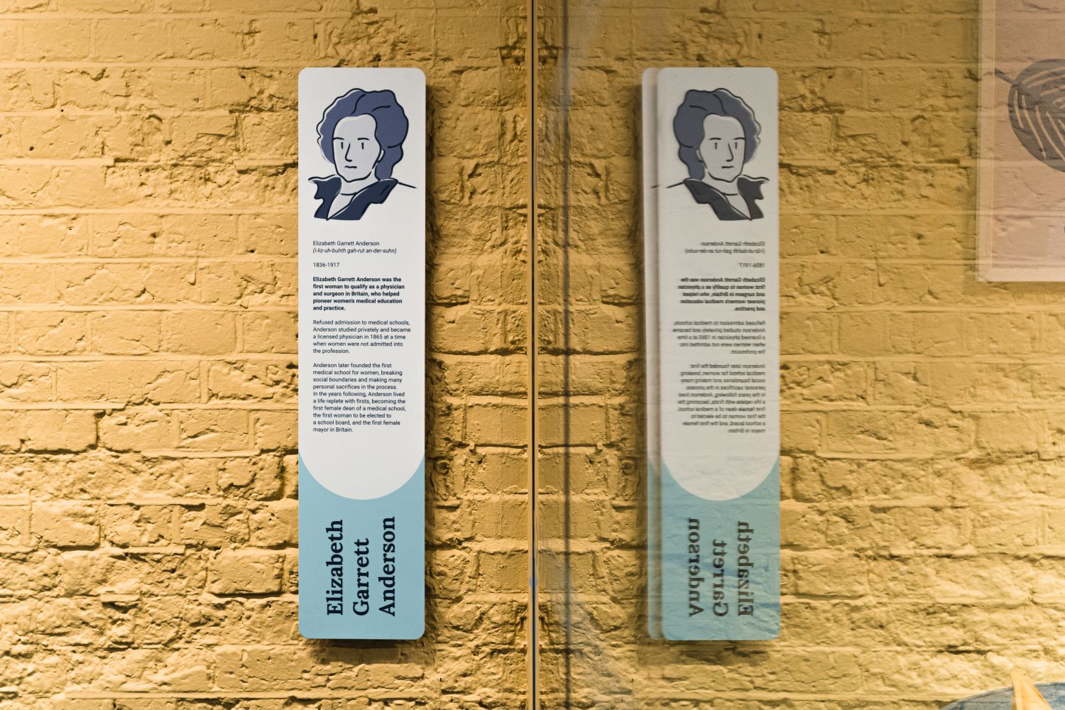
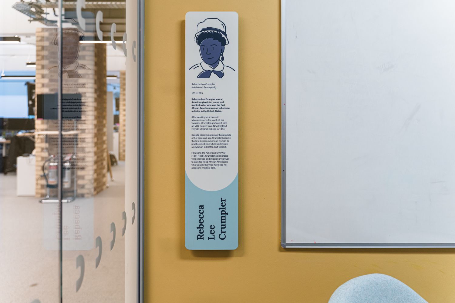
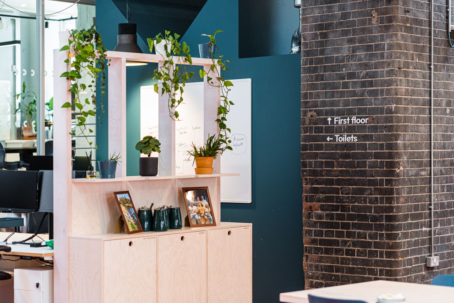
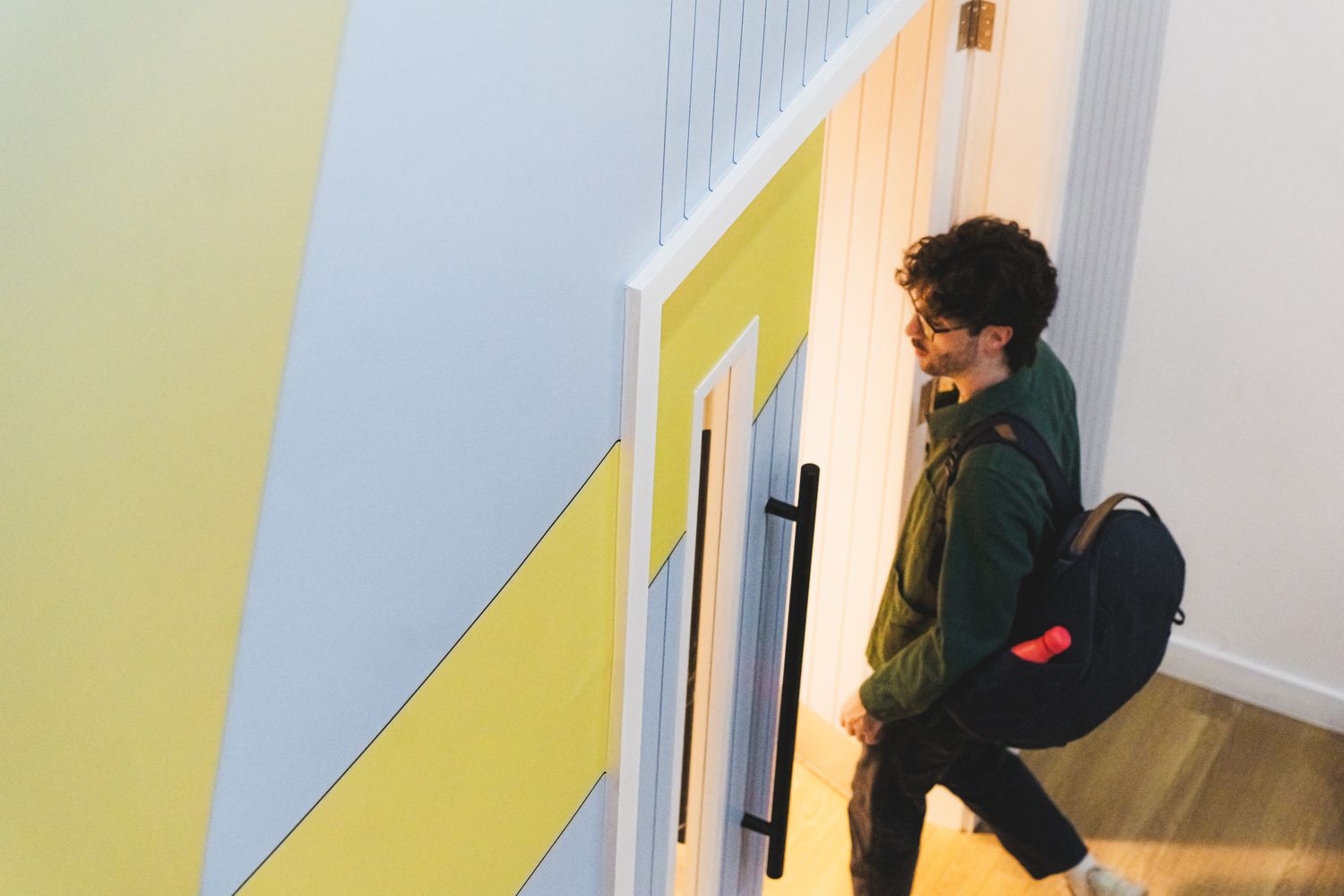
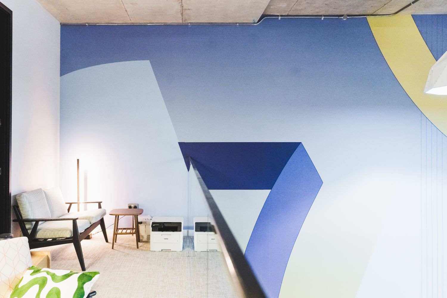
2. Accurx
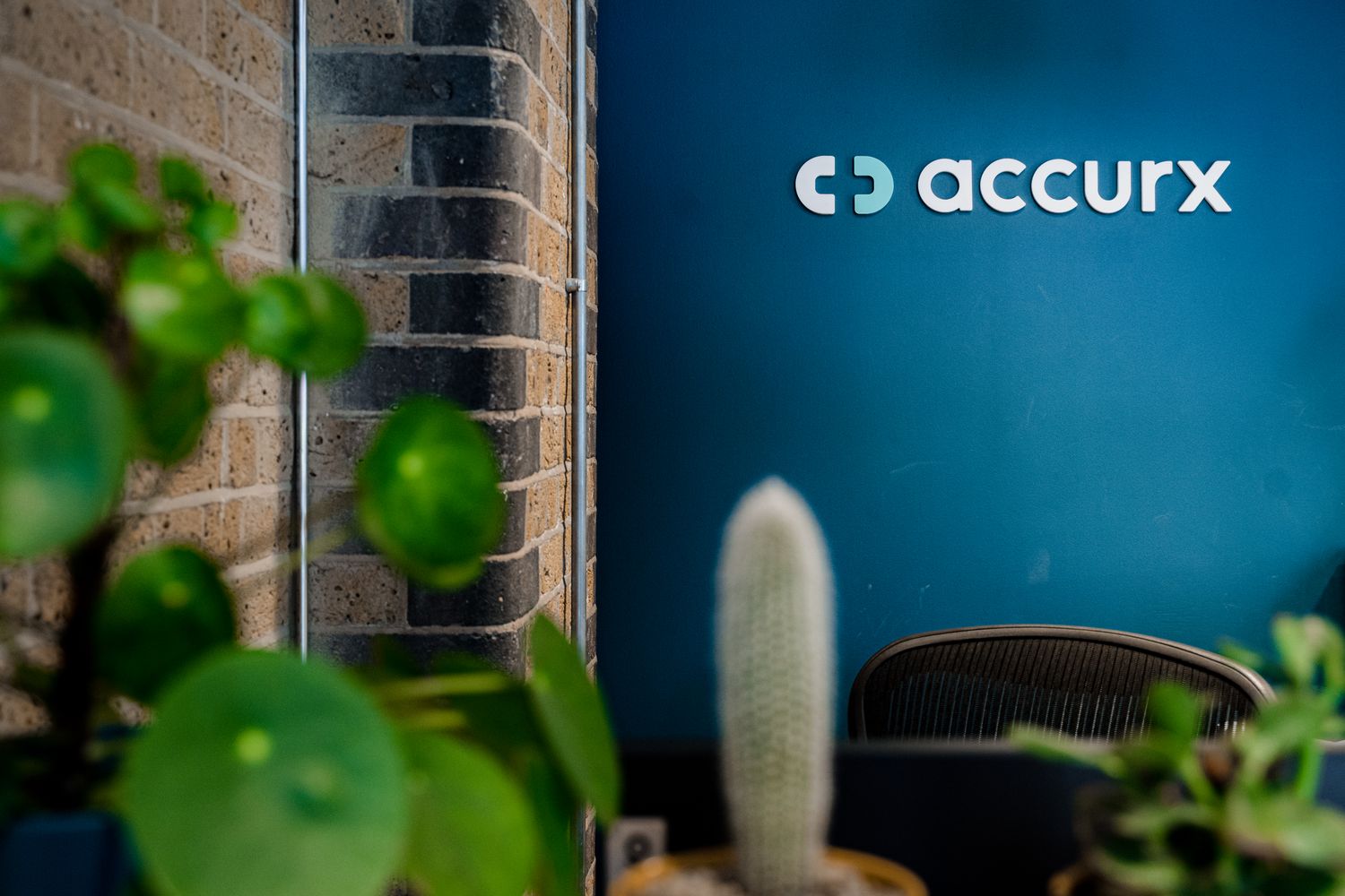
The Company:
Accurx, a software company focused on healthcare communication, approached Glyphics to help shape the visual identity of its new office.
The Challenge:
To create a coherent workplace identity from a blank canvas, developing signage and wayfinding that felt true to the brand while sitting comfortably within an open-plan office with exposed brick, glazing and an already rich interior palette.
Our Solution:
Adapted the company logomark into a repeat-pattern safety manifestation, using semi-opaque white vinyl to create an understated layer of branding across the internal glazing.
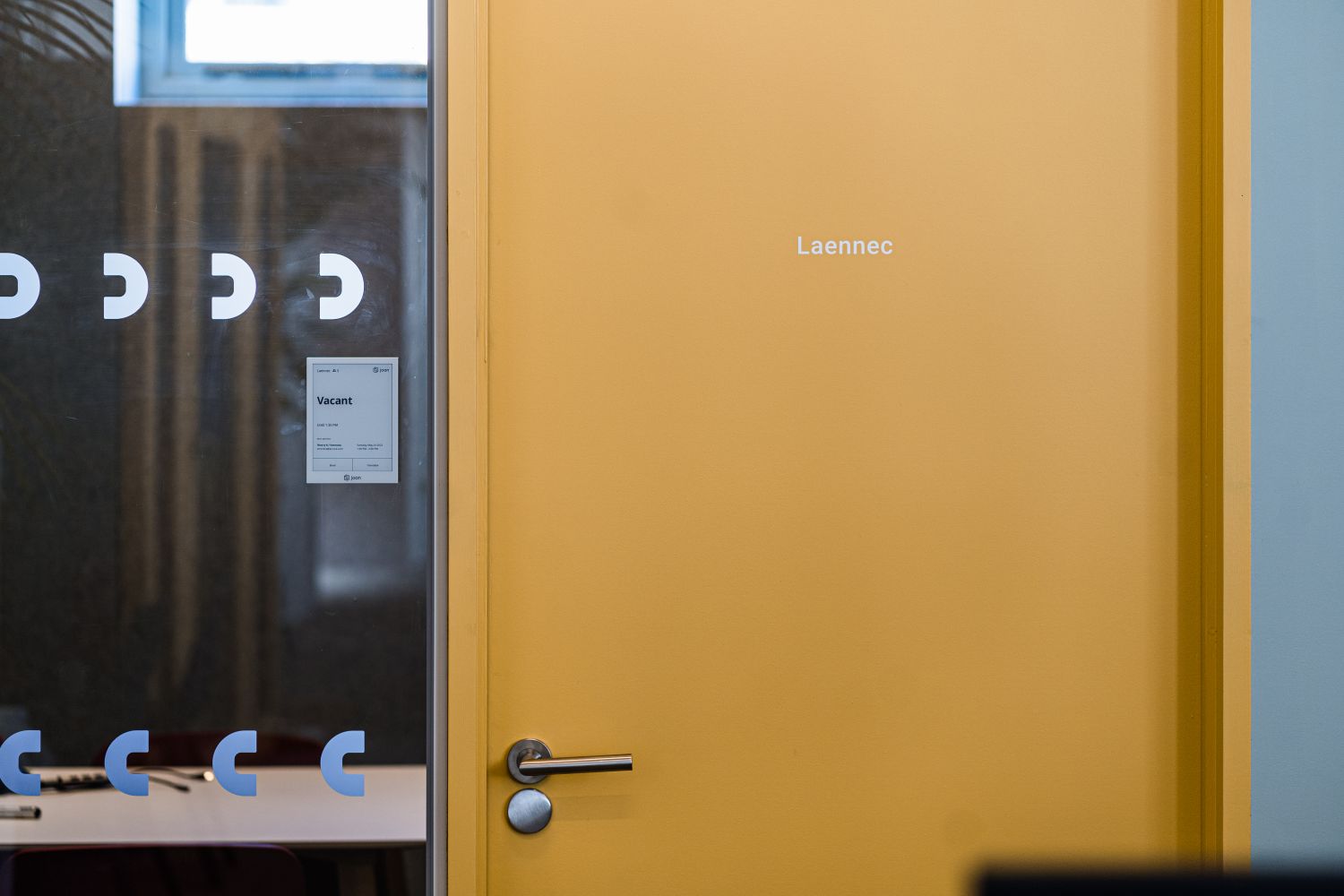
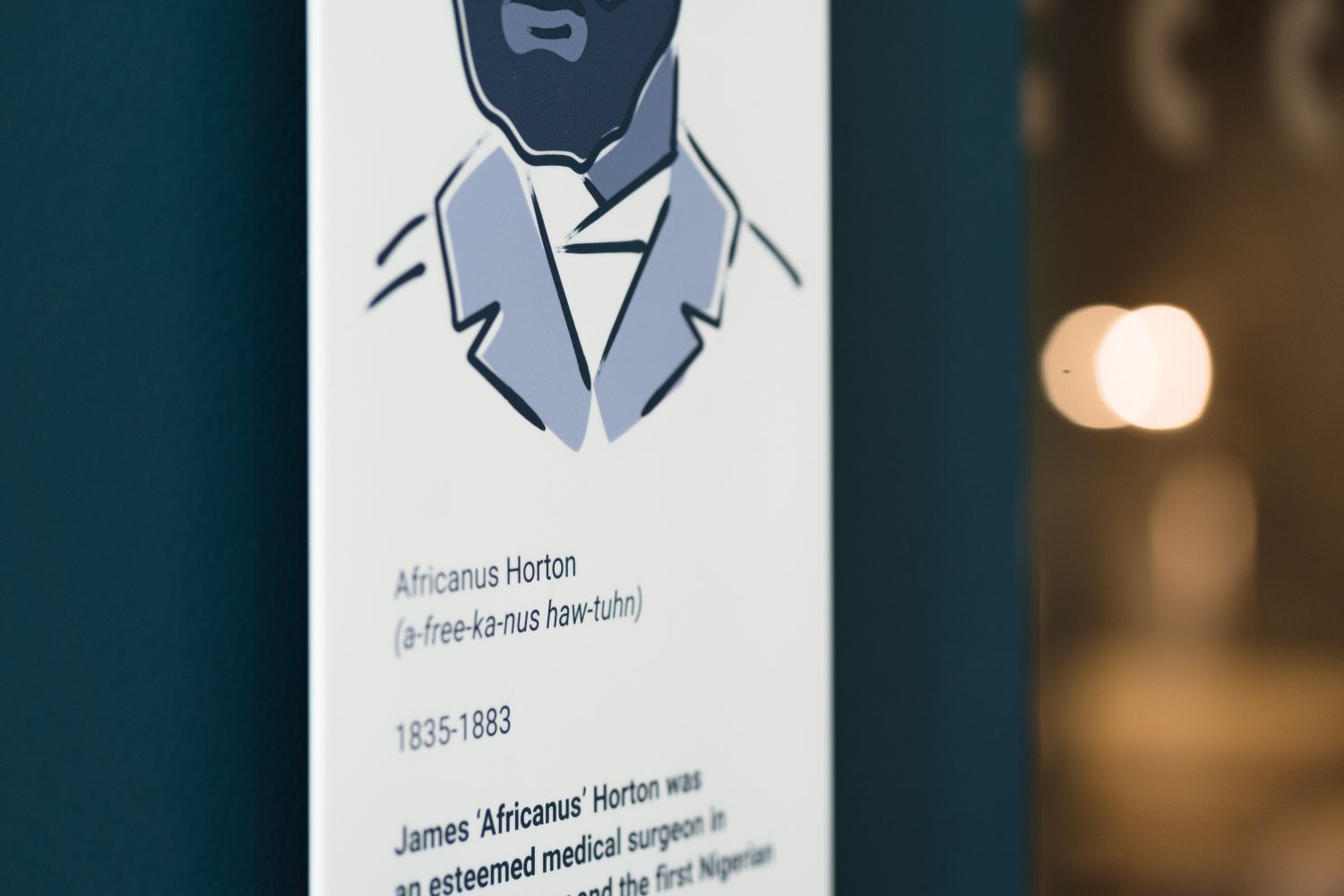
Cut vinyl and raised acrylic wayfinding signage brought clarity and consistency to navigation.
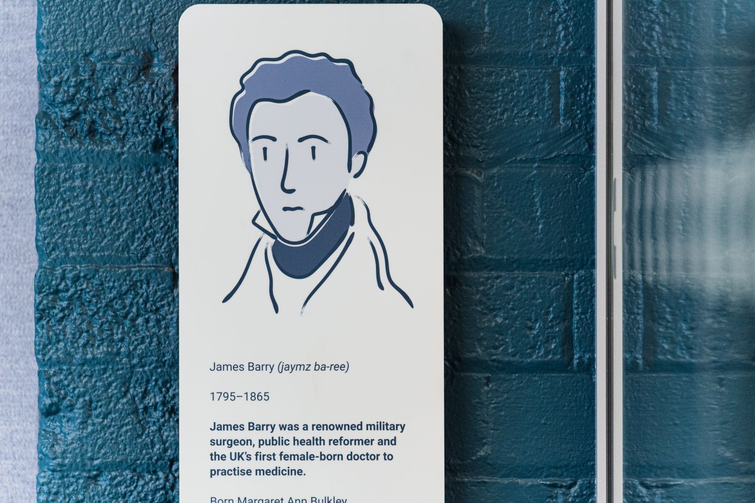
Bespoke metal meeting room plates in the form tall vertical signs featuring illustrated medical figures and biographical text.
The Smart Takeaway:
The strongest workplace branding systems do more than label rooms and meet compliance requirements – they give a company a tangible sense of self. At Accurx, signage became a way to translate a digital-first healthcare brand into a real-world environment, balancing navigation, atmosphere and storytelling. The project also shows how wayfinding can carry more meaning when it is rooted in the values of the organisation itself – in this case, through references to figures who shaped modern medicine.
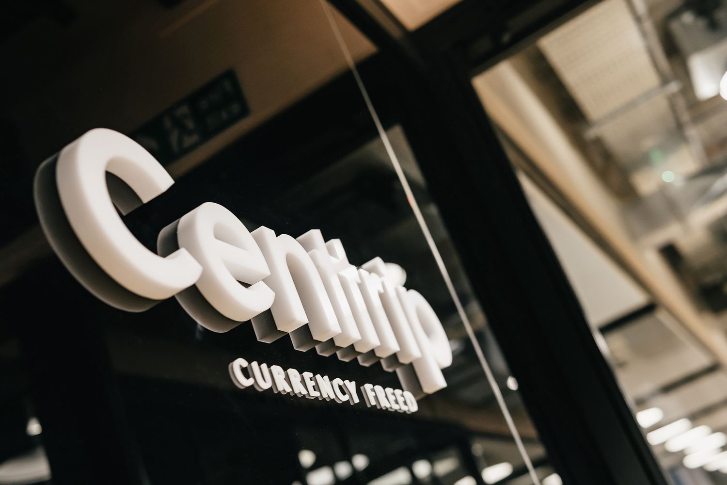
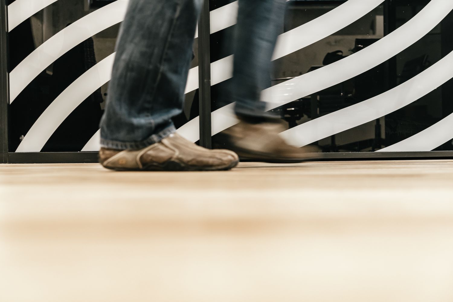
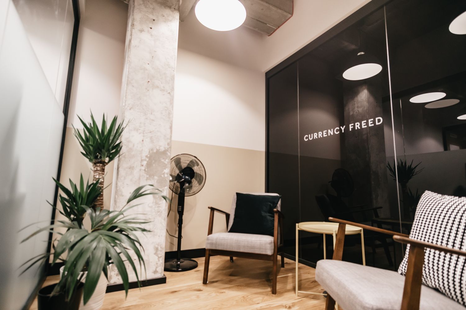
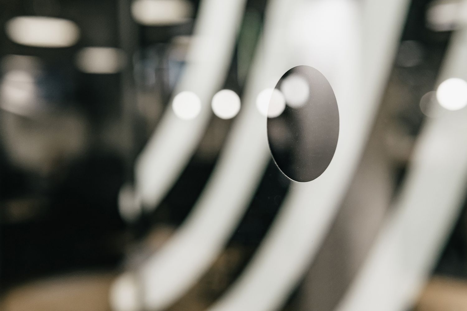
3. Centtrip
The Company:
Centtrip, a team of foreign exchange and technology experts, created a global multi-currency account focused on FX, payments and banking.
The Challenge:
To turn a predominantly glass office within a WeWork space into something that felt like a true reflection of the company’s values, while also handling privacy and practical compliance requirements.
The Solution:
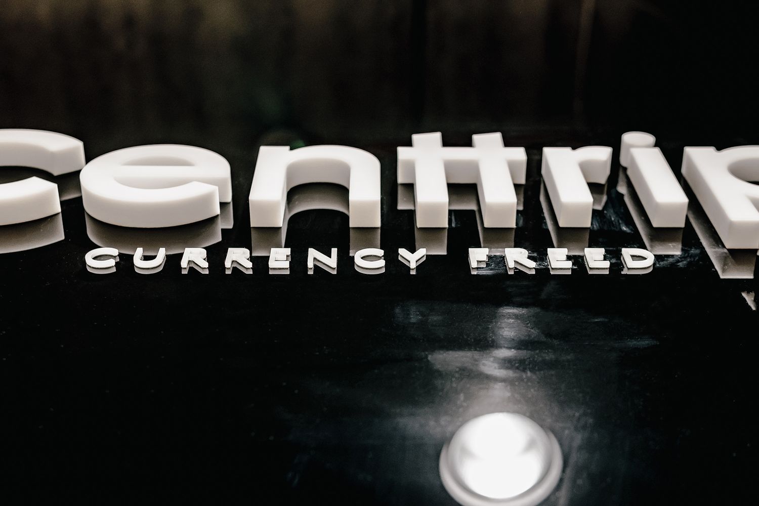
Matt black manifestations and monochrome graphic treatments gave the office a more defined visual identity.
Reverse-printed vinyl brought a wave-shaped graphic to the exterior of a cosy glass room.
A 3D white acrylic logo was mounted on the entrance glass panel, backed with matt black vinyl to create a glossy backdrop.
A strategically cut black vinyl screen improved privacy in the central meeting room without omitting light.
The Smart Takeaway:
This project is a strong reminder that glass manifestation can do much more than satisfy regulations. At Centtrip, it became the main visual language of the office – shaping mood, reinforcing the brand and giving the workplace a clearer visual identity. The black-and-white palette brought refinement and restraint, while the different vinyl treatments showed how practical interventions can still feel elegant, deliberate and highly designed.

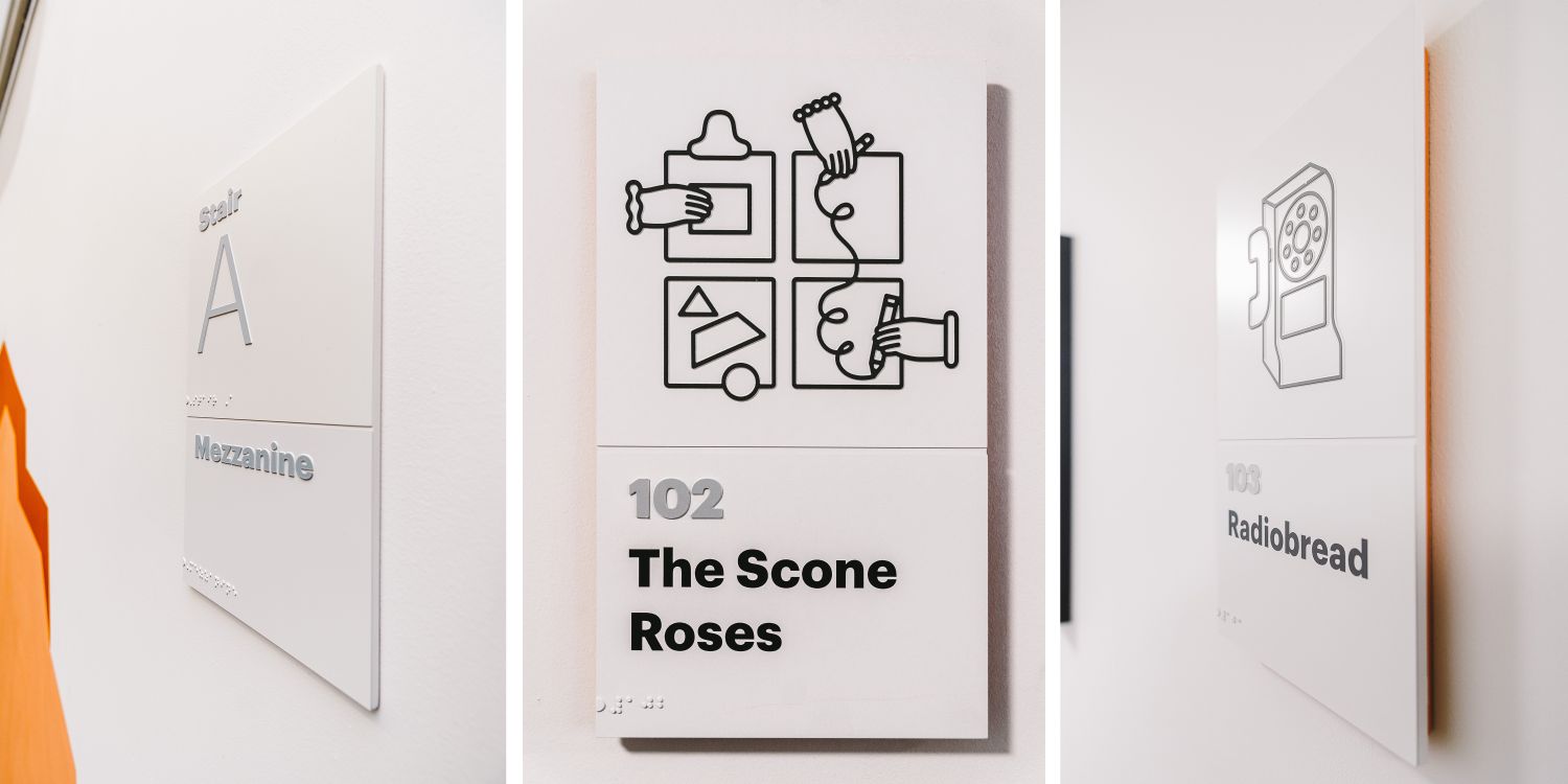
4. Etsy
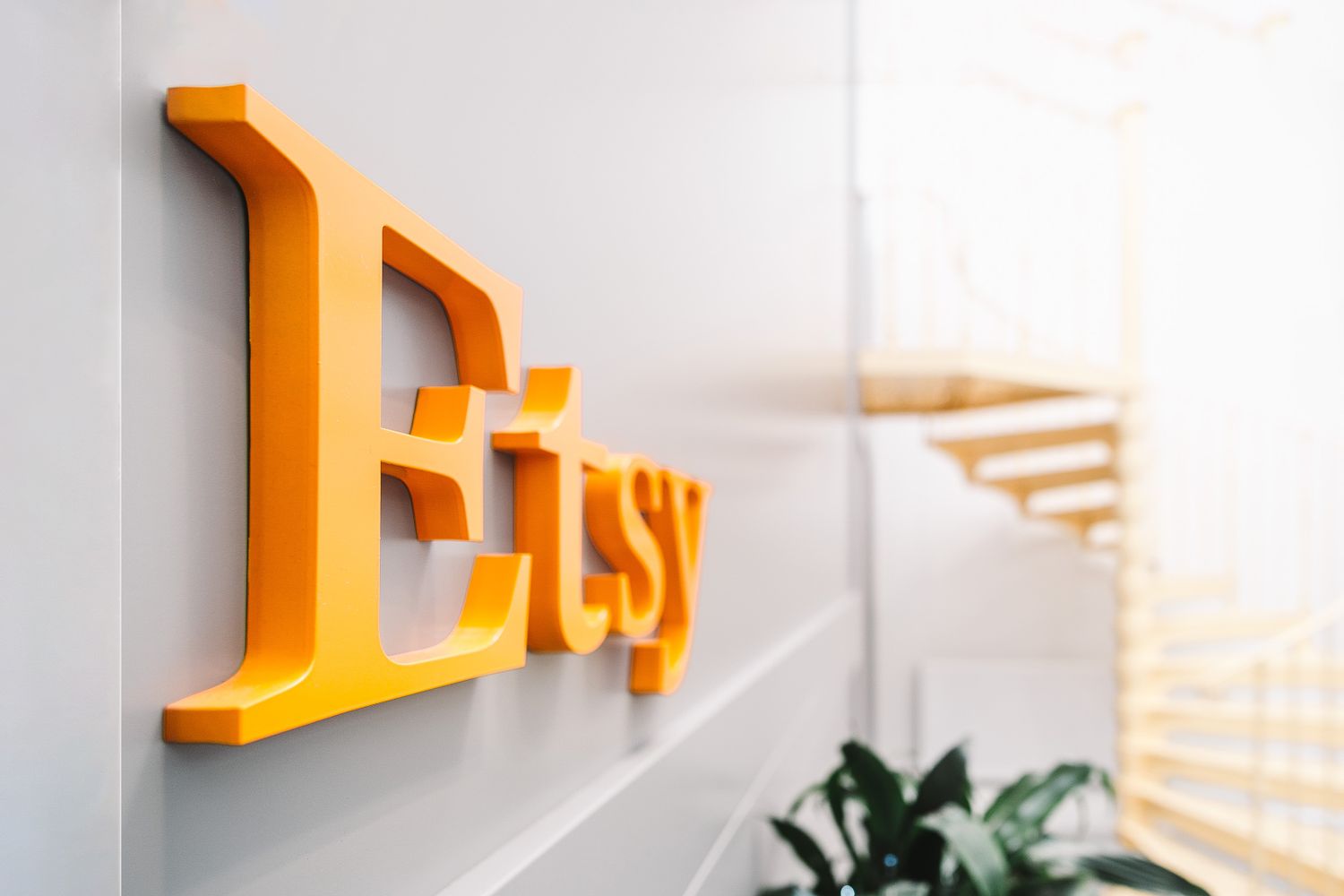
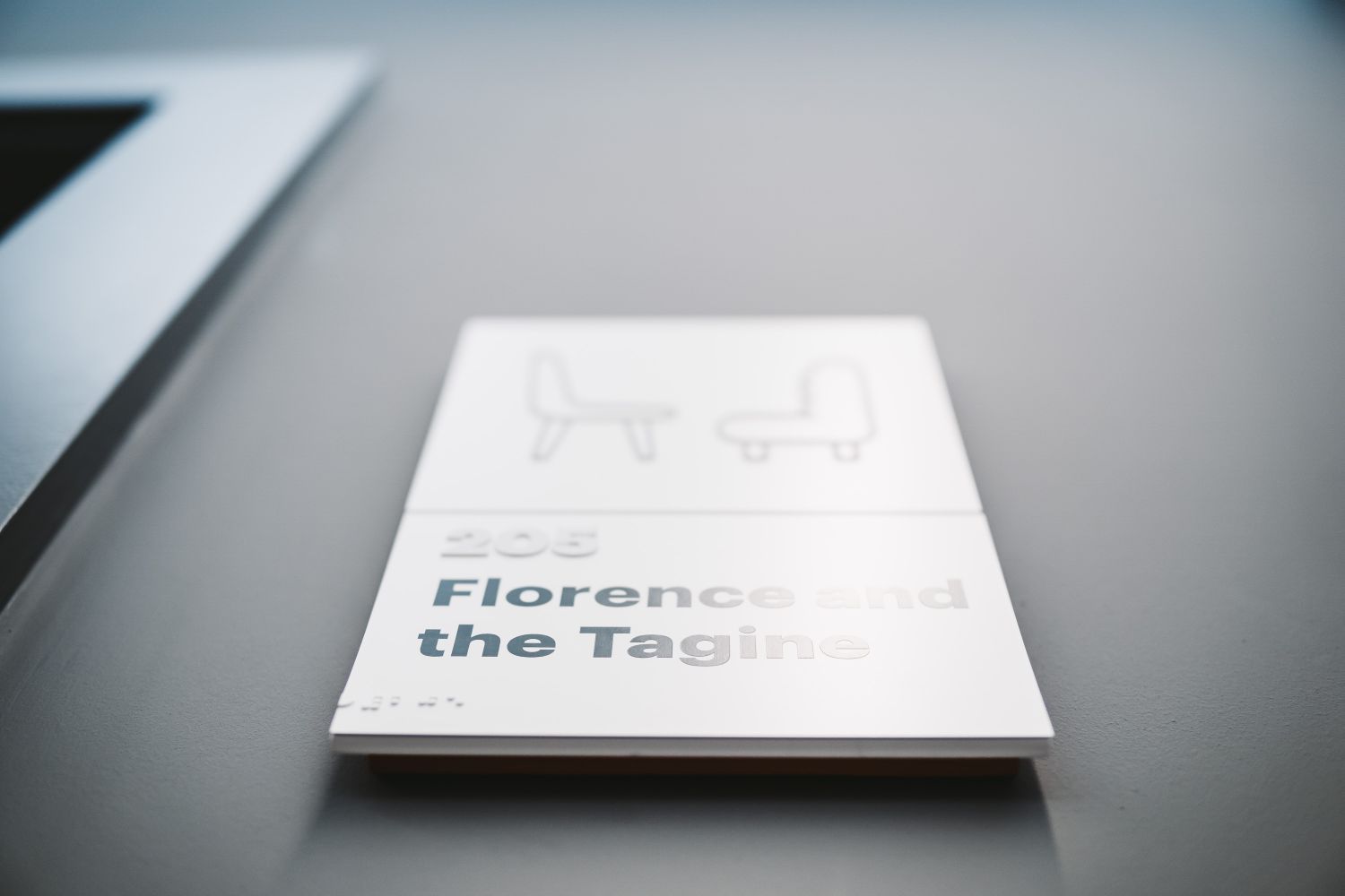
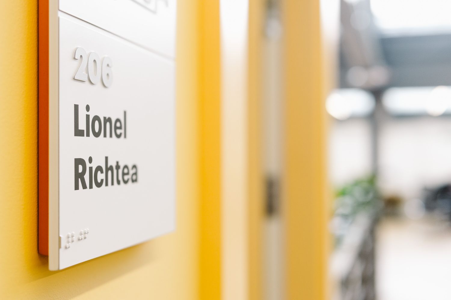
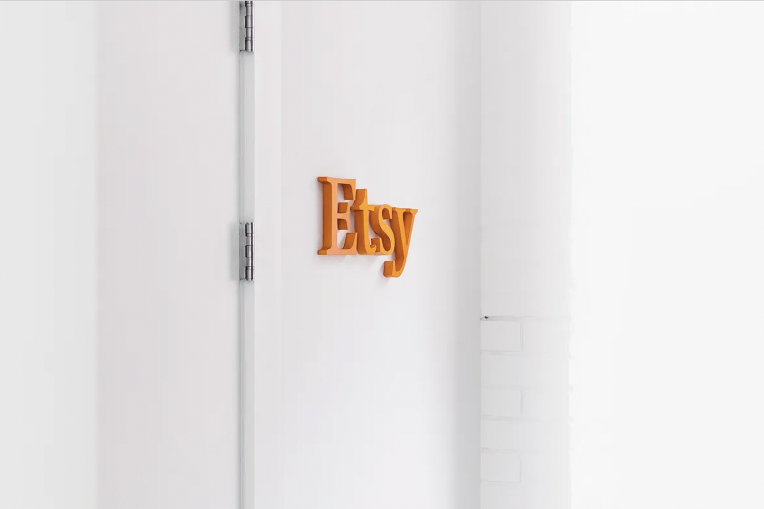
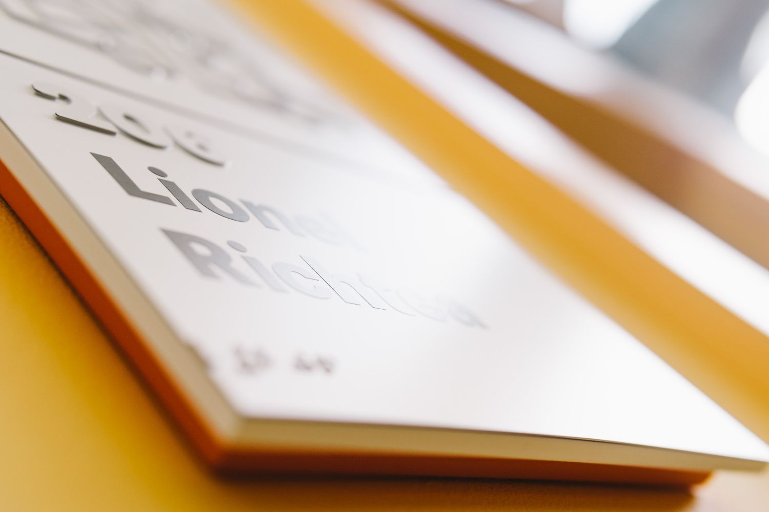
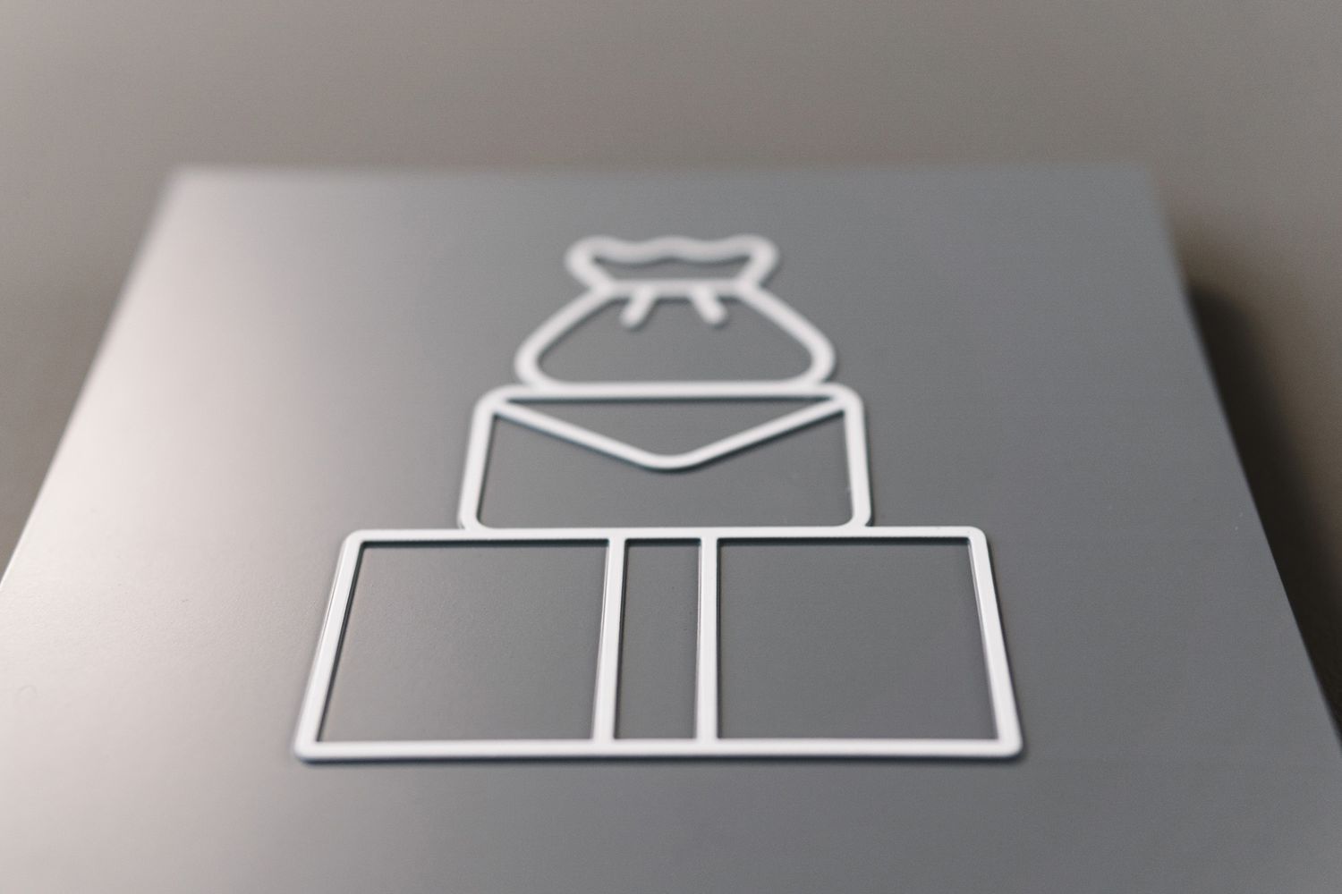
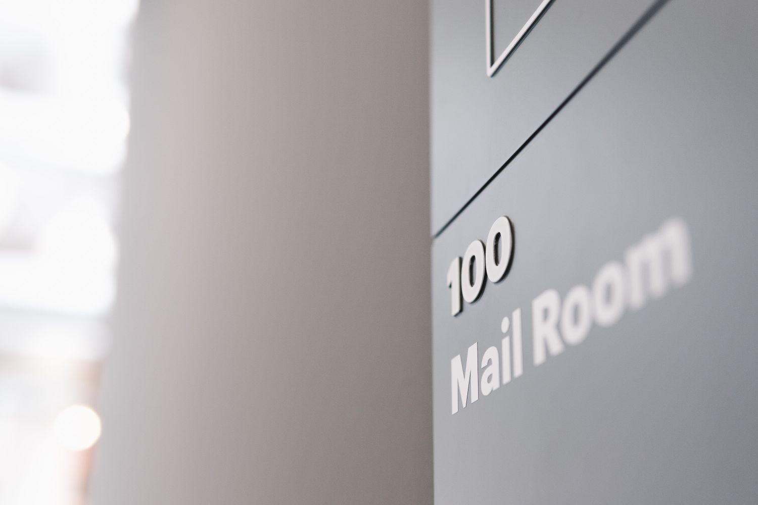
The Company:
Etsy, the creative marketplace for handmade and vintage goods, wanted signage for its Clerkenwell offices that felt as positive, design-conscious and characterful offline as the brand does online.
The Challenge:
To create DDA-compliant wayfinding across two floors of an open-plan office that was already full of craft objects, vintage furniture, plants and Etsy’s trademark orange – while making sure the signage felt like a natural extension of the brand rather than a generic accessibility layer.
Our Solution:
Thirty-one bespoke wayfinding signs were created across two floors.
Each sign combined tactile and braille elements with reverse-etched photopolymer sections, proud icons and room numbers.
Silk-screened colours were carefully matched to Etsy’s brand palette.
Creative wordplay in the room names and iconography turned practical navigation into something playful and unmistakably on-brand.
The Smart Takeaway:
It was refreshing to work on a wayfinding system that was not only inclusive, but full of wit and personality. Too often, accessible signage is treated as something purely technical or visually secondary. At Etsy, it became one of the most charming parts of the workspace, proving that DDA-compliant wayfinding can feel crafted, brand-led and full of delight.
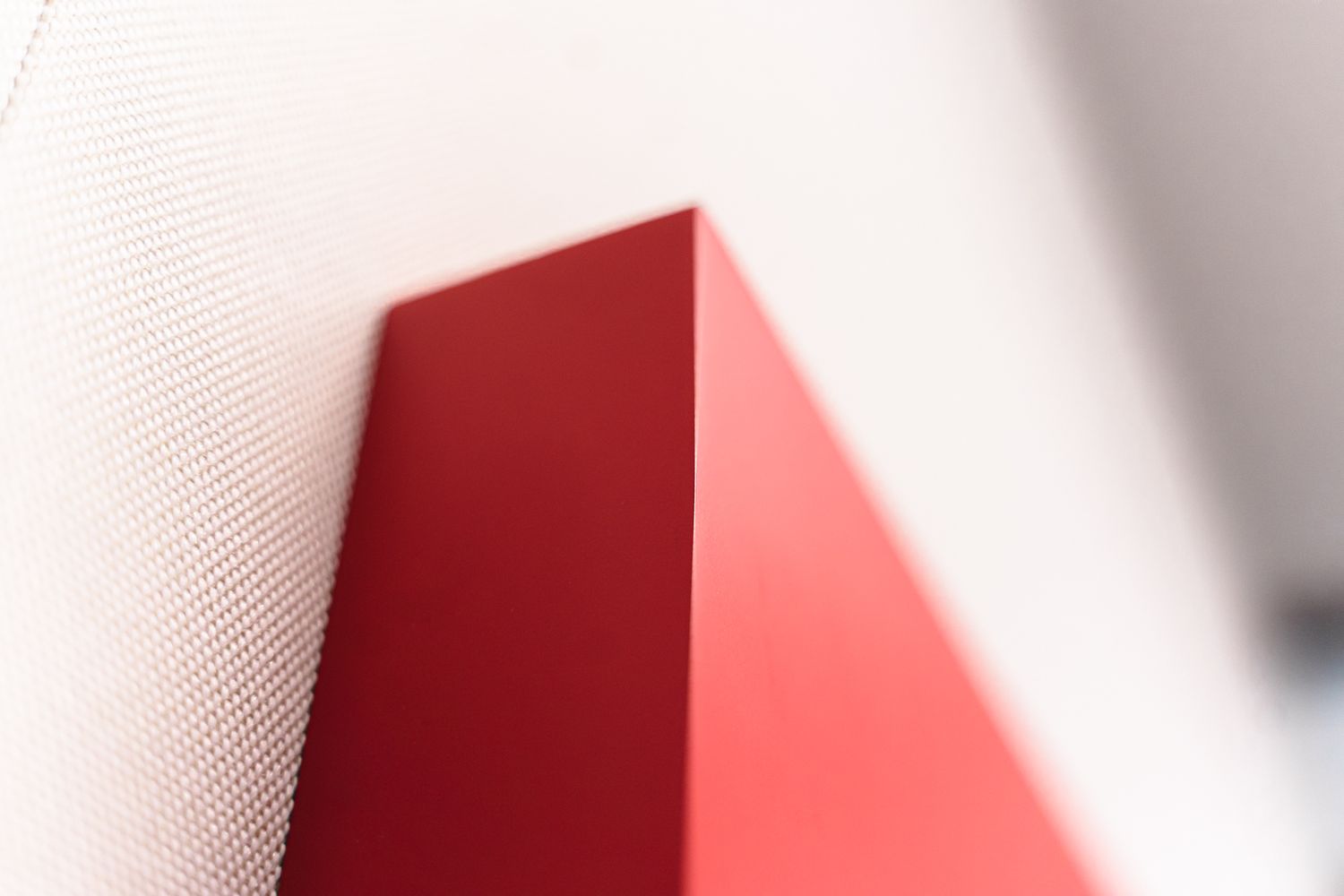
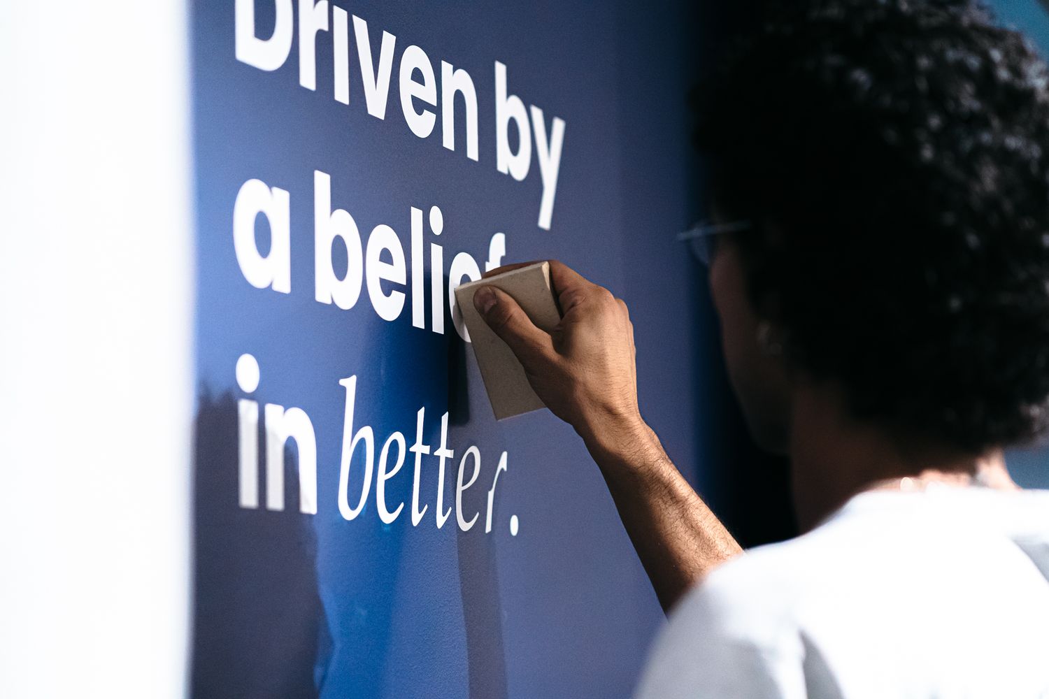
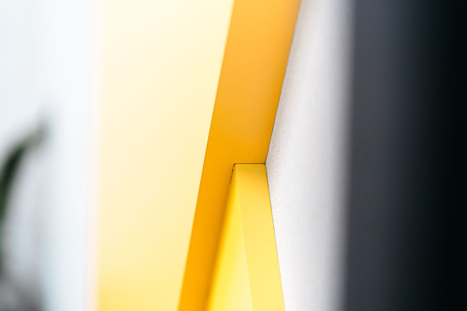
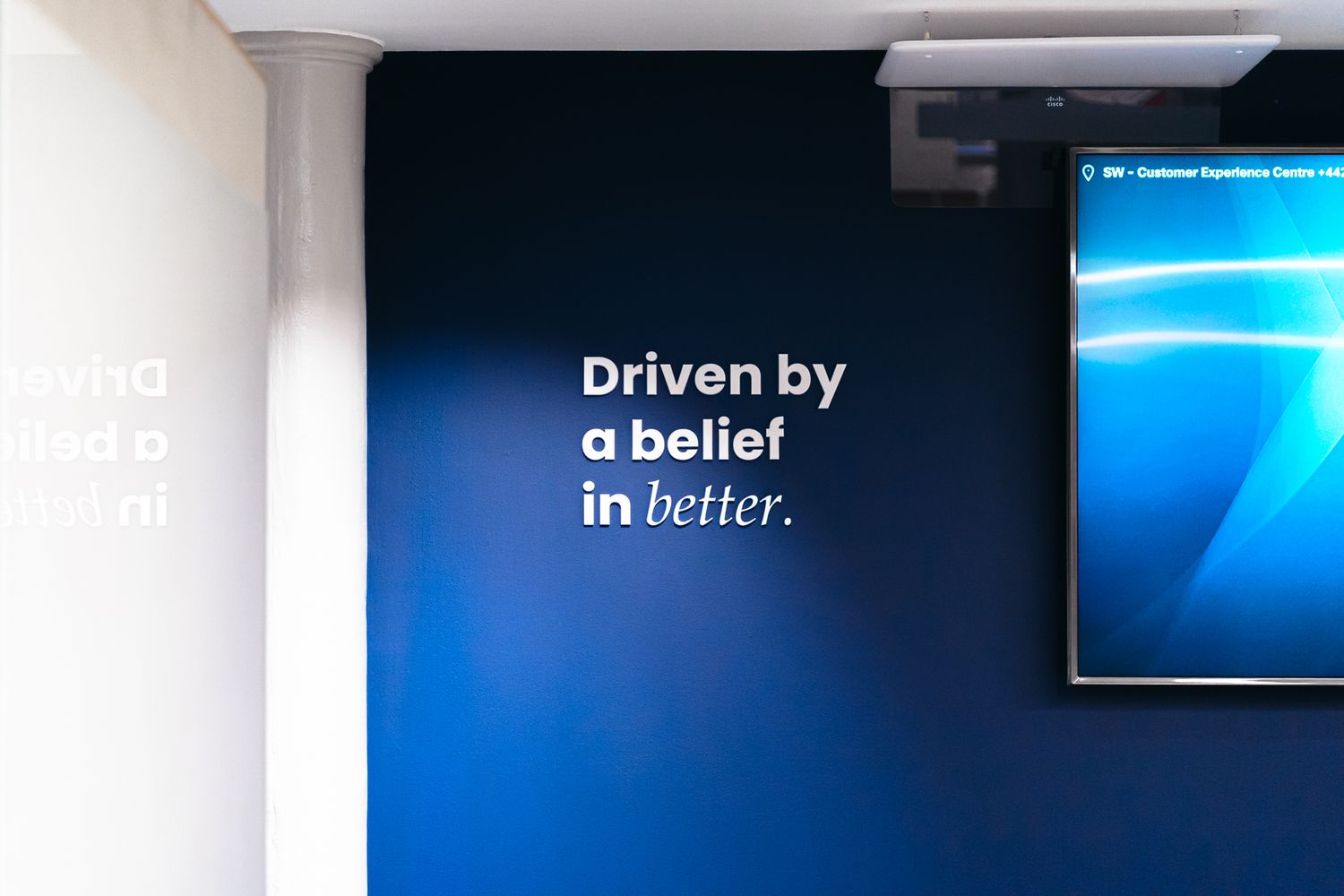
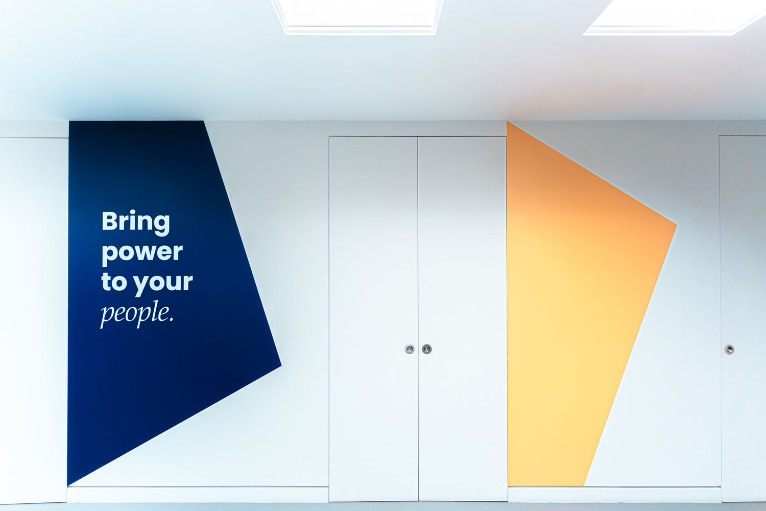
5. Attest
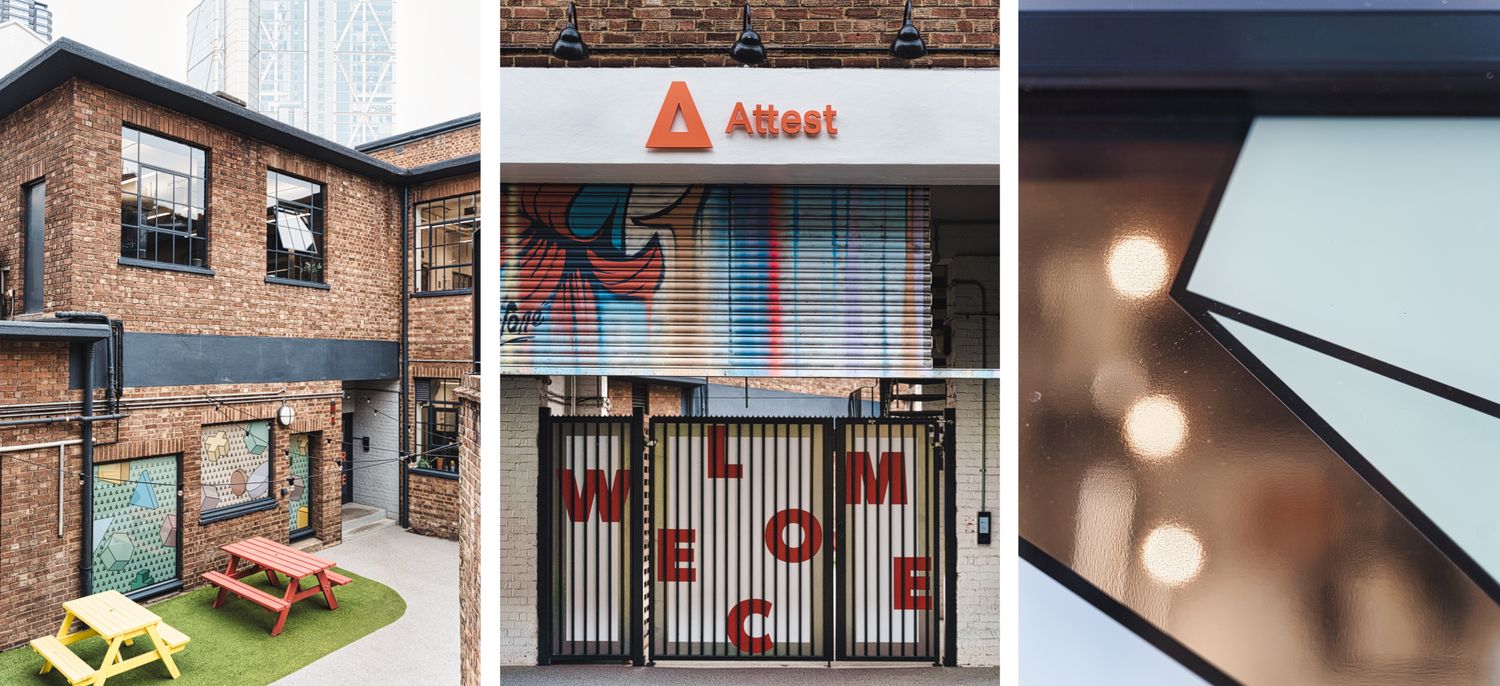
The Company:
Attest, a consumer research company, needed new entrance signage for its offices on Holywell Road in Shoreditch.
The Challenge:
What began as a request to replace the main entrance sign quickly grew into a wider brief: to bring more of the brand into the office and courtyard-facing glazing, while also improving privacy and making the glass areas work harder visually.
Our Solution:
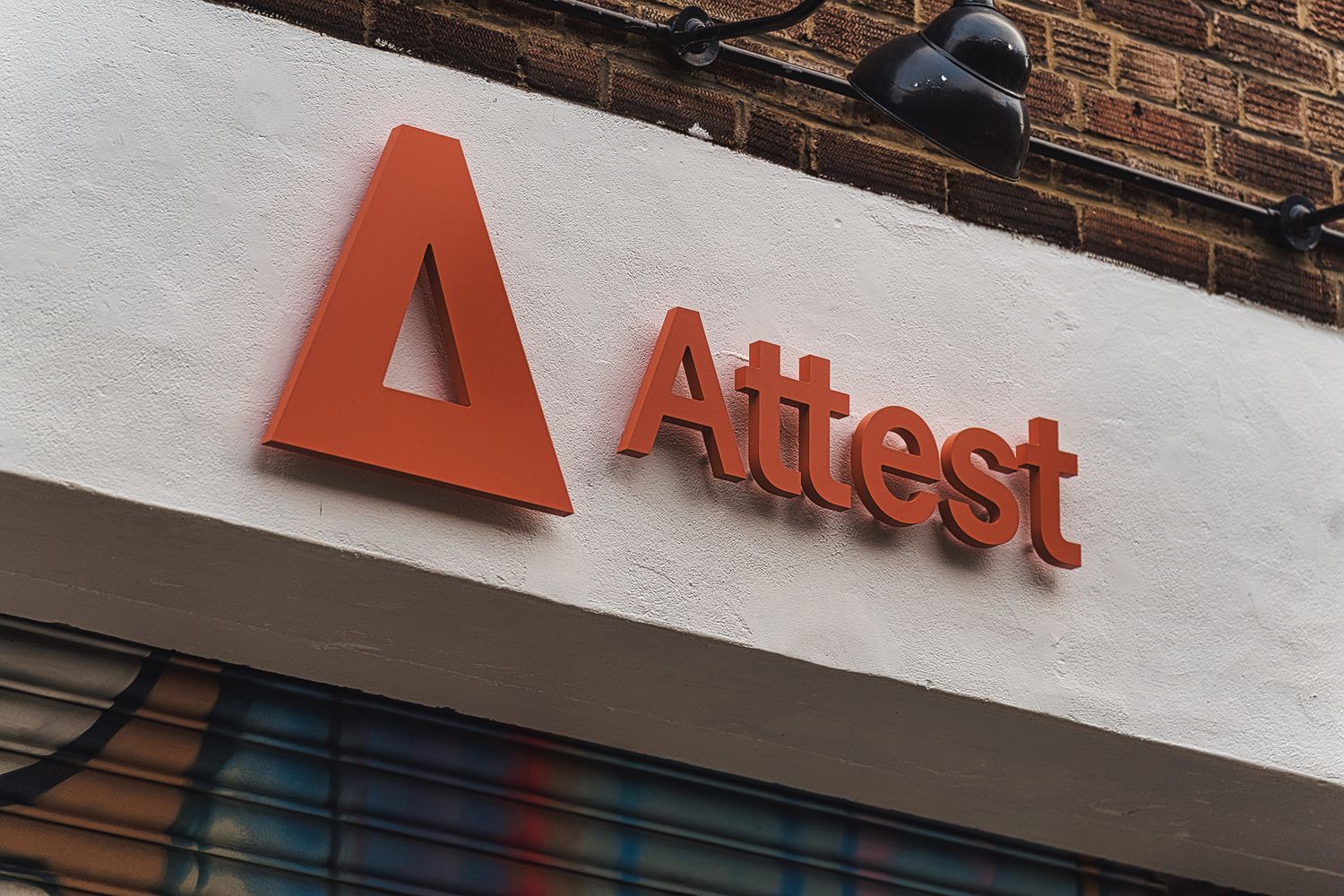
A satin-finish acrylic 3D sign in Attest’s exact orangey-coral Pantone colourway was mounted above the entrance arch.
Pop locator standoffs gave the sign more presence and created natural drop shadows.
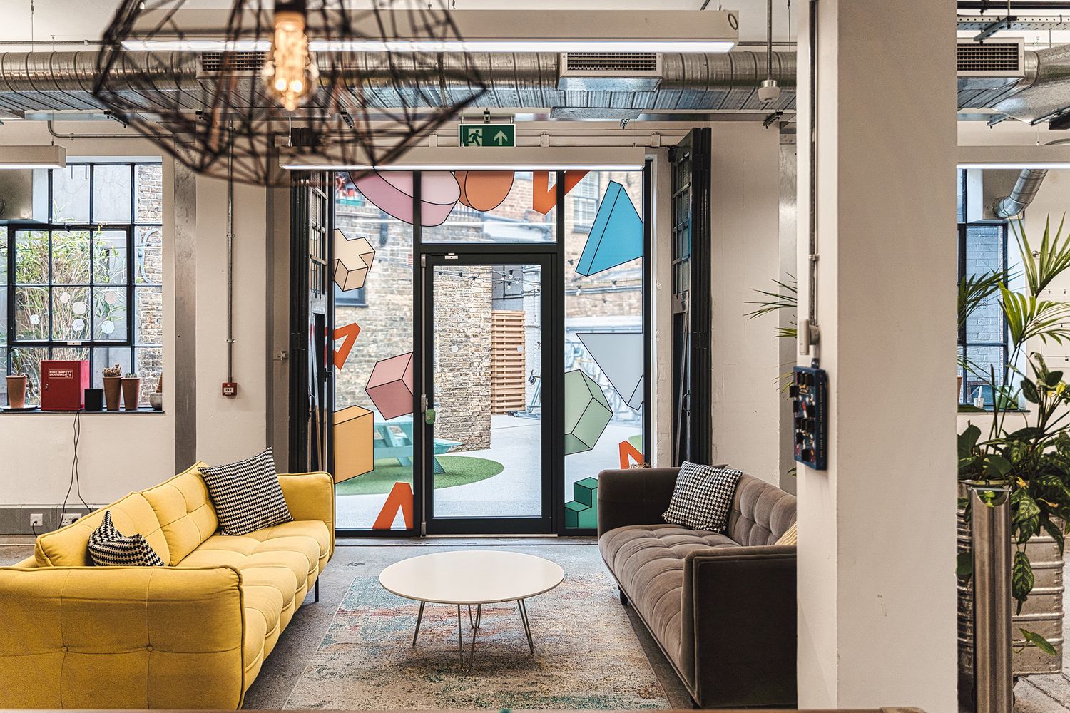
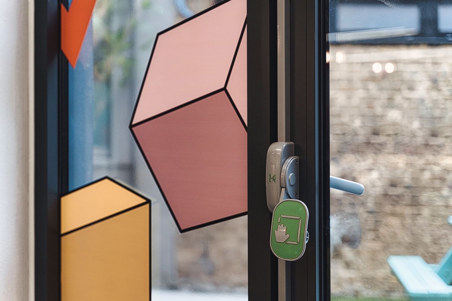
Fun vinyl manifestations featuring Attest’s 3D shapes in pastel tones outlined in black, extending the brand to doors and windows inside and out.
These graphics were also layered with privacy film for the courtyard glazing and the yoga room to create the appropriate atmosphere for each space.
The Smart Takeaway:
A single signage commission can easily grow into something much more immersive. At Attest, the entrance sign did the obvious job of visibility and welcome, but the real strength came from extending the brand’s visual language into the glazing throughout the office. The manifestations were not just decorative – they improved privacy, softened light, signposted glass for safety and gave the courtyard-facing spaces a more distinctive atmosphere. It’s a strong reminder that office signage works best when it is considered as part of the wider environment, not as a series of isolated elements.
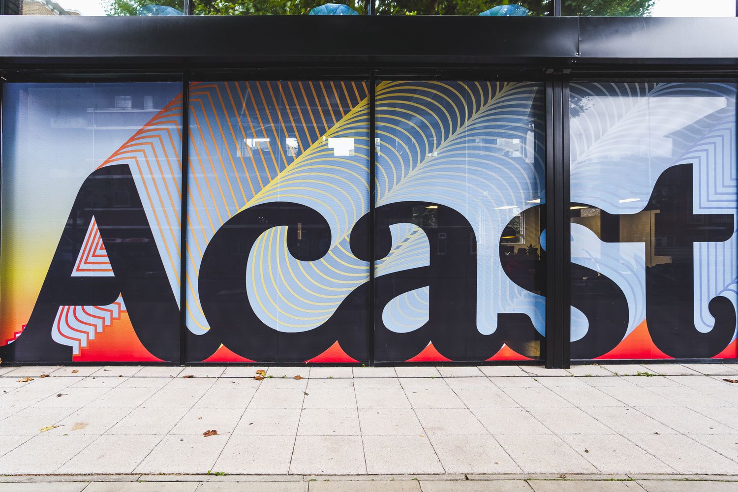
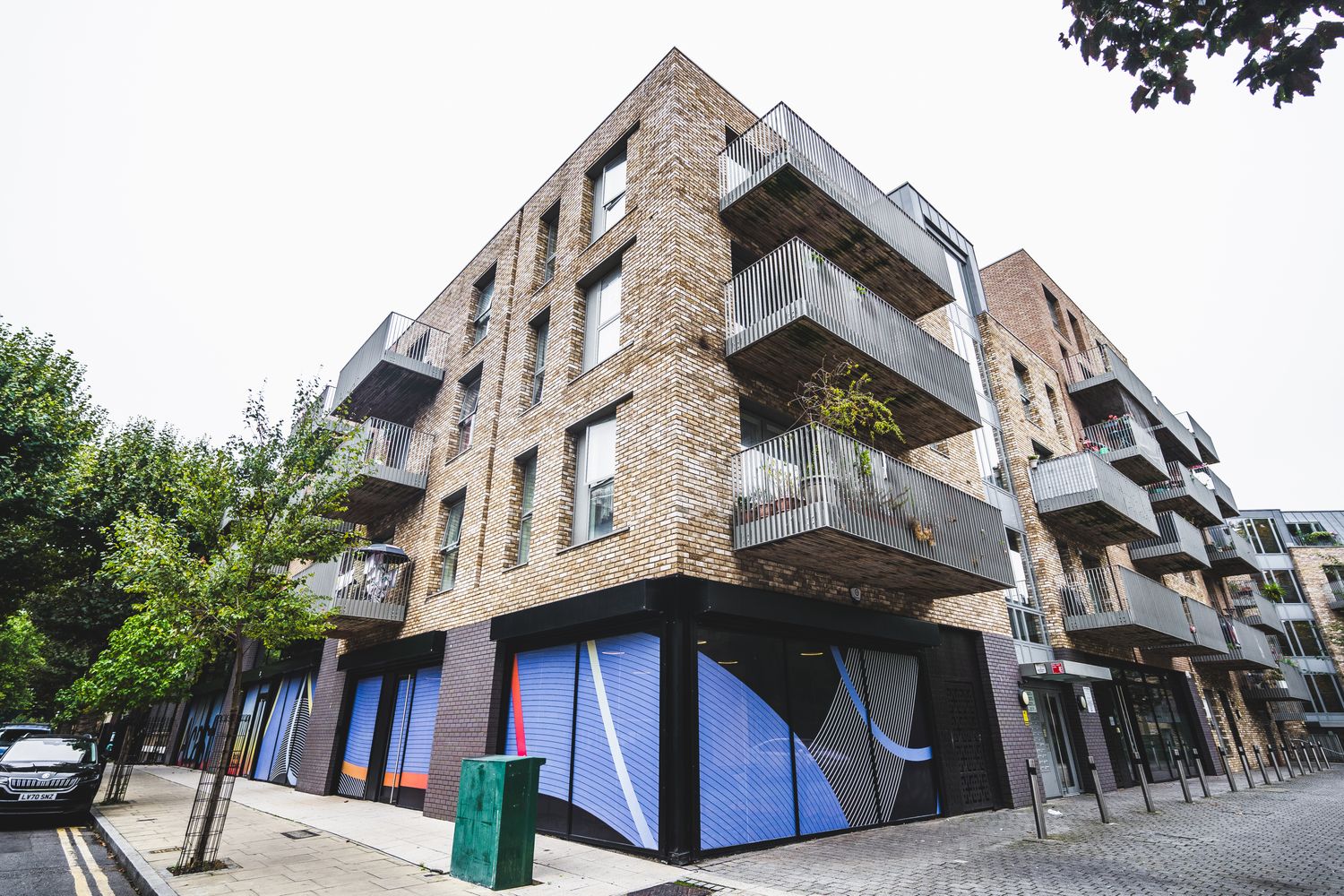
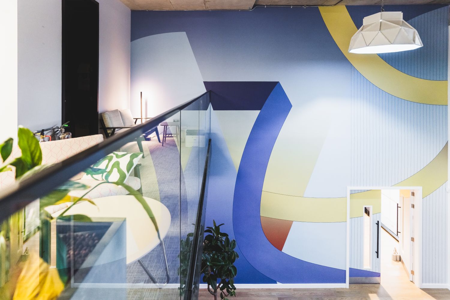
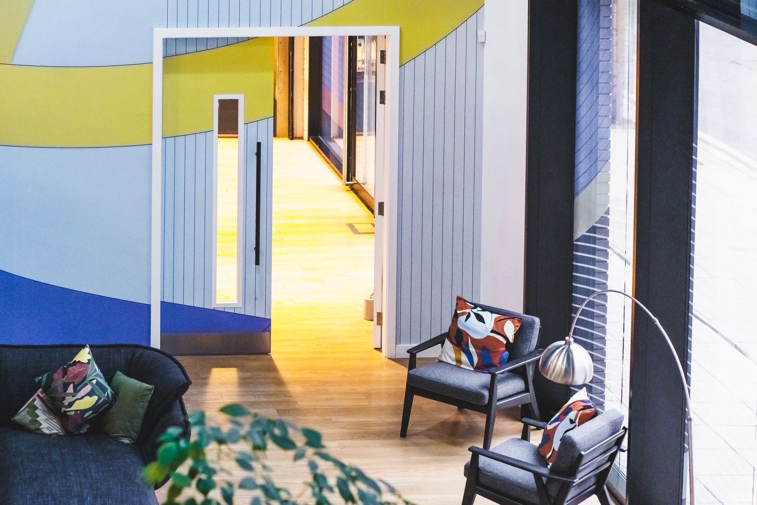
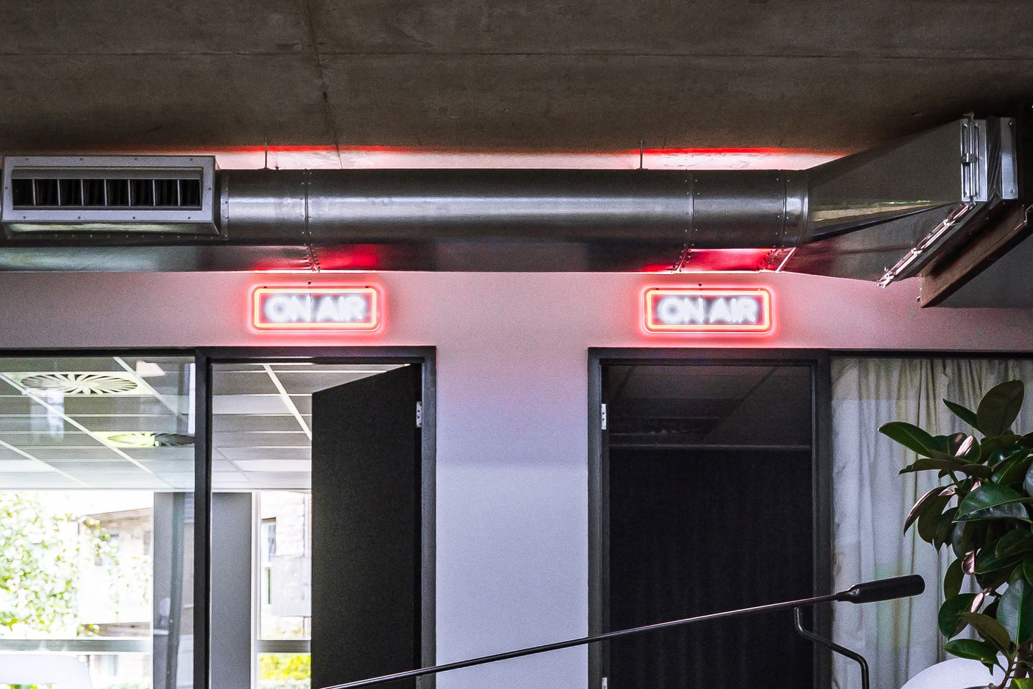
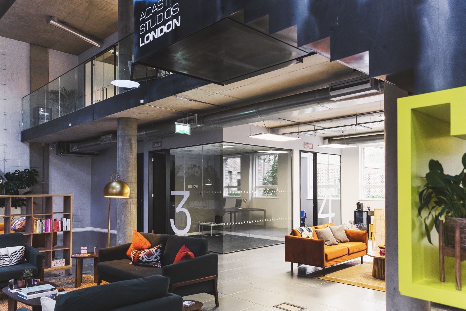
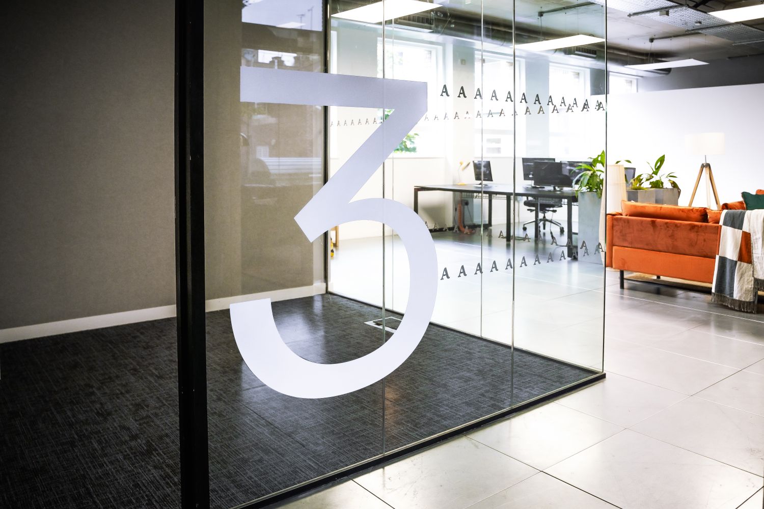
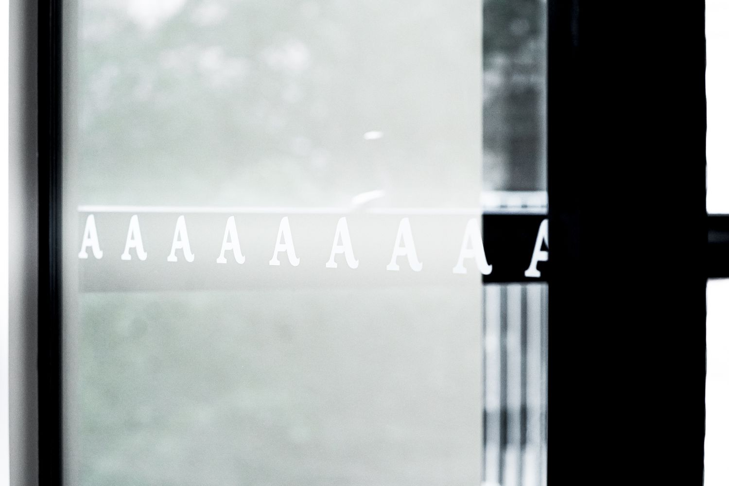
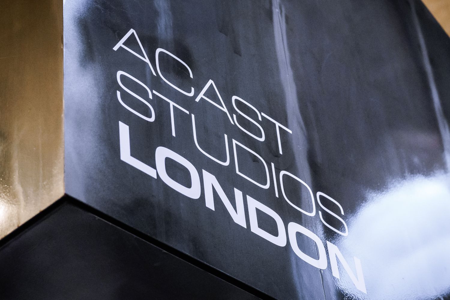
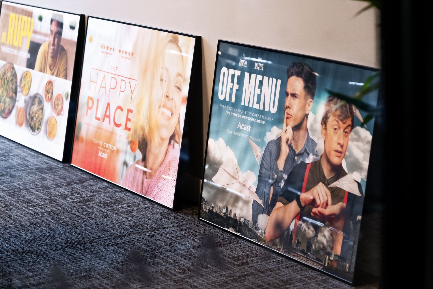
6. Acast Studios
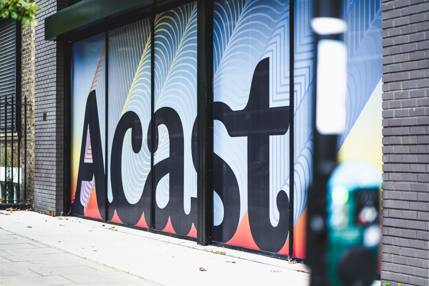
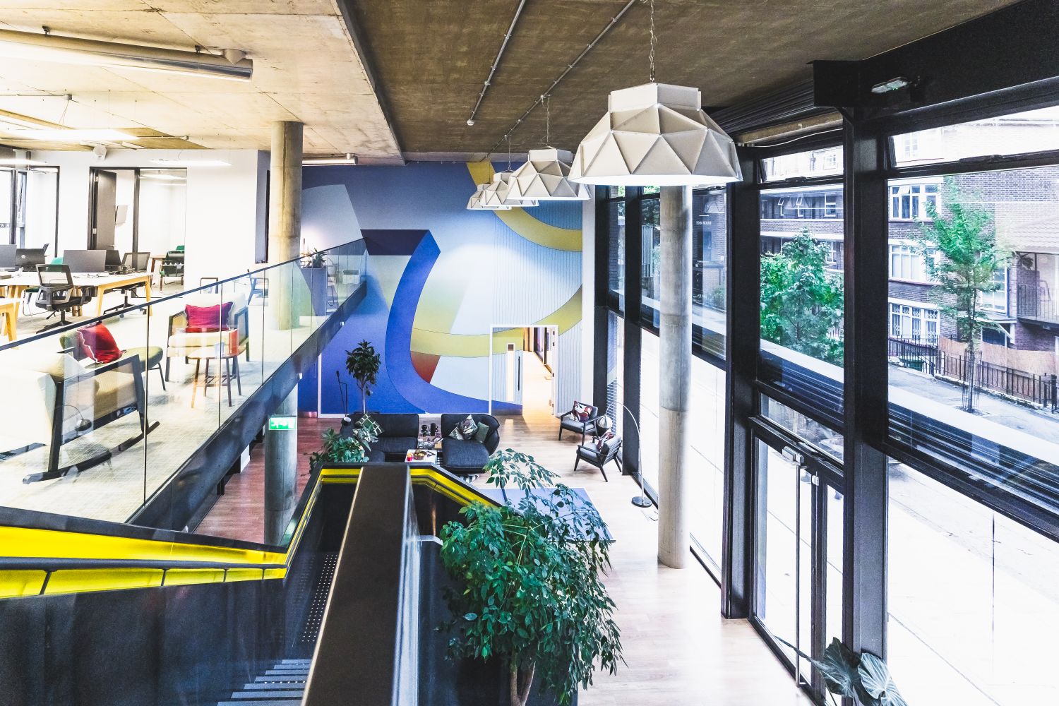
The Company:
Acast Studios, part of the global podcasting platform Acast, needed a workspace that reflected the energy, confidence and visibility of a modern media brand.
The Challenge:
To create a bold branded environment that worked at multiple scales – from the street-facing exterior to the internal studio spaces – while making extensive glazing feel visually purposeful rather than blank or overly exposed.
Our Solution:
Street-facing glazing treated with bold graphics printed on perforated vinyl to create a stronger exterior presence.
The visual language was carried through into the studio interior with large-format environmental graphics.
Reverse-cut details and glazing interventions helped unify the different parts of the space.
A major interior mural turned the studio into a truly immersive brand environment.
The Smart Takeaway:
Scale changes everything. Acast Studios shows how workplace branding can move beyond touchpoints and become part of the architecture of a space. By carrying the visual identity from the exterior through to the internal environment with the wow-factor of a large format graphic, the project creates a stronger sense of arrival, atmosphere and recognition.
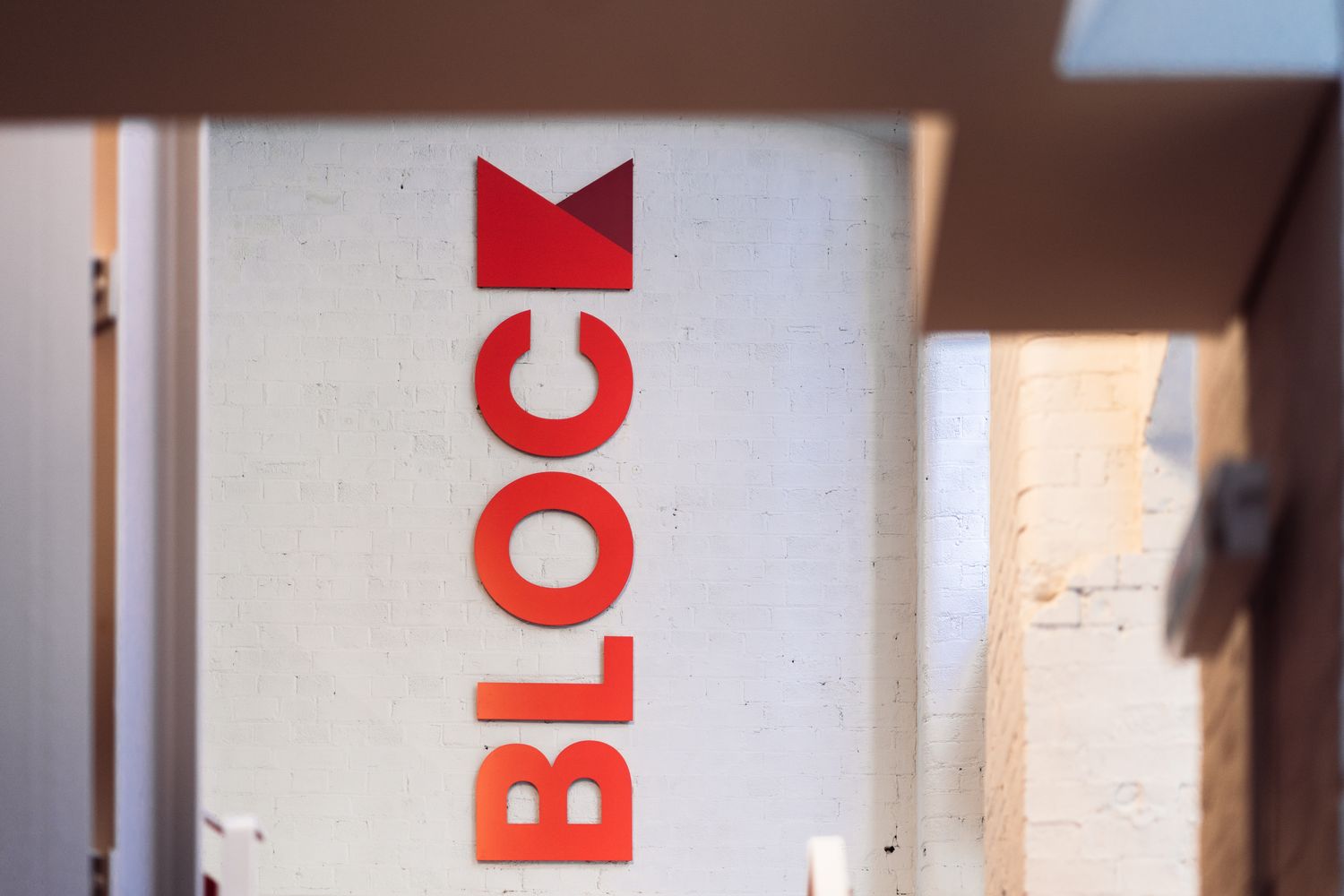
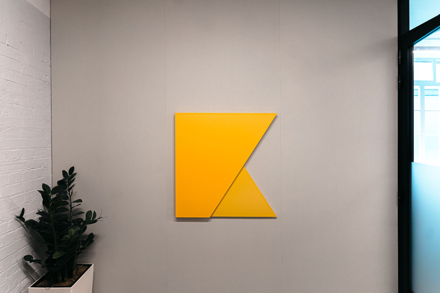
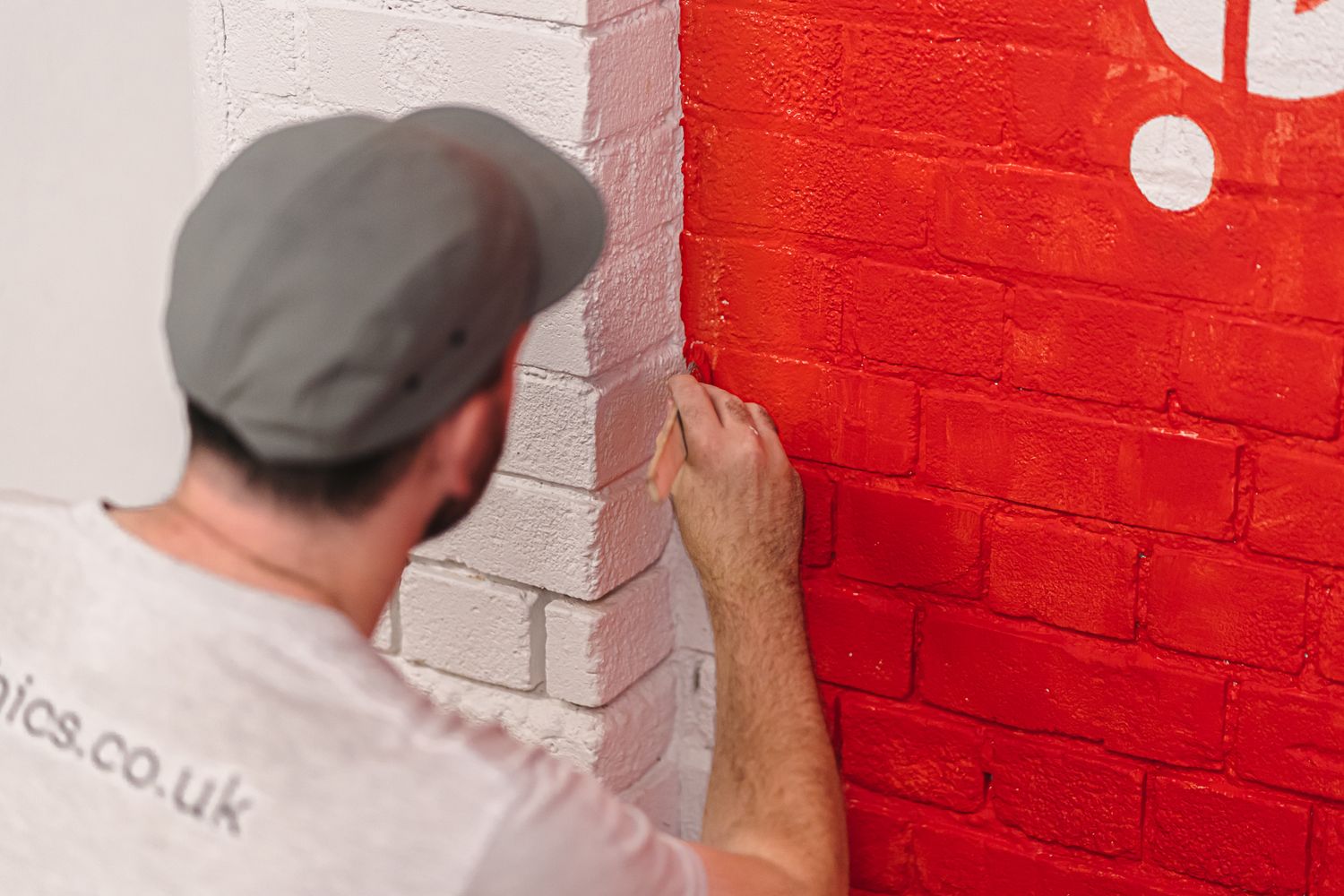
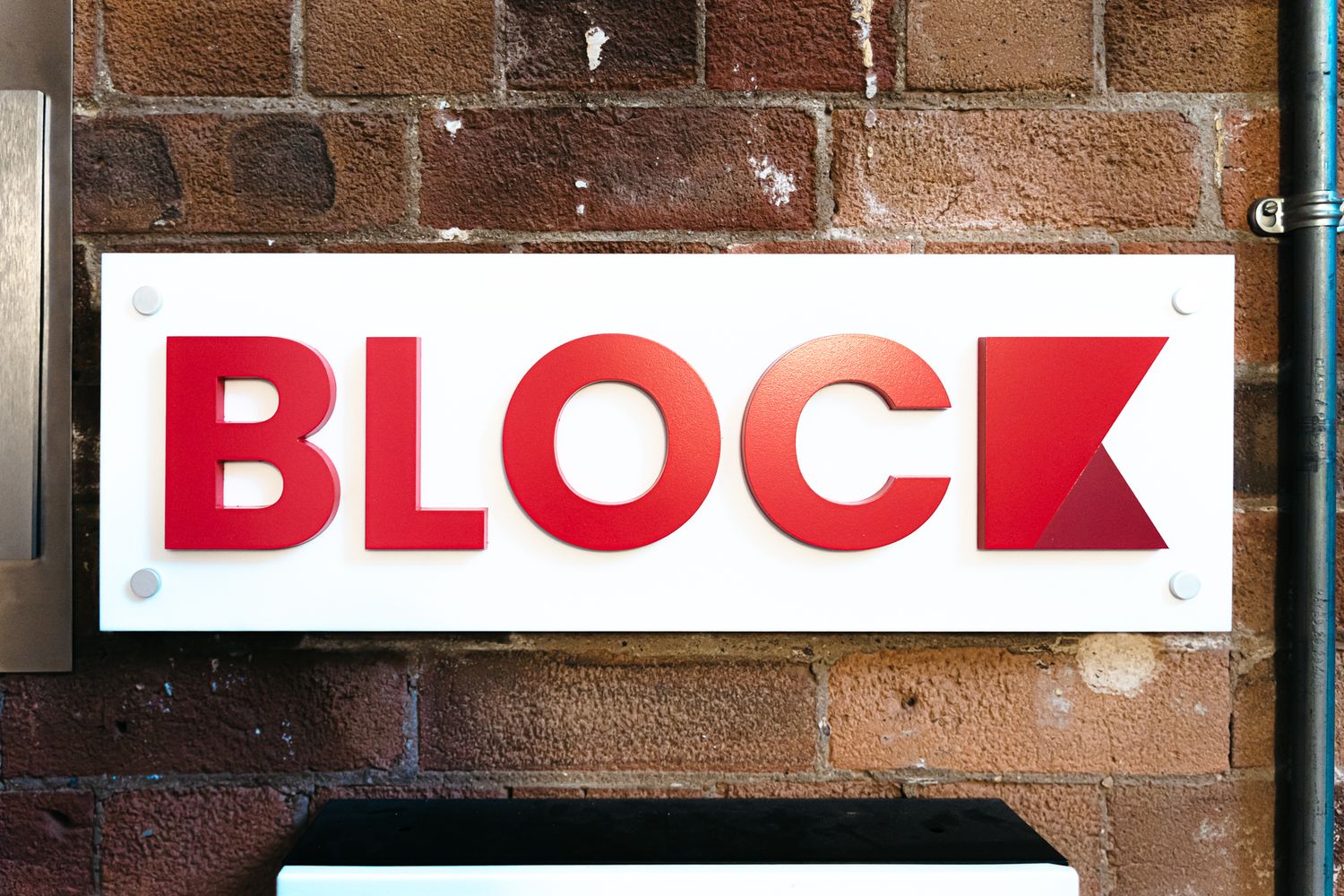
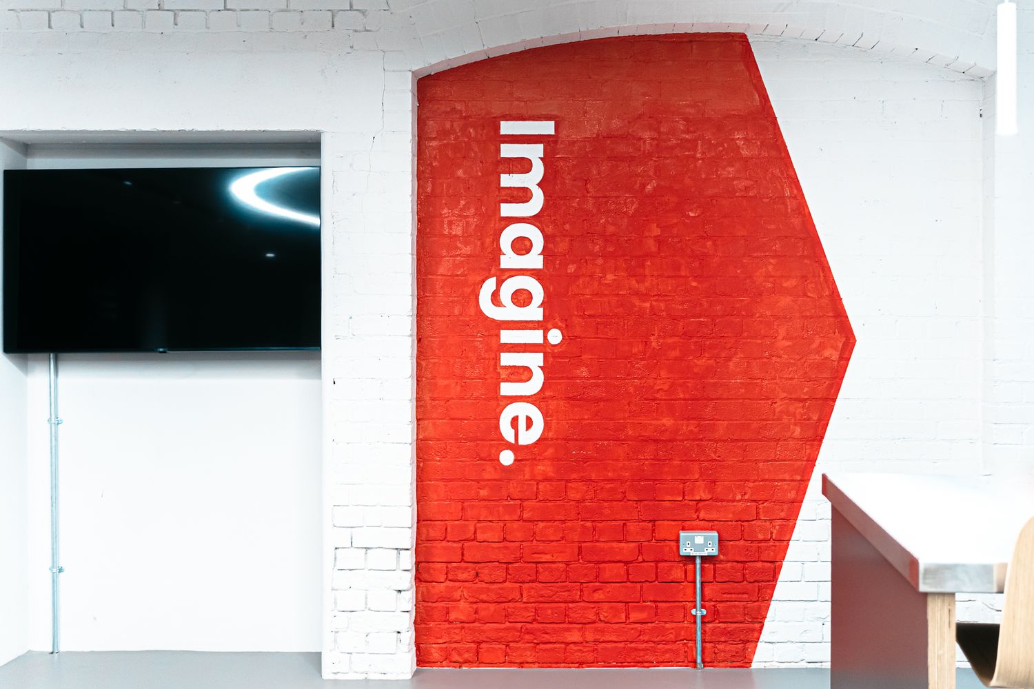
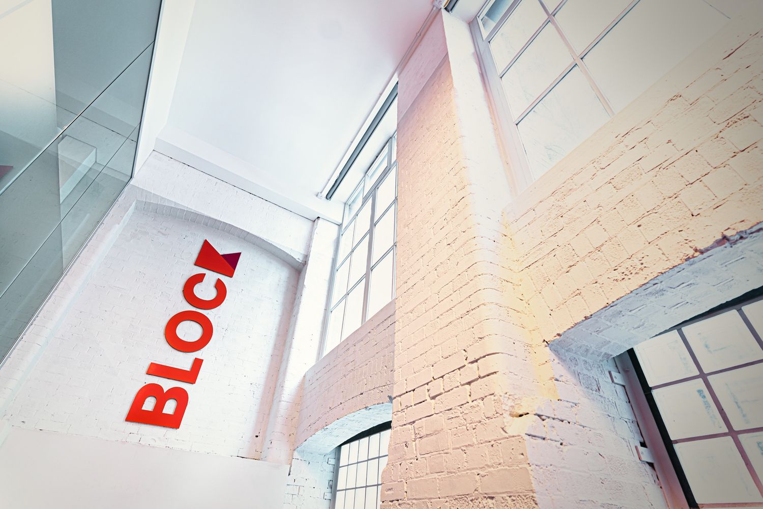
7. Block
The Company:
Block, wanted its headquarters to feel confident, contemporary and unmistakably its own, with branding that could carry across a range of spaces and materials.
The Challenge:
What began as a smaller logos-and-plaques brief grew into a wider need for a more complete workplace identity – one that could bring consistency, personality and craft into the whole environment without feeling formulaic.
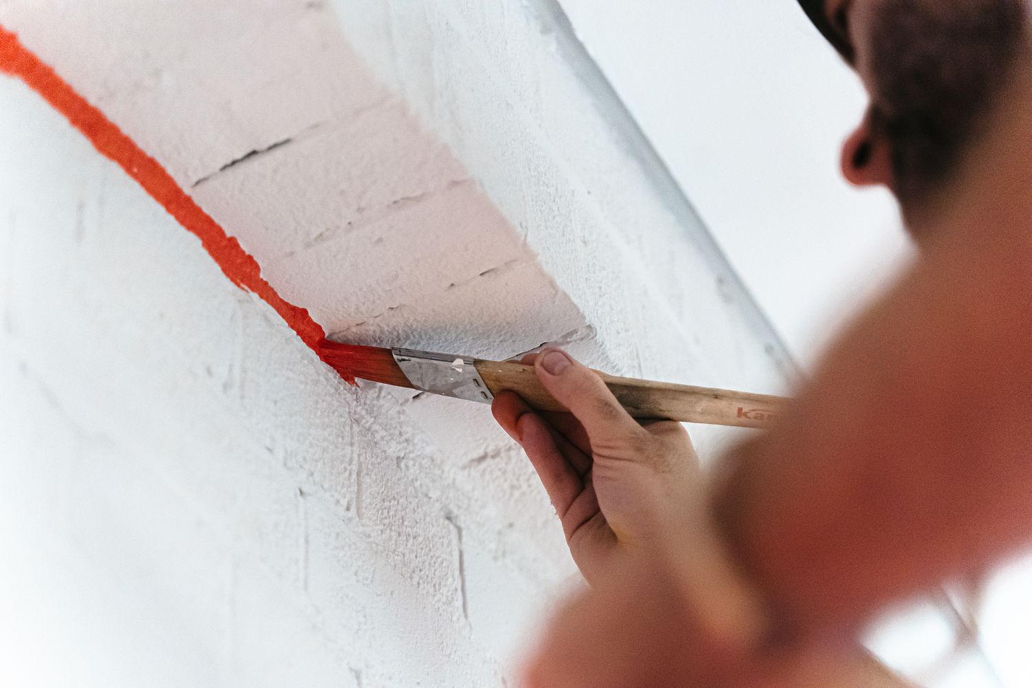
The Solution:
A broader interior branding scheme was developed from an initially narrower signage brief.
The scheme combined plaques, powder-coated aluminium lettering, MDF elements and large-scale wall vinyls.
Bespoke hand-painted signwriting added warmth, texture and a more crafted character.
Different materials and applications were layered across the office to create consistency without repetition.
The Smart Takeaway:
One of the strengths of workplace branding is that it does not have to rely on a single move repeated everywhere. At Block, the richness came from variety – different materials, different scales and different applications all working together as part of one visual system. That approach can make an office feel both more human and more designed, while also showing the depth of thought behind the brand itself. It is a strong example of how craft and consistency can coexist in the same workplace.
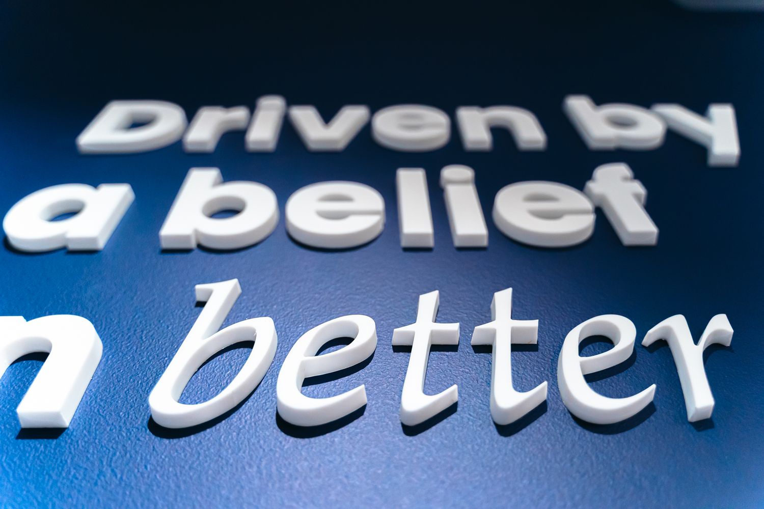
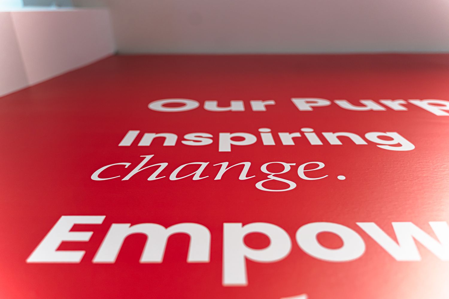
Each of these projects is different, but they all point to the same idea: the most successful workplaces are shaped with intention. Branding, signage and graphics are not just decorative extras. They influence how a space feels, how it functions and how clearly it reflects the identity of the people who use it.
For companies investing in their workplace, the goal is no longer simply to provide somewhere to sit. It is to create an environment that expresses brand, supports culture and leaves a lasting impression on employees, clients and visitors alike. Thoughtful environmental design helps turn an office into something more meaningful, memorable and alive.


