All Mapped Out How To Illustrate A Map
We decided to get our heads out of our gloveboxes and illustrate our own map. Yes, welcome to our A to Z (see what we did there?) on how to go about making one for yourself using contemporary design principles.
From a clay craft to an inked pursuit to the paperback navigation system of the 80s/90s to a computer software creation: map making has seriously changed directions over the course of thousands of years. We guide you through designing one in today’s sought after illustrated style.
Custom map illustration is where cartography meets graphic design, and becomes a lot less about accuracy and a lot more about art. Making an illustrated map involves bringing together functional elements while processing lots of stylistic decisions.
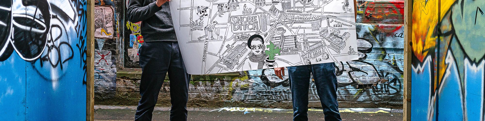
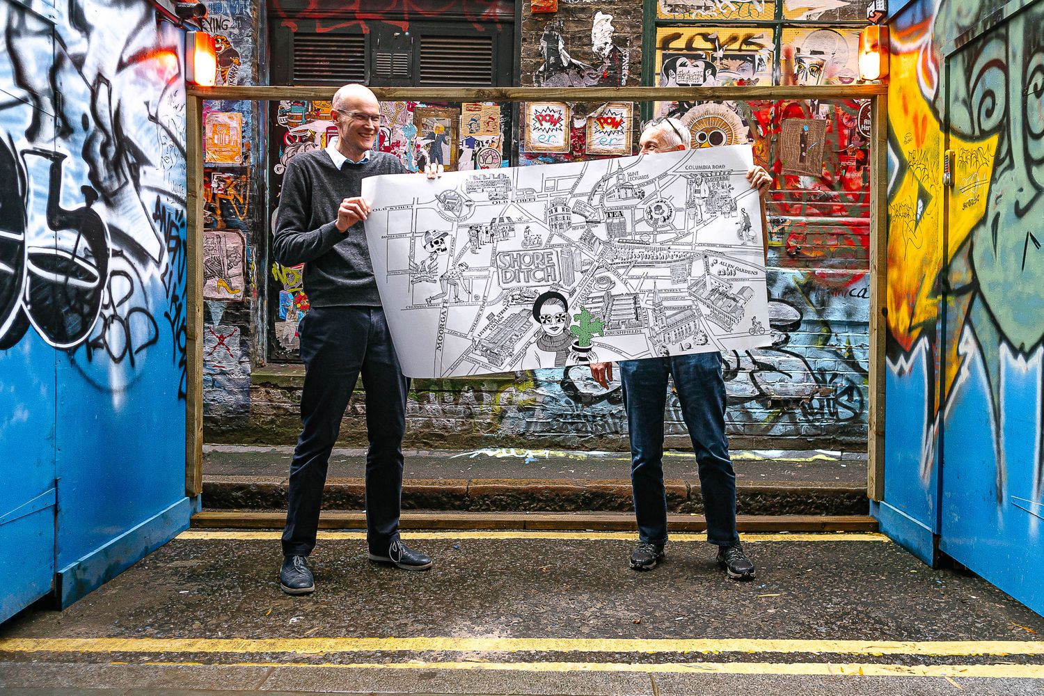
Everything you add or take away has a synergistic effect in the end, so using our project with The Estate Office as a point of reference, here we walk you through all the considerations to help get you to your creative destination…
Try and nail the aim of your custom map before setting out to build it. This will help you get an idea of how the process will pan out. Here are some example questions to ask from the get go:
How much information am I working with?
We find our clients usually have some hotspots in mind as starting points, while the surrounding areas are entrusted to us and our taste as designers.
Of course, leaving space for poetic license makes the experience exponentially more fun, however, packing out a partially blank canvas so that it’s rich with landmarks, icons and / or titles takes research and time. There are always pros and cons, but as a rule, the greater detail a brief has, the simpler it is.
Am I working to a deadline?
Drawing a map often takes much longer than anticipated. Give yourself a very comfortable cushion to; plan the map and make a rough drawing, get the go ahead for your draft, readjust any elements necessary and leave time for redraws, finalise the piece and add finishing touches such as colour. Remember to account for actual site visits and the approval stage, which is in the hands of the client.
Who is the target market?
The Estate Office asked us to create an illustrated map to brighten up the reception entry of their office, so we knew our consumers would be their main footfall – inhabitants of Shoreditch and resident businesses.
There’s a lot of pride in the neighbourhood’s historical significance and its status as a hotbed of subcultures, and being locals ourselves, we knew it would be important to reflect that sentiment in this project – we’d need to go beyond providing content with quirky aesthetics, and give attention to the little contextual details too. So essentially, pinpointing our audience early on enabled us to comprehend the true breadth of the brief.
Predetermining what you’ll include on your map is more than about estimating time and cost – clarity of thought at the start will undoubtedly translate into clarity in your mapwork. With that in mind, it’s a good idea to plan out the following:
Geography
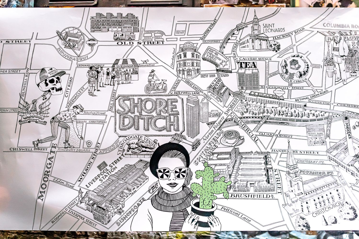
With this project, we kept The Estate Office HQs, 44-46 New Inn Yard, at the heart of the map. The outer peripheries were more of a challenge – it’s hard to distinguish where Shoreditch goes up to, but if you don’t know when to stop, your thumb is guaranteed to hurt at the end. We avoided an RSI by screen-shotting Google maps and using it to plot main roads, railways and big landmarks, giving us a general feel for the area we wanted to start with.
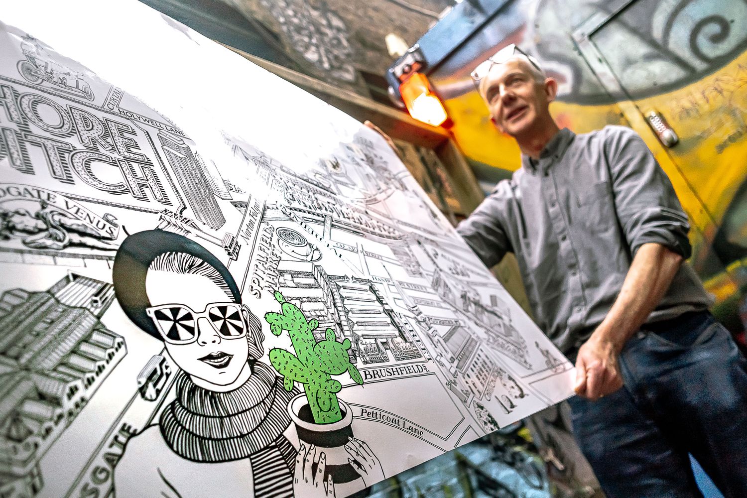
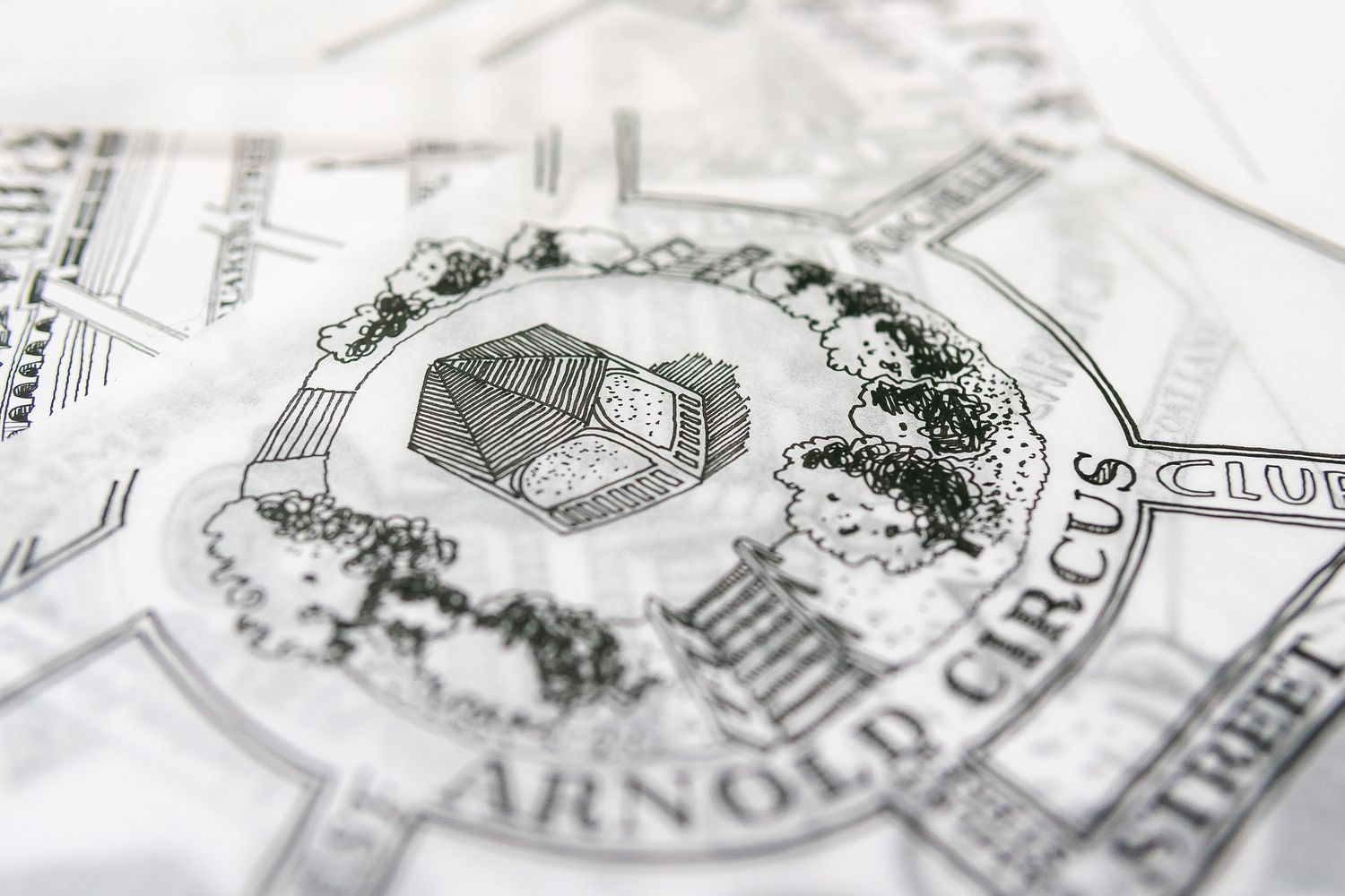
Once we had that down, we honed in on the bits of town that piqued our personal interest, without being too subjective. This included smaller roads of big significance to us and even miniature replicas of public art, like the Broadgate Venus statue, which we popped in there because of our passion for sculpture.
Adding little inside references to local popular culture was a nice way of creating something less generic.
Lastly, if you’re not familiar with the area, take a hike! Literally of course. Ground level research is a great way of adding depth to your work. We visited the marketing suite of The Stage (where the archaeological remains of Shakespeare’s Curtain Theatre were found) to get a feel for what the finished development would look like, taking pictures of the architectural model for reference – super handy for when we got to the drawing part of the process!
The beauty of illustrated maps is that they’re almost expected to be a distortion of reality. so let that imagination run wild.
Research and rebel
While we all do some digging for inspiration, be confident to elevate your work to the next level with your own design touches.
We flipped through Londonist Mapped: Hand-Drawn Maps for the Curious Londoner, and found ourselves favouring contemporary black and white maps. Colour scheme settled.
But the fad of sketching uber simplistic architecture left us needing more soul, so we added a character to our take on Shoreditch by drawing in a few choice caricatures.
Create feelings with design functions
To make our characters minimalist in nature we utilised a flat graphic design style; drawing them with fine lines and negative space, using a monotone pathway (admittedly the giant cactus lady got a pop of green – if you’re using colour, limit your palette) and not going into too much facial detail. We wanted the folk about town to reflect the melting pot, to be miscellaneous yet familiar, and entertaining but grown up.
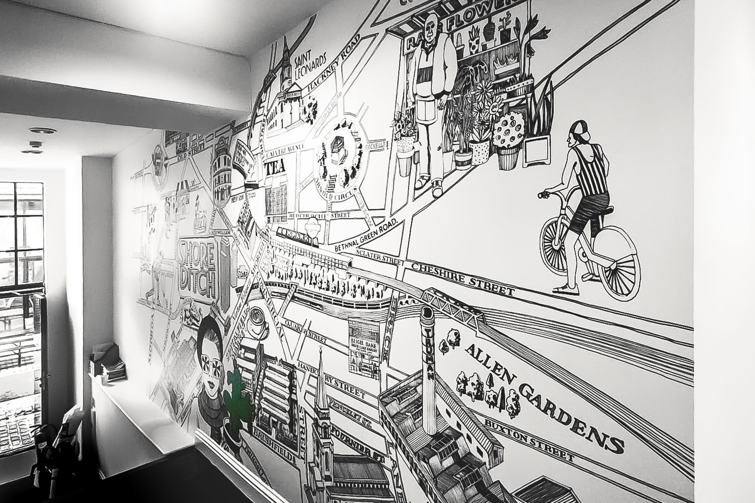
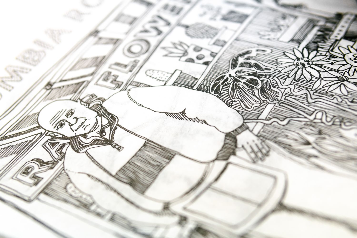
As signmakers, we naturally find typography a great way to be expressive – we used Victorian fonts for old worldy parts and geometric sans serifs for the fashion quarters, like Redchurch Street. The walls in Shoreditch wear lettering trends like no other, so we implemented handwritten titles for points of interest. Beyond graffiti, we included calligraphy, neon script and street names that look like they’ve been engraved, keeping readability at the fore.
It’s easy to get carried away when it comes to artistic license and emotion led design, so just remember to be aware of your client’s needs too. With that in mind, we were clear in our heads that our fun had to be unfussy. We balanced busier hives of activity by offsetting them with white space. Instead of block colouring in shadows, we used line work – still clean but a touch more sophisticated. As they say in the wizarding world of maps – mischief needs to be managed, or something along those lines.
Break the rules
Don’t be afraid to take liberties with proportions and perspectives. We did a lot of aerial angles, mixed and matched with street view. We thought it would be interesting for people to see the rooftops around Shoreditch, it’s a whole other world we don’t normally get access to!
There’s also a coffee cup icon as large as the establishment its next to. Though measurements may be off-kilter, when it comes to buildings, make them accurate enough to be recognisable, but not so detailed that you’re drawing them for ages, especially if you’re going to go over them in Photoshop or the likes.
On that note, as mentioned before, combine analogue and digital techniques if you want to. Create hand drawn layouts, scan them in and compose your map out of pixels from there – trace over the outlines with a pen tool, and build on top with elements such as wildlife, trees, people etc but also, flying doughnuts and badgers in suits, if they’re relevant.
Yes, last but not least – let realism meet fantasy, if it helps go beyond a utilitarian map and reveal the vibe behind a place. We decided to tell the story of big landmark buildings that live alongside the small everyday freeze frames that make Shoreditch loveable – our map is bursting with tiny details, from local characters and works of wall art, down to the area’s famous kebab shops. It roughly tells you where stuff is, but mostly it gives off the feeling that iconic concrete monuments can exist side by side with fleeting, human moments, without overshadowing them.


