The Ampersand 3D Signs & The Greatest Glyph
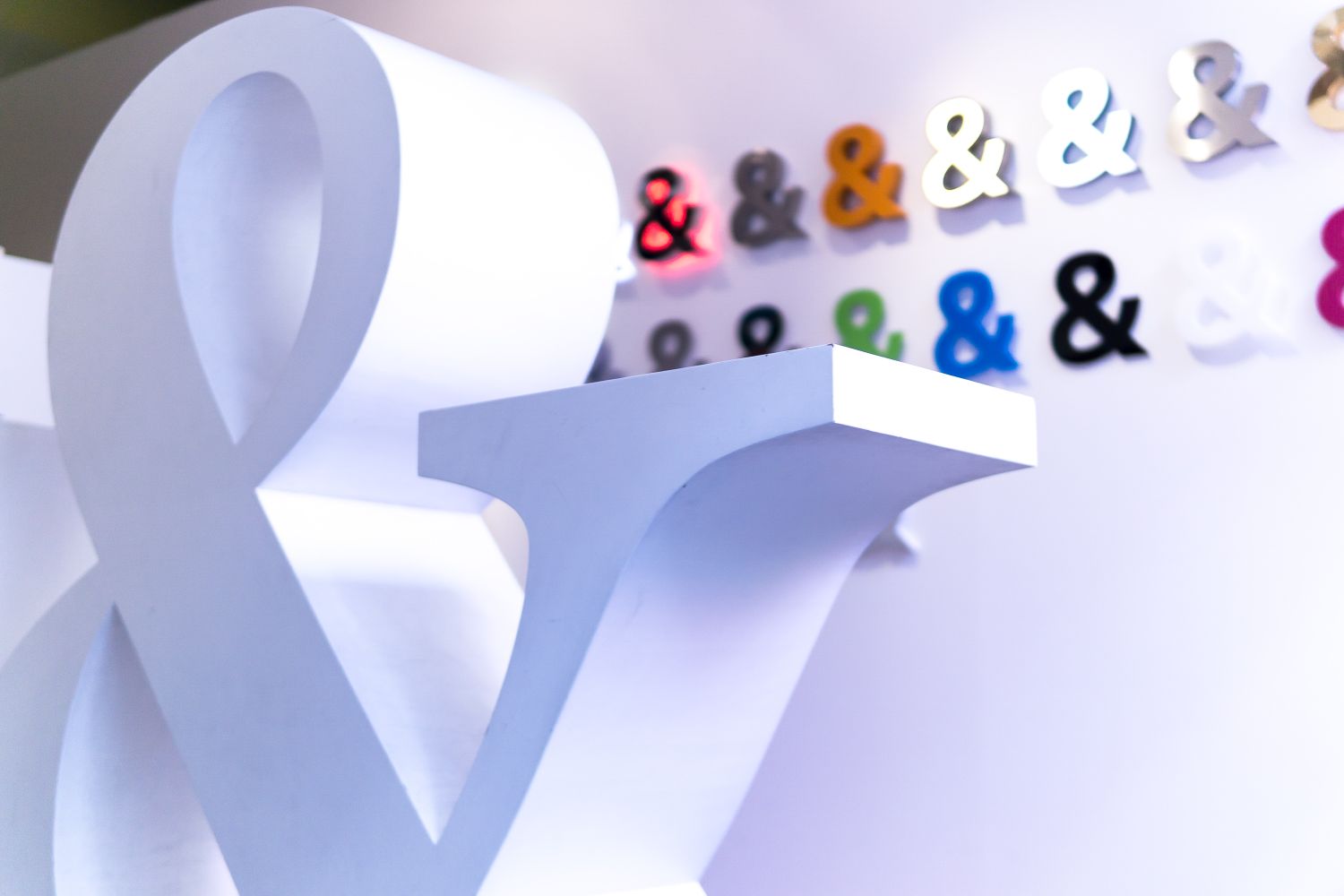
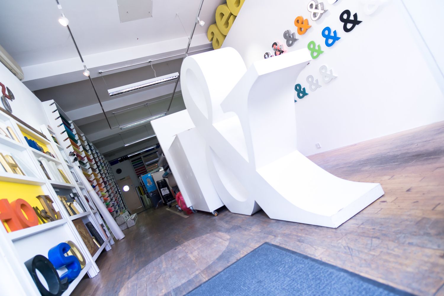
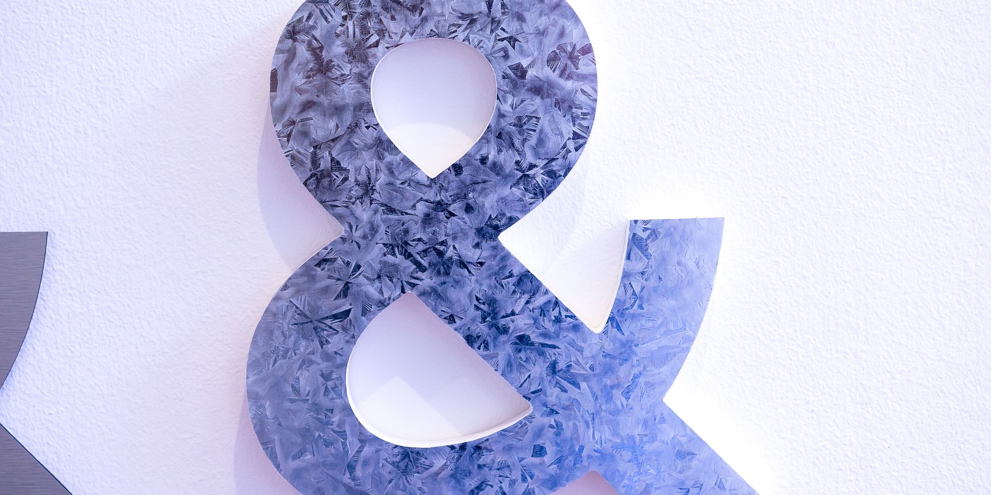
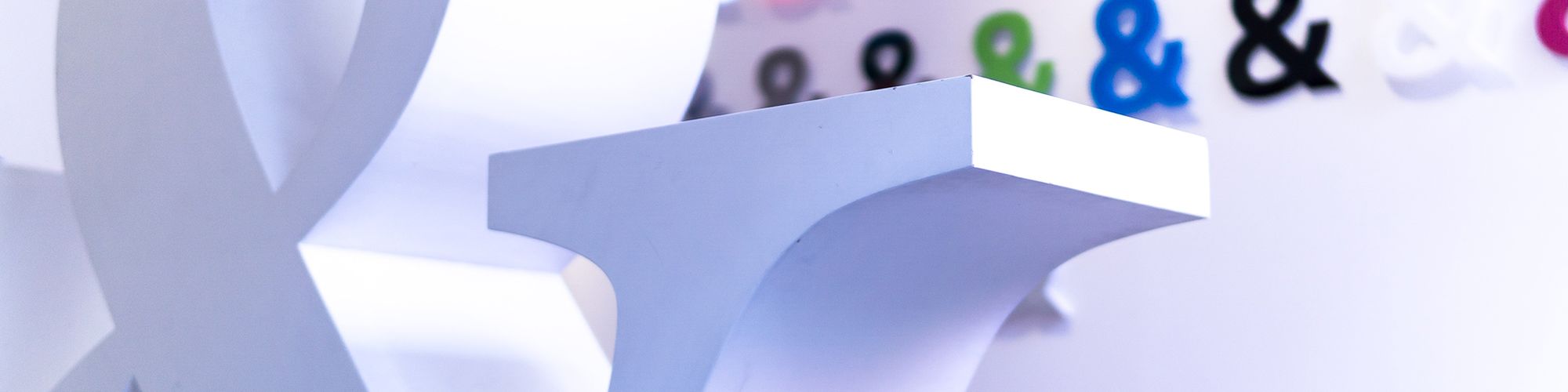
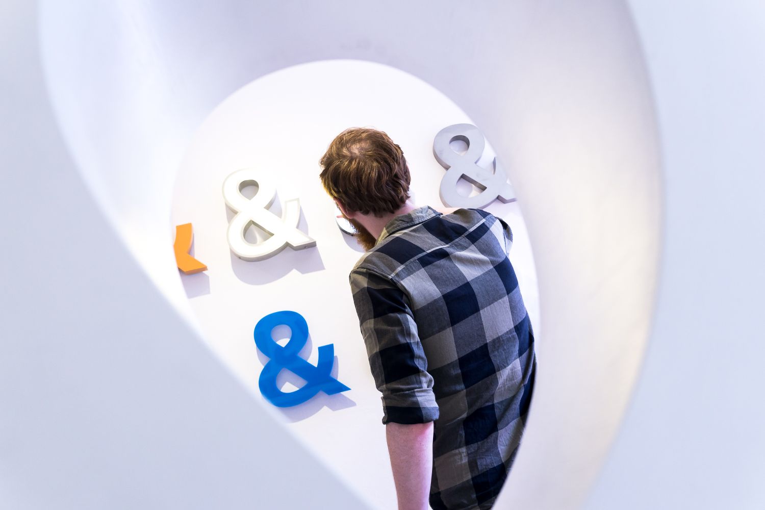
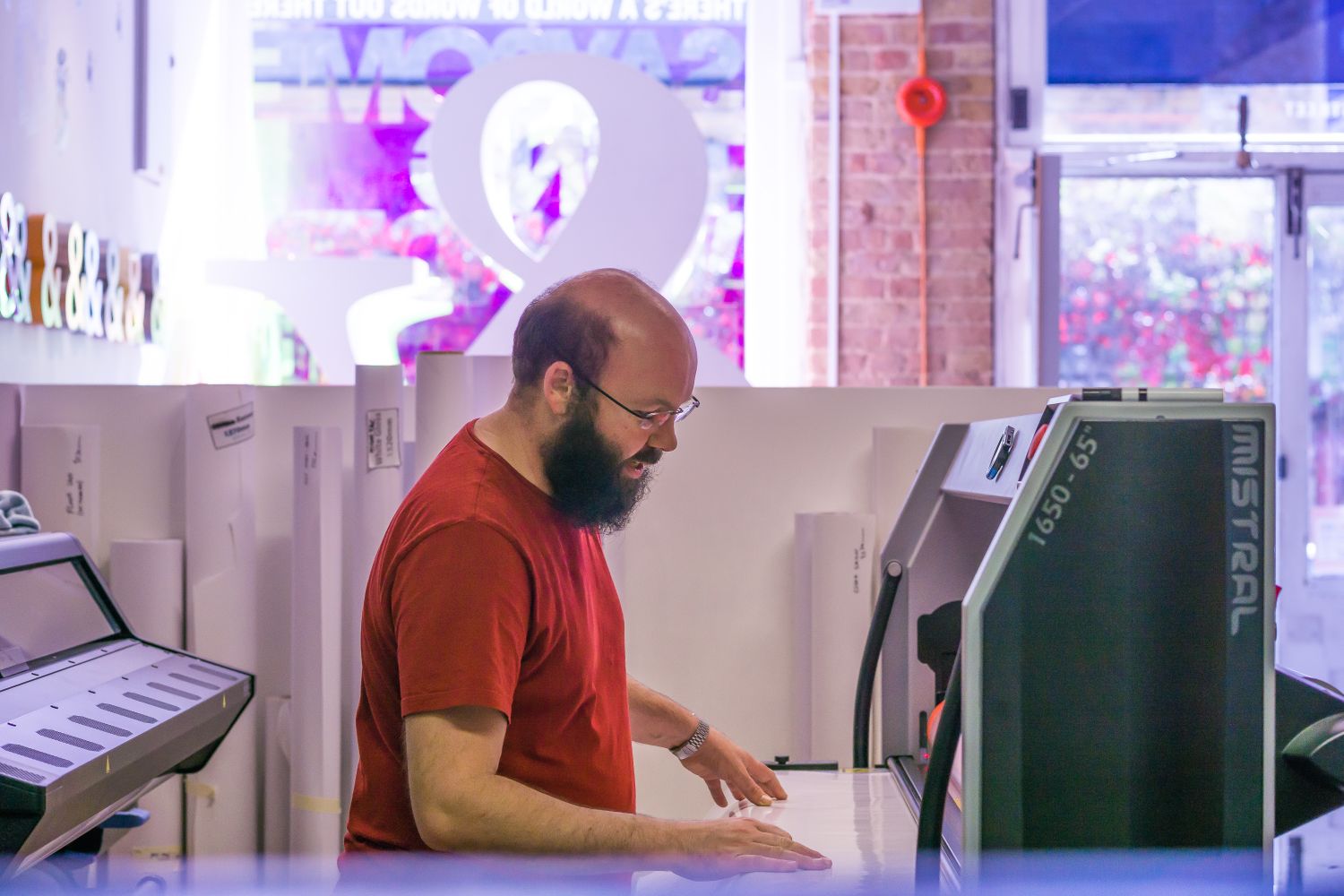
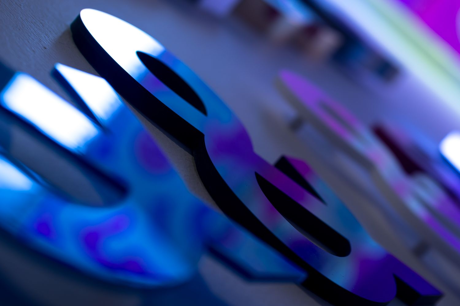
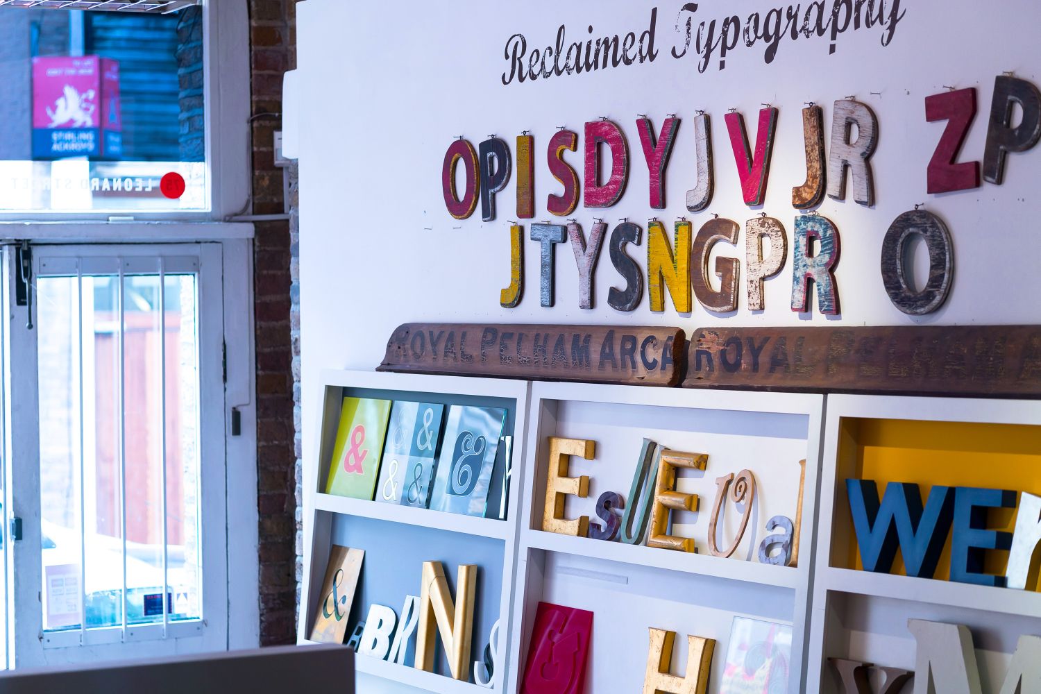
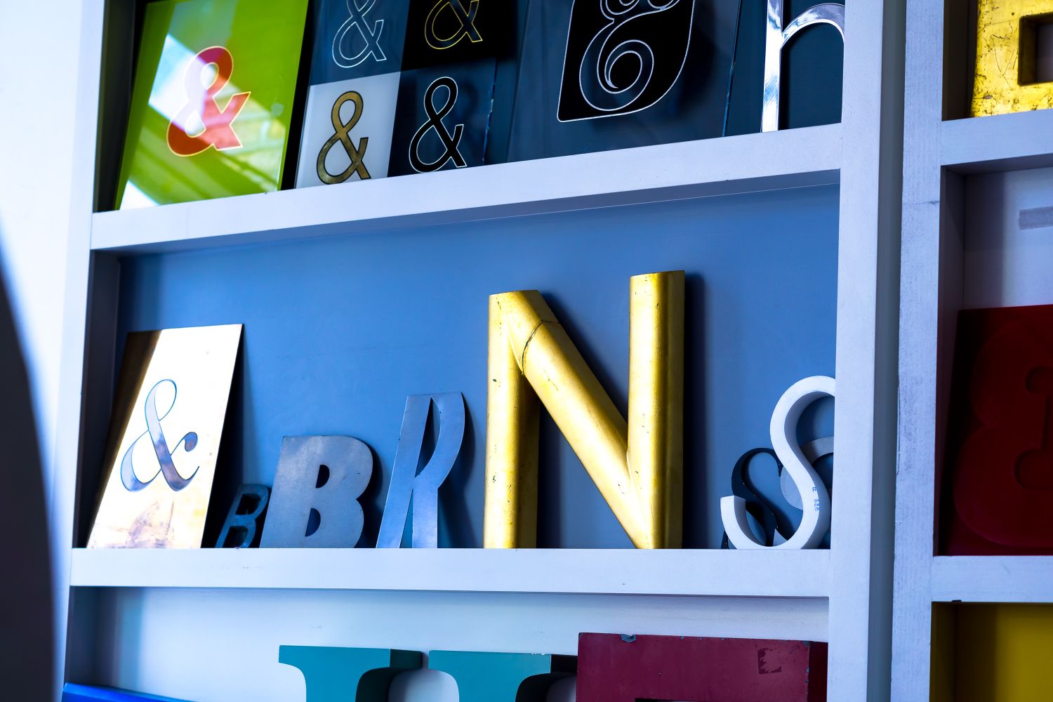
We’ve recently put up a wall of 3D signage to illustrate the variety of materials, thicknesses and finishes that 3D signs can come in, and took the opportunity to make the collection an ode to the ampersand. Like most designers, we’ve an almost indescribable love affair with the symbol….almost.
We’ve declared our love for it in our business manifesto, we even have a wooden life size ampersand in our shop foyer, and have now installed a display of 26 &s for you to come and see what’s what, but why are we so smitten? Well if you don’t know and you too want to be inspired, here’s everything you’ve missed about the greatest glyph:
Shaping et
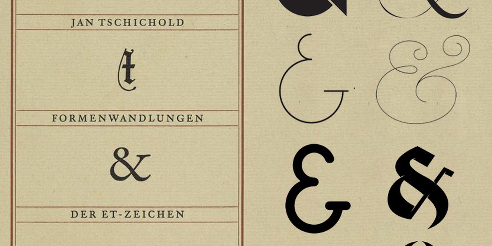
 The origin of the ampersand glyph can be traced back to Roman times, and predates the English word ‘and’ by about 1500 years or so. The symbol’s roots lie in the Latin word ‘et’, which meant and acted in the same way as our modern day ‘and’.
Back then though, Roman scribes wrote in cursive and the lazy buggers hand wrote ‘et’ as ligature – scrawling both letters into one one glyph: &. Over time, it became stylised and recognised as meaning ‘and’ in English too.
 Credit: http://www.shadycharacters.co.uk
In fact, the DNA of the ampersand can be decoded to reveal the antics of a graffiti artist, or the ancient equivalent, who carved the first ever known & into the walls of Pompeii. Thanks, anon!
Today, most of the tags are lost or illegible, but there are still a few beauties that can be made out amongst the brick and stone. Professor Brian Harvey of Kent State University compiled a few notable markings, and wow, did the Romans wear their hearts on their streets:
Atrium of the House of Pinarius
If anyone does not believe in Venus, they should gaze at my girlfriend.
Bar/Brothel of Innulus and Papilio
Weep, you girls. My penis has given you up. Now it penetrates men’s behinds. Goodbye, wondrous femininity!
Gladiator barracks
Floronius, privileged soldier of the 7th legion, was here. The women did not know of his presence. Only six women came to know, too few for such a stallion.
Alas, we digress. It doesn’t take too much squinting to deconstruct the ampersand symbol and make out the remnants of an ‘e’ and ‘t’, especially if you take a look at calligraphic scripts, but even with non italics like the traditional, contemporary or casual fonts of the world. Often the symbol is written as a half-closed eight, with the last leg curving off into the the cross of a ‘t’ – like in Trebuchet MS, Garamond Italic, Casalon Italic, or Papyrus.
Former slave of Cicero, Marcus Tiro, proposed the other symbol (⁊) as part of a shorthand system. The Tironian et is still visible in Ireland, somehow managing to gain a place in Gaelic, but it fell out of favour everywhere else, probably because it was tied to a whole other writing framework. Conversely, the ampersand gained popularity, eventually finding itself plonked on the end of the English alphabet…
Slurring and per se and
 From a 1863 book called “The Dixie Primer, For The Little Folks”
Yes, the ‘&’ is the English language’s 27th letter.
Interestingly, in the 1800s, that sentence would have been read as – Yes, the ‘and’ is the English language’s 27th letter – because the word ampersand had not yet come into being. Its etymology is a quirky one, born in the medieval period from a mondegreen – a jumble of words that is routinely misheard.
School children who were reciting the Old English alphabet would have to conclude their ABCs with the glyph &, which was considered part of the set, but it was awks as hell to say ‘ex, why, zed, and.’ It just sounds frustratingly unfinished. Back then, ‘per se’ was part of our lexicon and meant ‘by itself’, so when speaking out loud, the class would say ‘ex, why, zed, and per se and’.

The ampersand isn’t a tag on at the end of the alphabet anymore. We’re happy to see it often finds itself warmly tucked in between some famous letters and words, e.g. M&S, H&M, Johnson & Johnson, Barnes & Noble, and Ben & Jerry’s – basking in its status of union maker, the typographical equivalent of a celebrant. In fact, sometimes, in film credits, the use of & between scriptwriters or any two names indicates a closer collaboration than when ‘and’ is used.
We don’t really know why the greatest glyph is no longer part of the alphabet, but it might in some way be because of Mozart. His tune Ah vous dirai-je, Maman is the basis of Twinkle, Twinkle, Little Star as well as the ABC song British folk are all familiar with, and the time when it was copyrighted in 1835, is about the time the ampersand dropped off the end of our ABCs.
On & on
Today, the ampersand makes its home perched just above the 7 on our keyboards. It’s part of a line up of punctuation marks and abstract characters, and it’s a character alright – remaining the most intriguing of them all to type designers, perhaps because of its significant function when it comes to naming business partnerships, or perhaps because it’s got some killer curves.
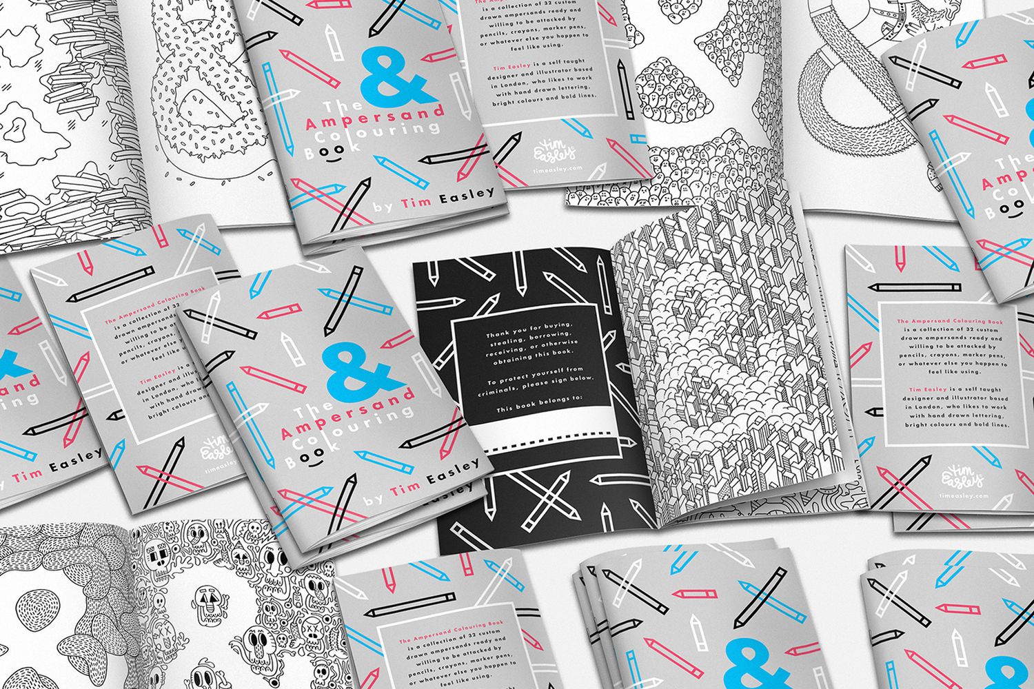
It makes a living as the muse of adult colouring books like Tim Easley’s illustrative wonder, an ampersand-a-day Tumblr blog, and some 400 typeface designers, spanning Argentina to Australia. They joined forces to create the ‘Coming Together’ font – made up entirely of ampersand glyphs, with any proceeds from sales donated to Doctors Without Borders for victims of the Haiti earthquake. The font is surprisingly non repetitive, showcasing the endless versatility of the ampersand, in a way no other letter or glyph could be.

 Jonathan Hoefler, influential typeface designer (think Rolling Stones, Harper’s Bazaar, NYT Magazine, Sports Illustrated, Esquire the Solomon R. Guggenheim Museum, or just take a peek at the renowned serif font of your very own Apple Mac’s operating system) is obsessed with the ampersand. He admits to drawing it endlessly and spoke of its spirit to Wired in 2014. “Even the most conservative typefaces can give sanctuary to a whimsical ampersand or two,” he says, perfectly capturing why it is so revered: “It’s always an opportunity for adventure.”
Regardless of how it’s implemented, the ampersand is normally in the middle of all the action, frequently part of a display type – used largely in headlines, signage, and advertisements. For some, like renowned type founder Erik Spiekermann, its aesthetic is clinical and mathematical. “I like designing them because I like designing figures, and the ampersand is like an 8 with bits added.” To his design sentiments, it represents order – it’s not an ornate logo in itself, it is still part of a set – an honorary member of the alphabet.
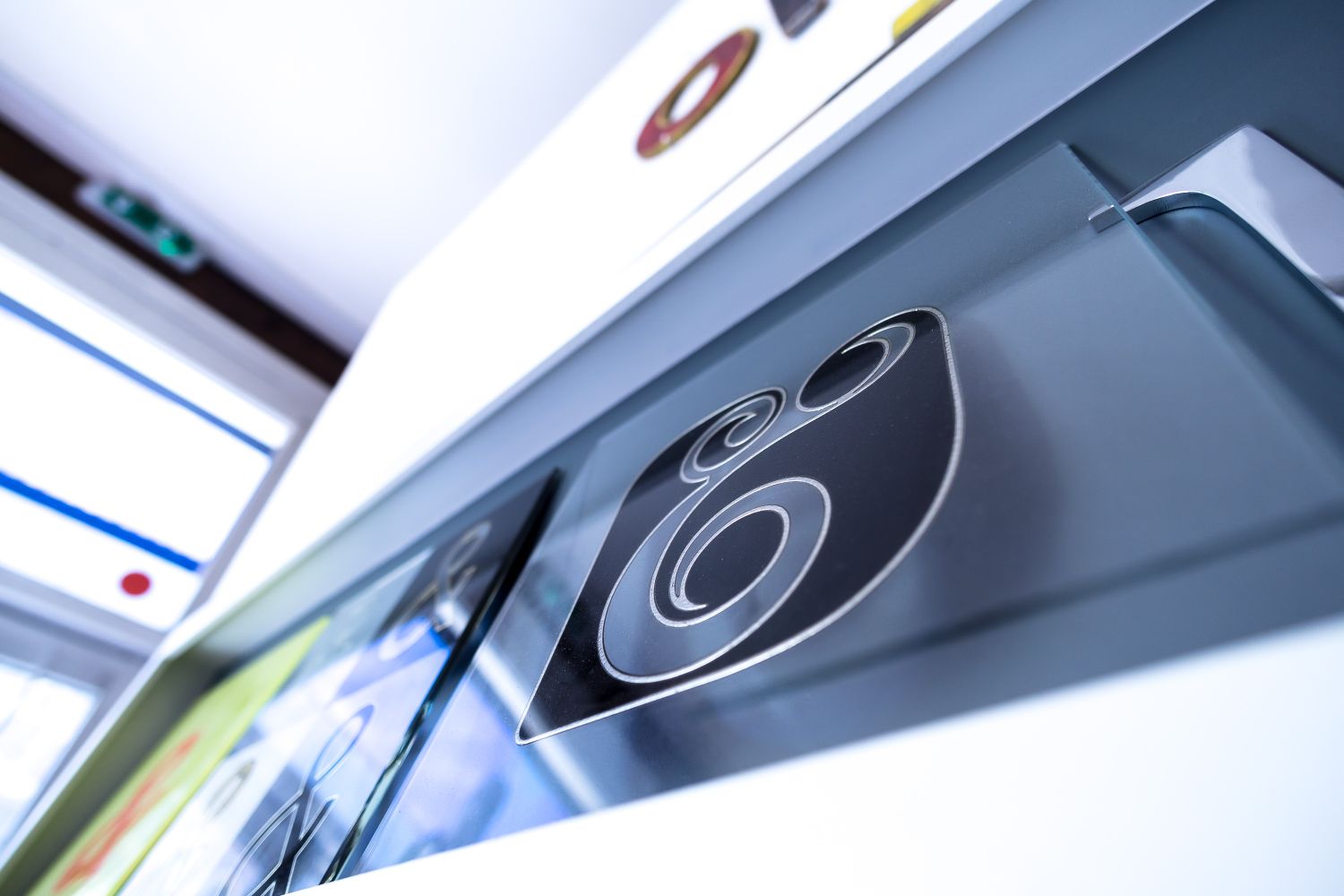
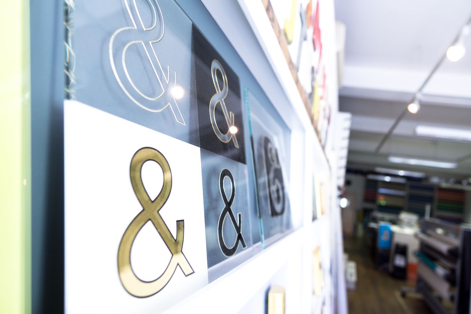
Our 3D collection takes from him, a repetition of &s from the understated Corbel Bold font, lit up and backset in a multitude of ways, showing you how on top of all its other super powers, the greatest glyph can speak for itself. Check out our 3D ampersands here.