Time to perform

THE LOWDOWN

Our relationship with Sadler’s Wells goes back to some very old metal signage that was once the face of this international dance venue. Unfortunately, the middles of the letters kept falling out, and so the organisation asked us to come in, replace the counters and piece it all back together again.

Admittedly we took this opportunity to step up and steal the spotlight ourselves! And we were thrilled when this little job led to Roger, the building manager (originally responsible for stage lighting design), asking us to redo the Front of House wayfinding system of Sadler’s Wells.

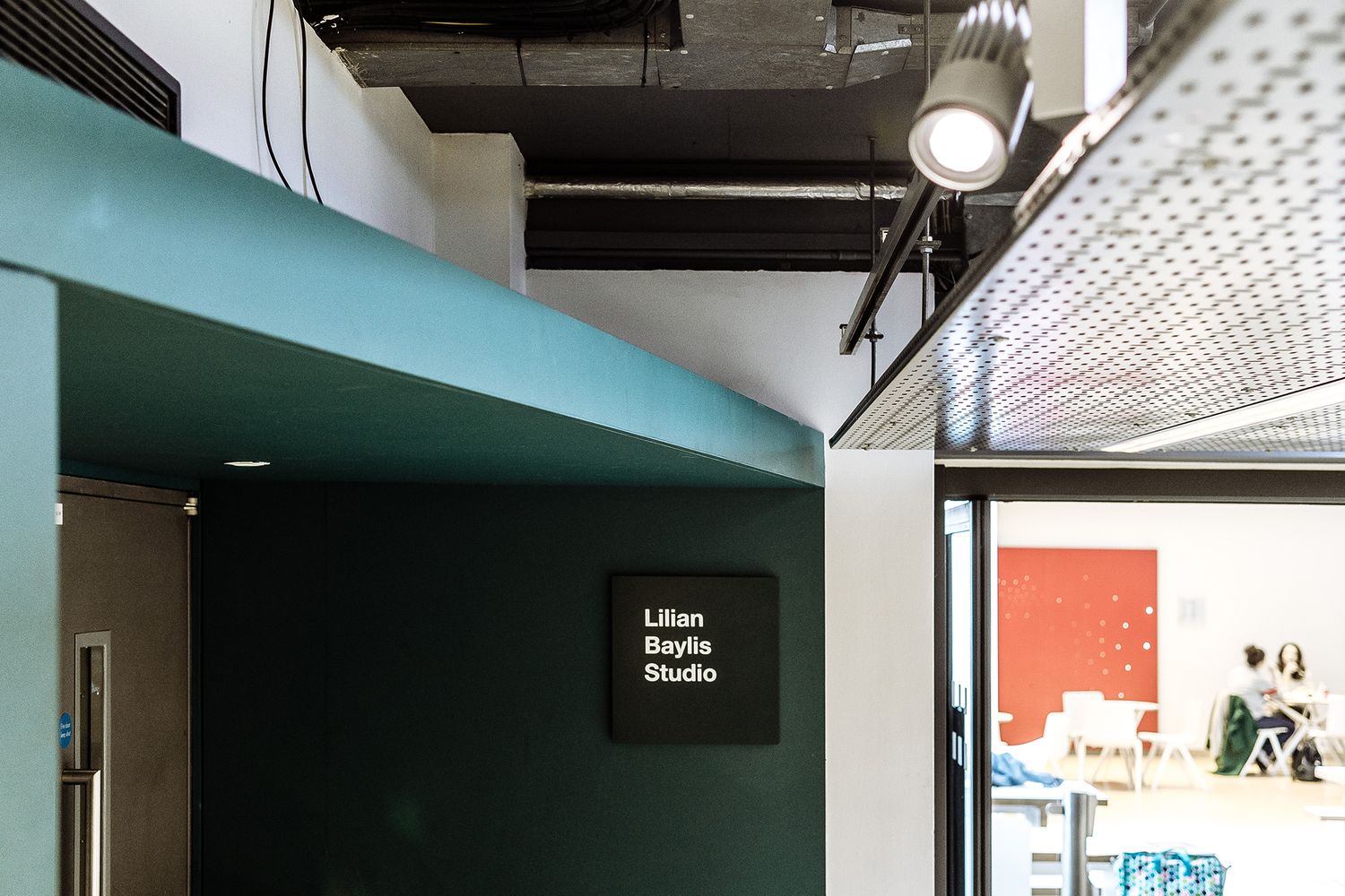
The building’s old installations were pieces of green Perspex trying to imitate glass, which gave a really dated impression and were difficult to read. So with the space closed for about a month at the end of summer and just before the Christmas season set off, we grabbed the moment to give the interior signage a refresh and improve visibility! What a privilege.

2 grey and white metal signs showing a ban on photos depicting a camera and a mobile phone.
Grey and white signs showing a camera and a mobile phone crossed over.
A square red sign showing all the amenities around the theatre.
A long mat and shiny black theatre wayfinding sign
A small grey and white metal sign showing a women.
Red metal theatre wayfinding sign on a white wall.
A visitor consulting a black and grey wayfinding board located on a pillar.
A black sign behind the bar.

THE SPECS

It’s never as easy as just sprucing up the walls, is it? And we don’t want it to be! We loved this project because rather than a simple swap out, we got involved with designing and reworking Sadler’s Wells’ wayfinding system.

The process for providing the perfect solution involved getting our jazz hands on the floor plans and figuring out the logic of the building first. It was then a matter of face to face interaction with the client, with us all walking around the historic venue, making suggestions, and deciding where we would put the signage. By putting ourselves into the shoes of a ticket holding guest, it became clear to us that the main obstacle for Sadler’s Wells was visibility.

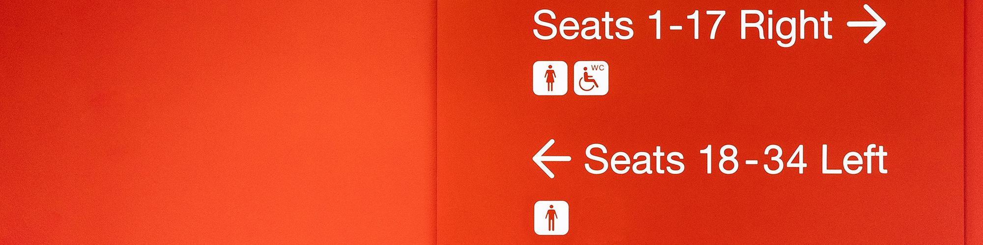
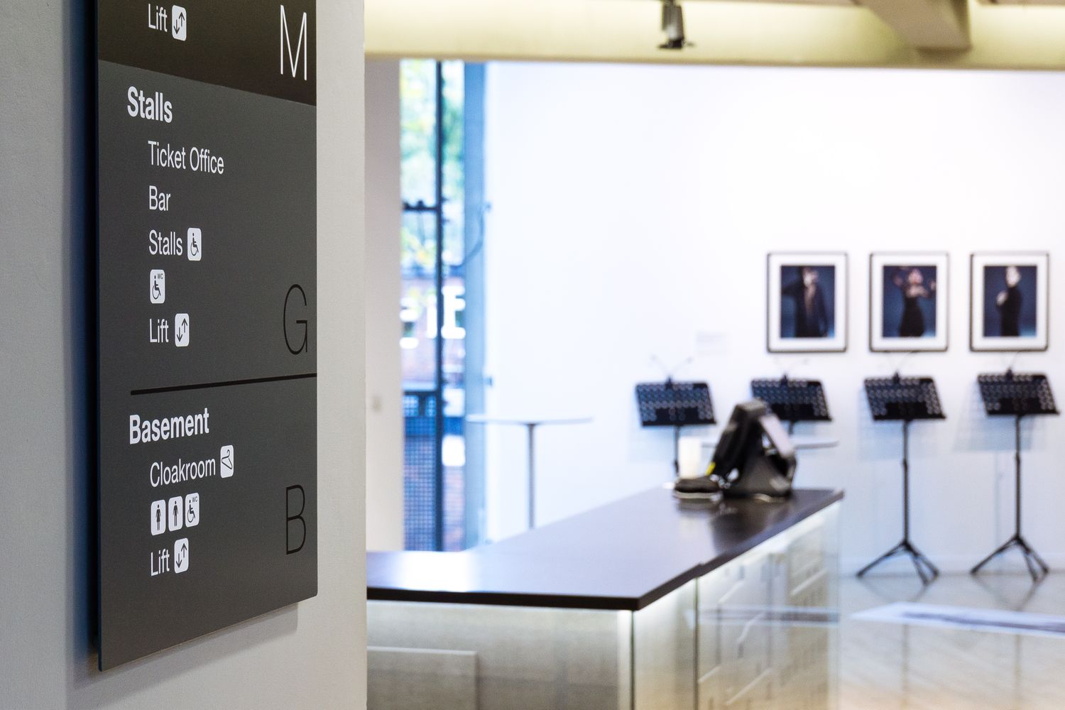
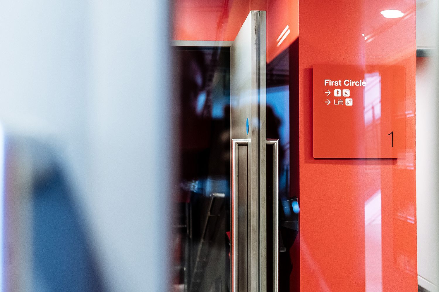
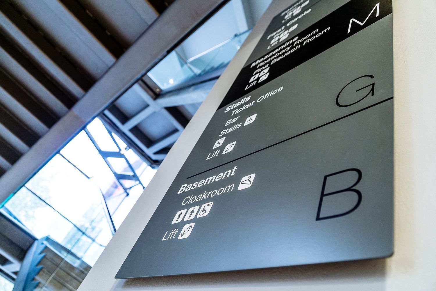
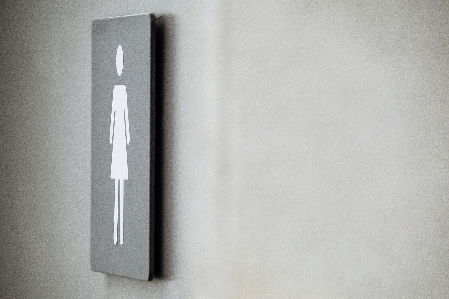
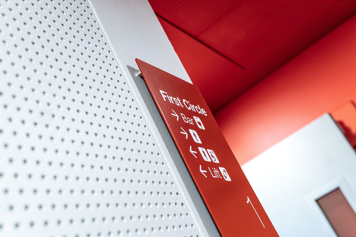
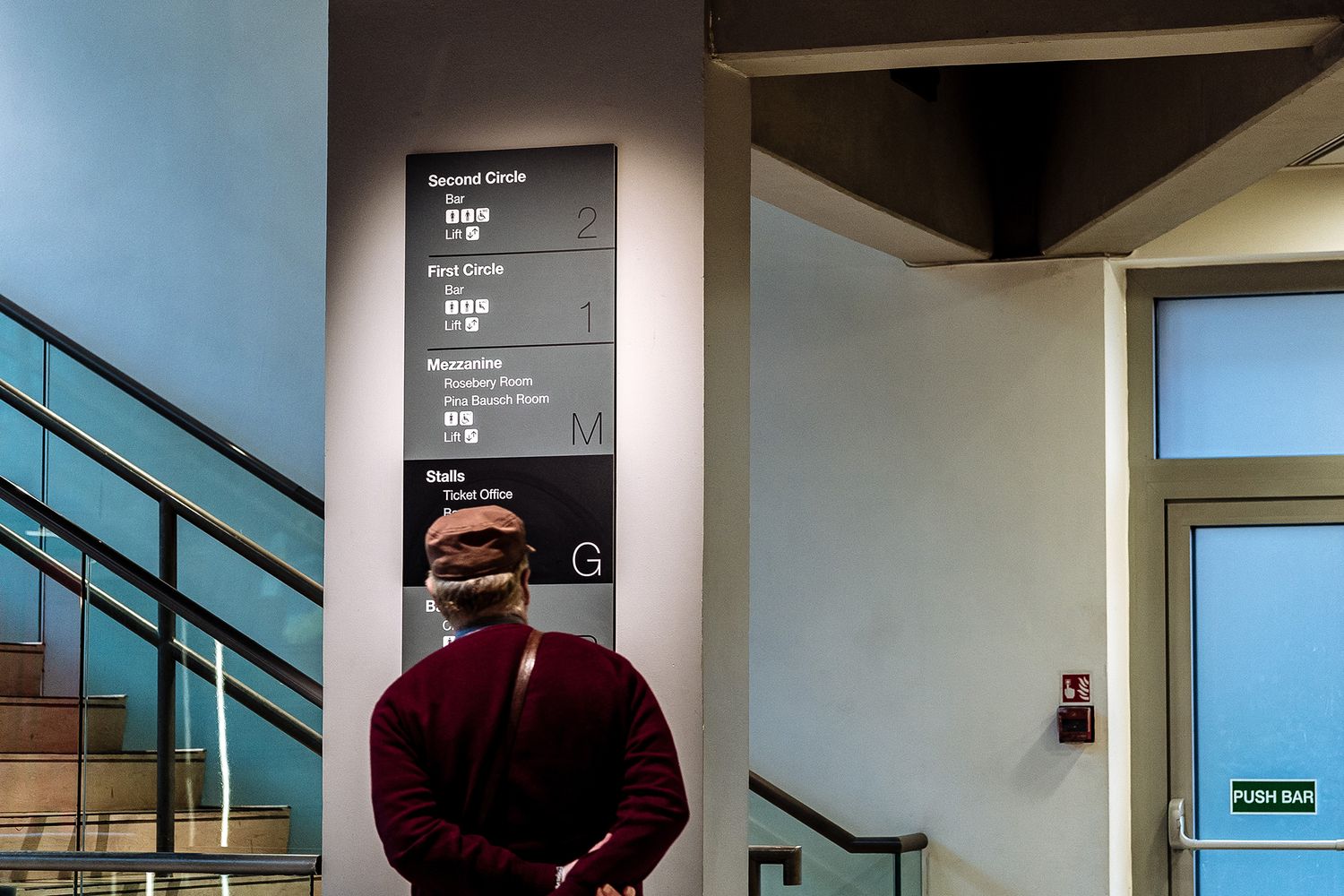
At the start of their journey, attendees will need to know clearly where the box office is, as well as the location of their stalls and their seat number. In between the shows there tends to be a lot of hanging around, so wayfinding has got to be immediately obvious for things to run smoothly, with people being directed to the balconies and mezzanines where they can go and have their gin and tonics and glasses of wine. Of course good and merciful signage always addresses the typical thing of people coming out of the shows and looking eagerly for the loos! Finally, they’ll want the cloakrooms and right at the end, to exit – that’s where the lift directory comes in.

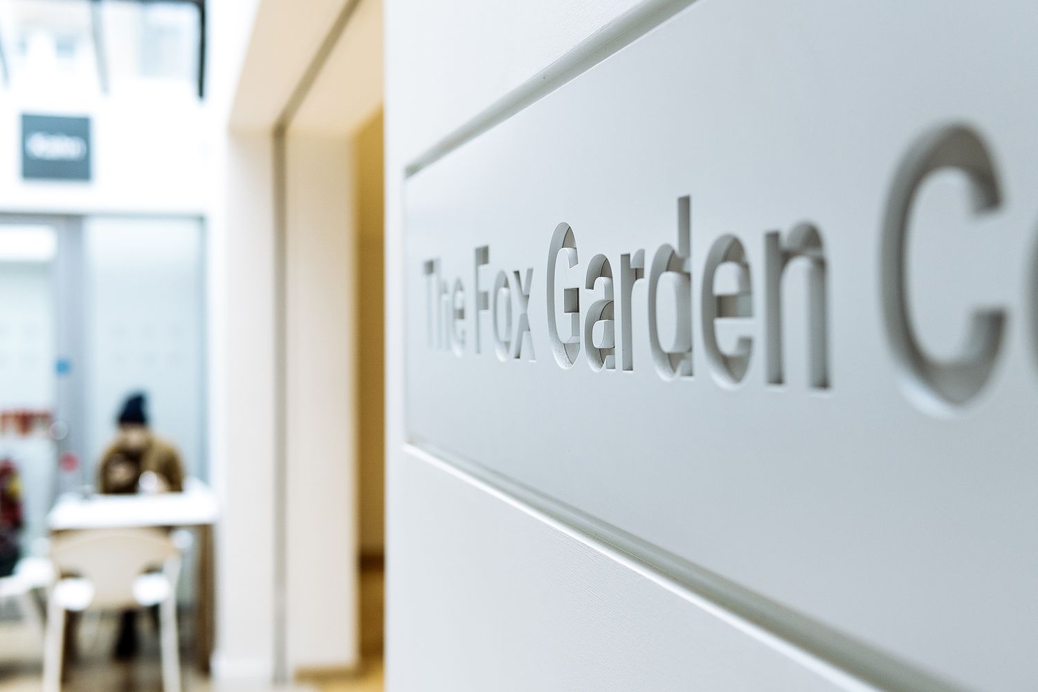
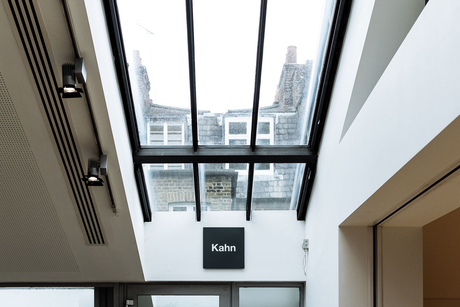
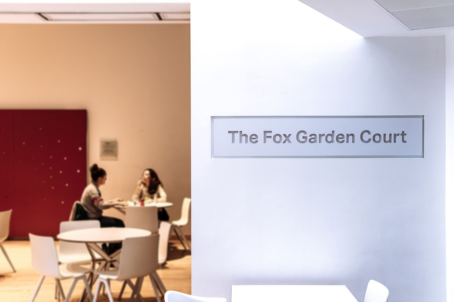
With this natural flow in mind, our designer, Paul, produced bespoke visuals and marked up the floor plans. We worked to the brand’s colour scheme which is a simple red and grey with highlights of black or white. The company typeface is a good sans serif, and we designed some very simple pictograms to work alongside it, making sure all signs would be accessible to everyone.

Once approved, we then set about producing full size paper mock ups for the bigger signage in the auditoriums and showed the client live examples so they could be completely sure, checking that the project manager and stakeholders were all happy as can be to go ahead. These were then made in powder coated aluminium, and installed to sit at eye level for all to see and follow.

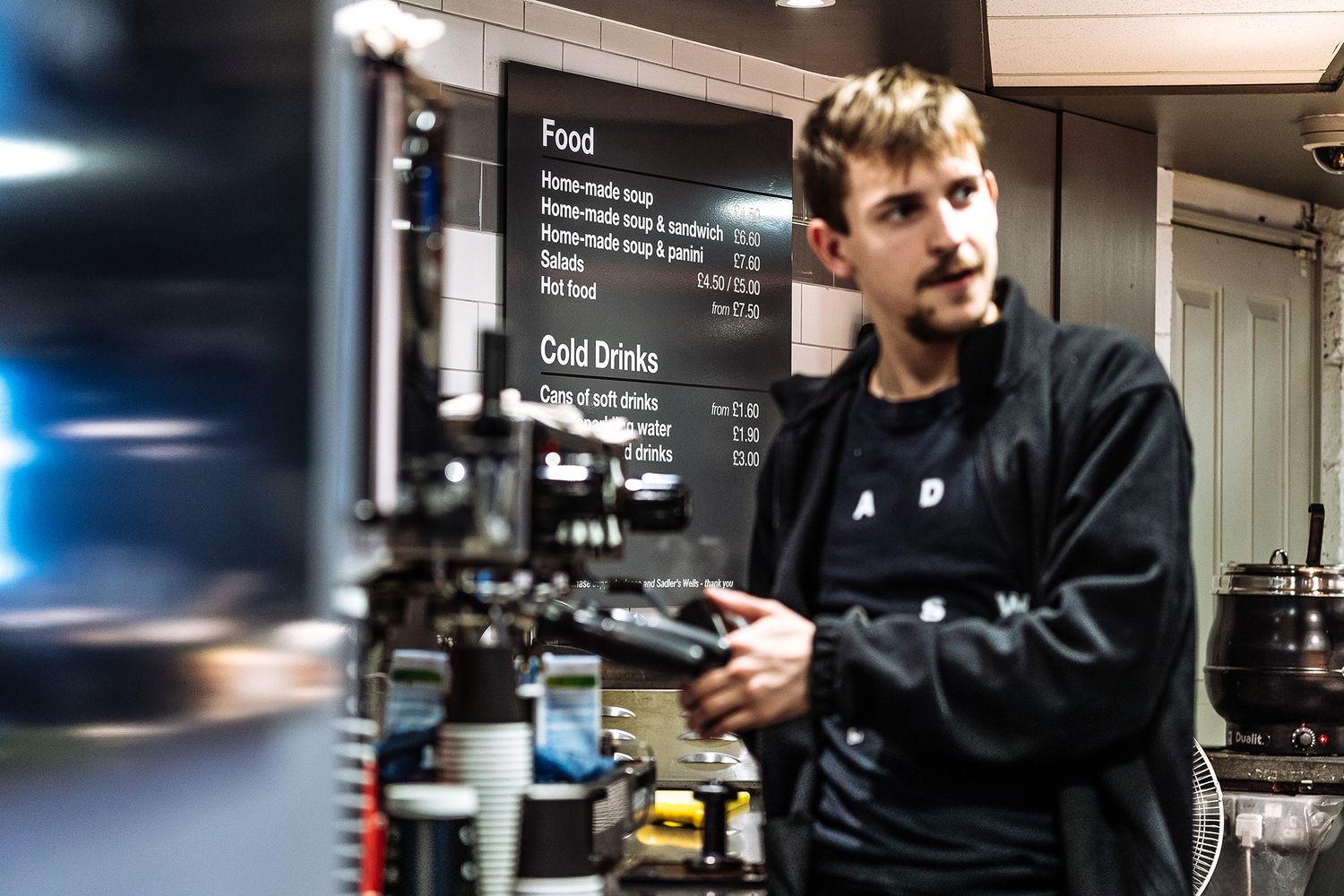
This thorough workflow resulted in us being commissioned to kit out the Back of House too, allowing us to get behind the stage, beneath the stage, in the dressing rooms and down into the staff canteens and kitchens. Ah the life of a celeb! On our last visit, we wrapped the entrance way with a graphic promoting Swan Lake by Matthew Bourne, and now regularly update their external artwork.

A bright red sign on a bright red wall.
A small square sign on a dark green background
Side view of a white cafe sign.
A view on the roofs with a square black sign on a white wall.
Front view of the cafe sign with people in the background.
A bright red sign on a bright red wall.
A small square sign on a dark green background
Side view of a white cafe sign.
A view on the roofs with a square black sign on a white wall.
Front view of the cafe sign with people in the background.
A bright red sign on a bright red wall.
A small square sign on a dark green background
Side view of a white cafe sign.
A view on the roofs with a square black sign on a white wall.
Front view of the cafe sign with people in the background.
A bright red sign on a bright red wall.
A small square sign on a dark green background
Side view of a white cafe sign.
A view on the roofs with a square black sign on a white wall.
Front view of the cafe sign with people in the background.
Latest articles
More articles
Some of our awesome clients
Workspace Group logoCo Space logoOzone Coffee Roasters logoStrong Roots logoThe Hackett Group logoGrabthai logoEtsy logoPlaystation logoThe Croc logoCenttrip logoSadler's Wells logoBP logoHerbert Smith Freehills logoNational Crime Agency logoZSL London Zoo logoNonsense logoInterchange Coworking logo30 St Mary Axe logo
THREE DECADES AS LONDON’S TRUSTED SIGN MAKER
QUALITY BESPOKE SIGNAGE

From independent businesses and private offices to public buildings and cultural centres, we serve organisations across the UK with signs made using both traditional skills and contemporary technologies.

As a company built on testimonials and repeat custom, we nurture strong relationships with our clients from the very start.

Our ordering process is simple and hassle-free:

  1. Contact us through the form to discuss your design needs and receive a quote.

  2. Our team of experts will determine the best materials and construction methods.

  3. Feedback or approve the design and quote.

  4. Relax while we craft your custom sign.

  5. We'll handle installation and ensure everything is to your satisfaction.

Get a quote
Name
Company
Work email
Work phone number
Company size
Number of signs required
When do you need the sign(s)?
Upload relevant design files
Installation address
Job description