

70/71 Wells Street by The Silverman GroupA complete wayfinding signage system for a premium office space in Central London
Built in 1869 as a school for the neighbouring St Andrew’s Church, 70/71 Wells Street has had several lives - from classrooms and workshops to creative studios and contemporary offices. As the only surviving part of the former church complex, it later housed a haberdashery business and photography loft before becoming office space, with subsequent refurbishments retaining many original features alongside modern interiors.
The Silverman Group came to us while planning the next stage of that evolution. A freshly refurbished basement had already begun to set a new direction for the building, and the team wanted to carry that approach through the floors above. Their brief was for a modern take on a classic industrial aesthetic.
What began as an update to the existing internal and external directories soon developed into a much broader project covering wayfinding, floor numbering, tenant identification, safety and compliance signage, directories and external building signs.
With several businesses occupying different levels, the challenge was to make the building easier to navigate while creating a visual language strong enough to connect everything from the street-facing identity to the smallest practical sign.
We developed a complete signage family around a deep blue and warm brass palette, giving the scheme the material character Silverman were looking for while keeping the overall finish crisp and contemporary.
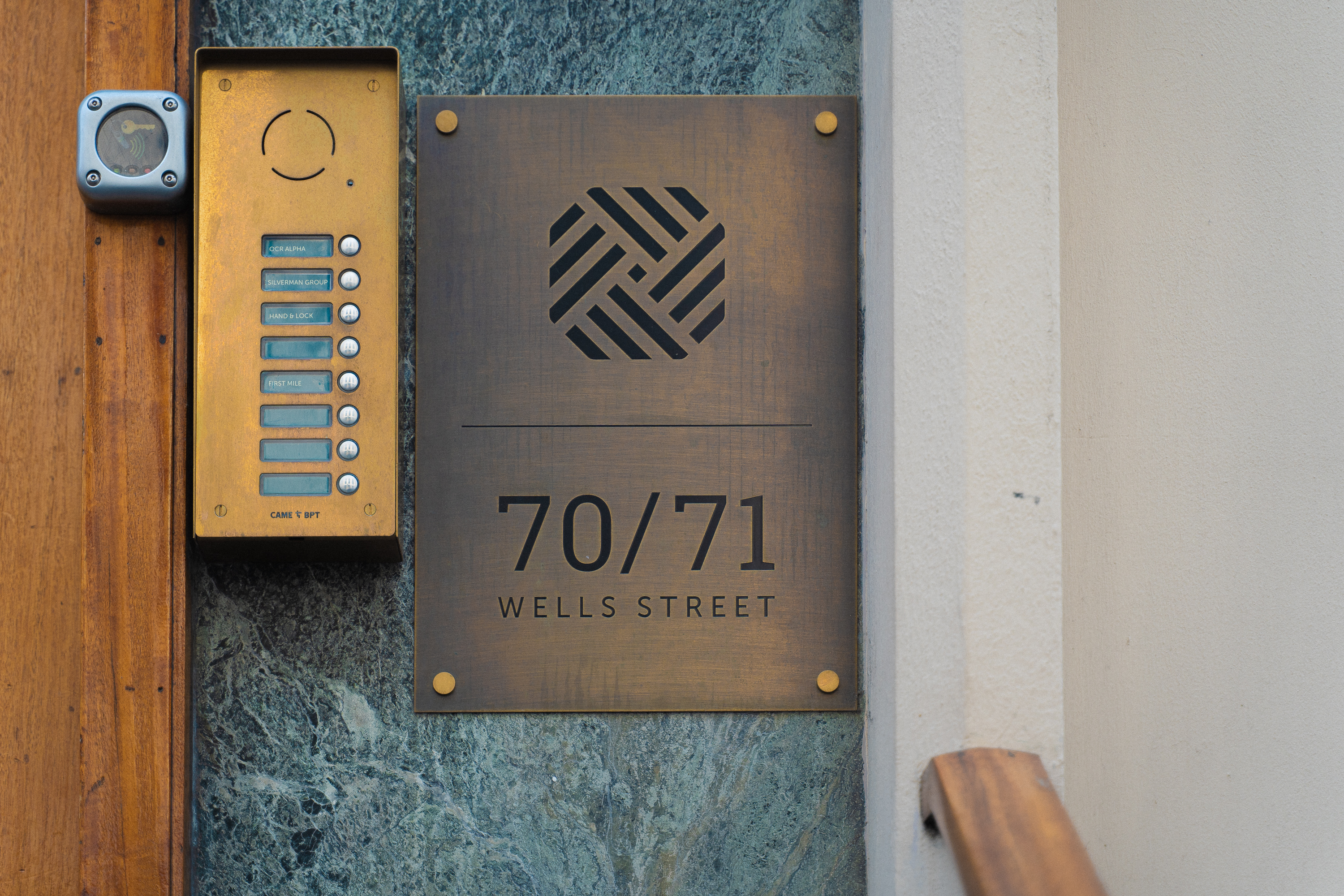
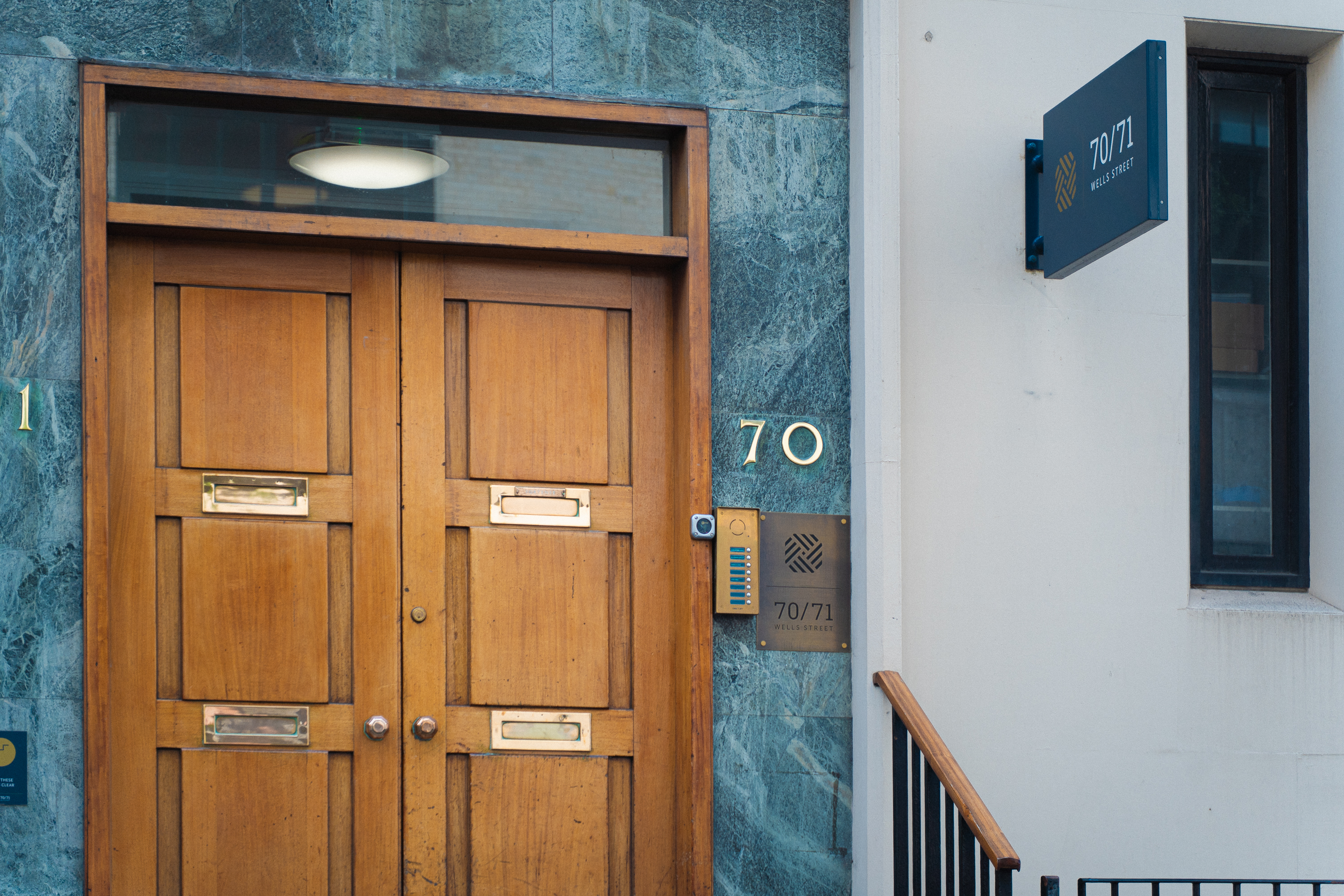
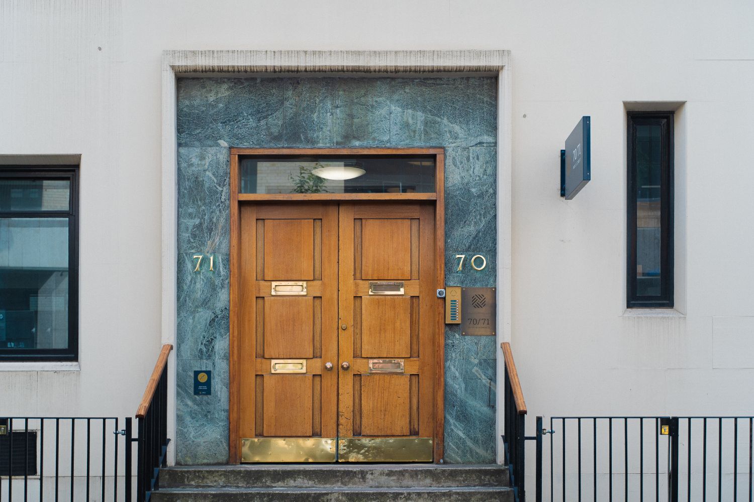
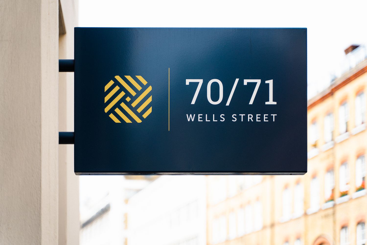
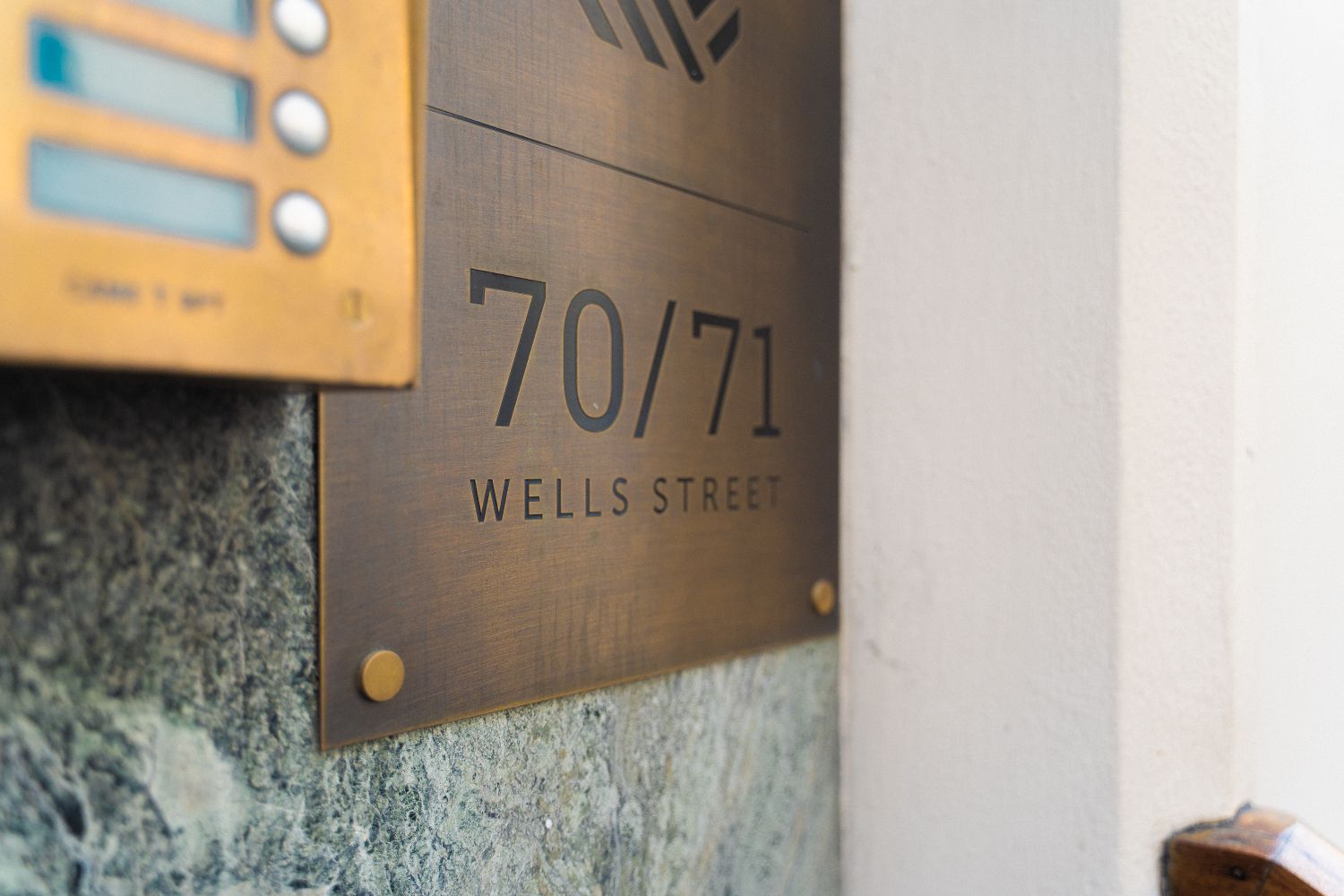
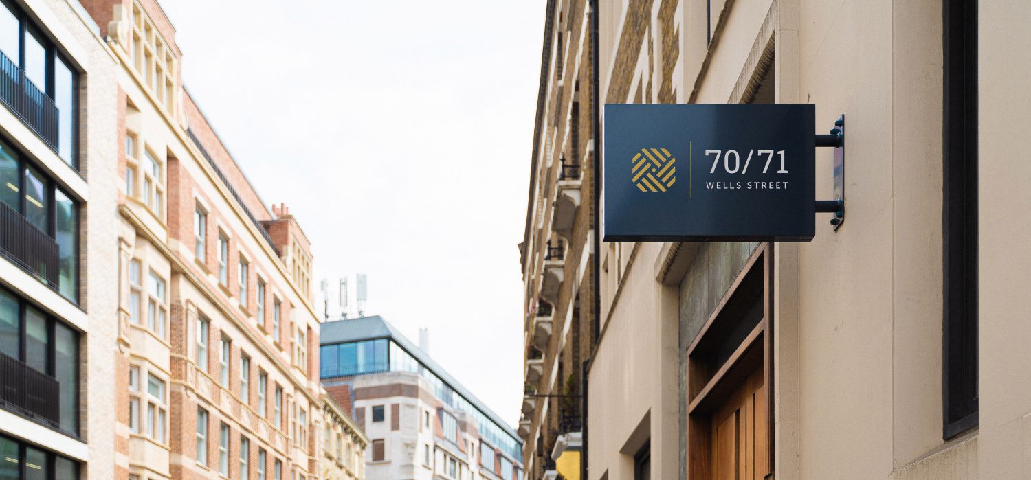
On the exterior, a double-sided projecting sign gives the building a clear street presence, while an aged brass address plaque provides a more permanent architectural marker at the entrance, with the Silverman logo and Wells Street address etched into the metal and filled in black.
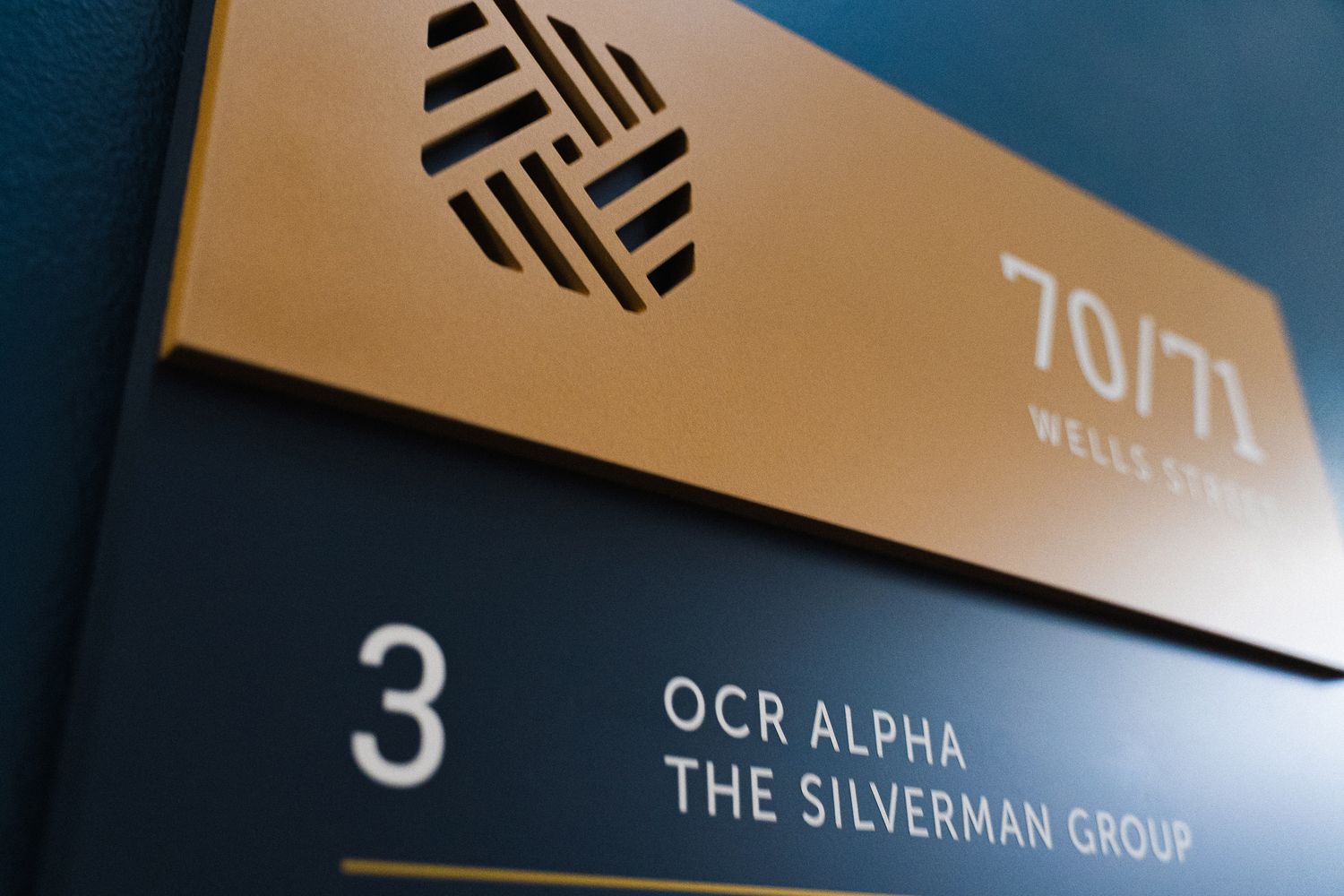

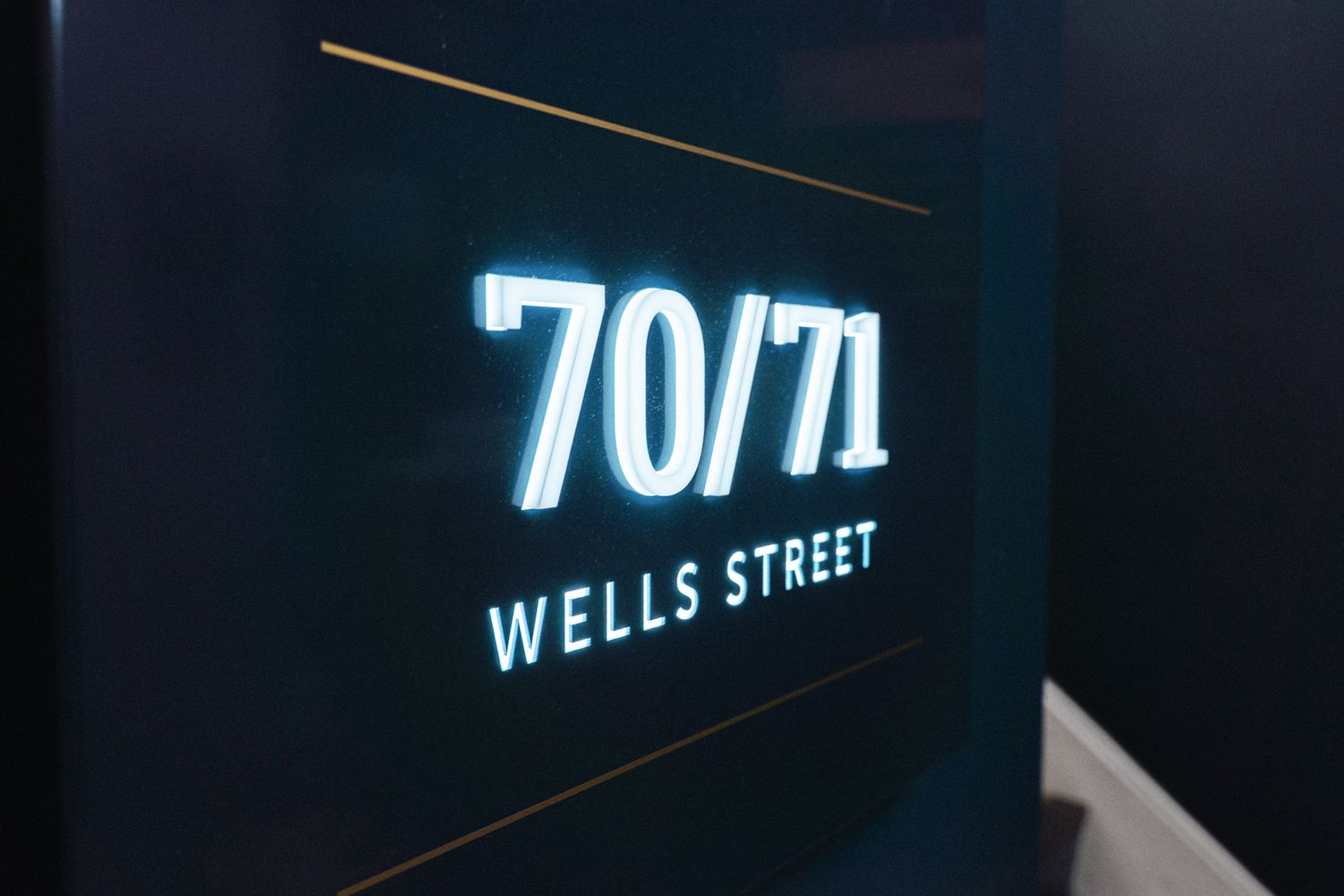
Once inside, the main entrance sign takes that identity a step further. Built as a fabricated tray, the 70/71 Wells Street lettering is stencil-cut and illuminated from behind, while the geometric logo is formed in acrylic, pushed through the face and illuminated. The result gives the entrance extra depth and presence without feeling overly decorative.
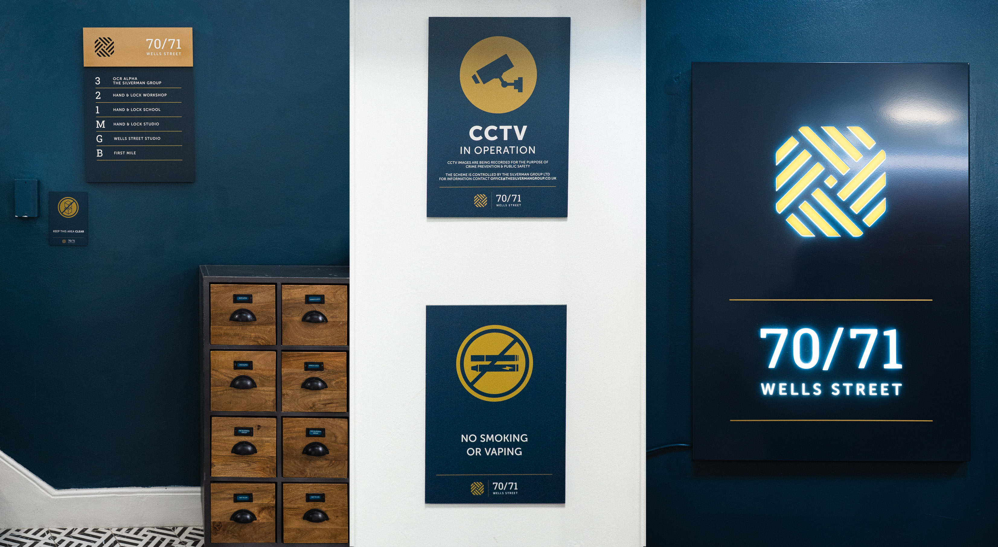
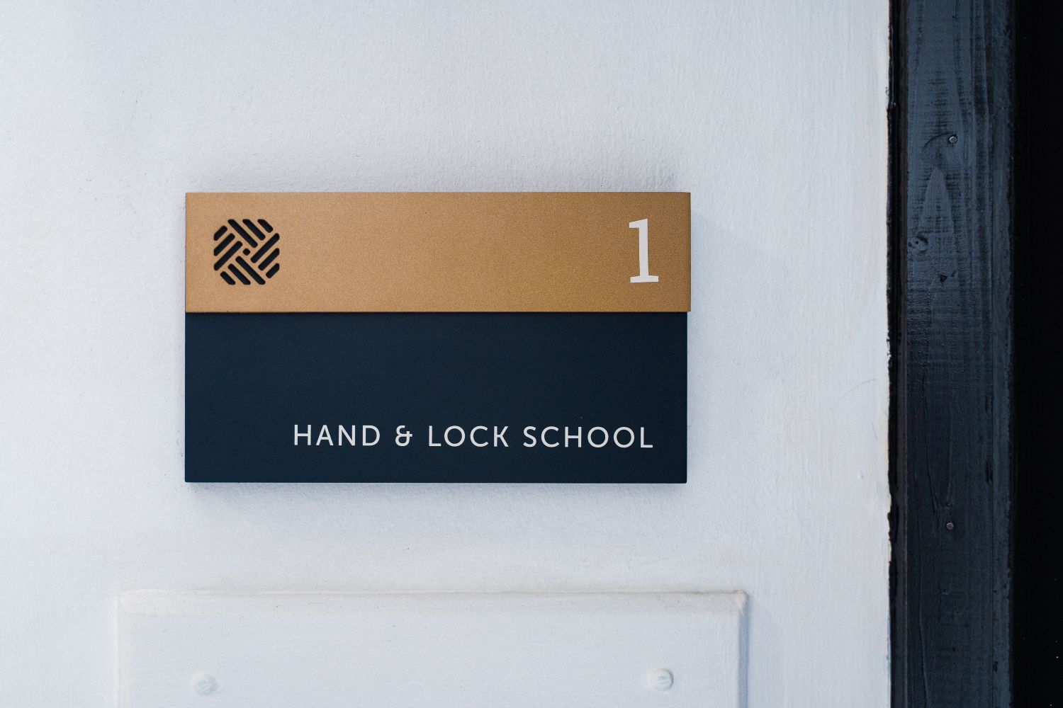
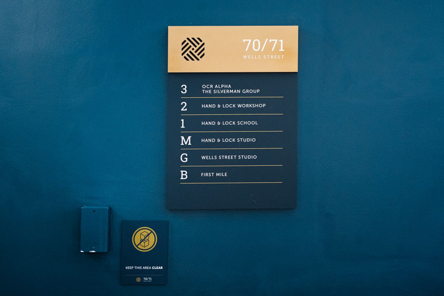
Inside, the same attention to material continues through the directory and individual tenant plaques. Deep blue acrylic back panels are paired with raised matt gold headers, with the Silverman emblem stencil-cut into the upper layer rather than simply printed onto the surface. Tenant names and floor details are applied separately in vinyl, meaning the information that changes can be updated while the permanent branded elements remain in place.
Even the practical signage, from CCTV notices to access instructions and electrical cupboard signs, was brought into the same graphic language, helping everything feel considered rather than added as an afterthought.
The finished scheme feels embedded into the building, rather than merely applied to it, giving 70/71 Wells Street a strong contemporary identity while respecting the character already there - bringing the exterior, shared spaces and tenant areas into one coherent whole. Just as the brief grew from a simple directory update into something much bigger, the project has since developed into an ongoing relationship with The Silverman Group, with further work together across prime London properties.
FAQs - 70/71 Wells Street by The Silverman Group
It starts with the materials, proportions and character of the space. At 70/71 Wells Street, the deep blue, aged brass, layered acrylic and illuminated details were chosen to complement the building’s interior direction and give the signage an architectural quality of its own. Planning a fit-out or refurbishment? Talk to us about developing a signage scheme around your space.
Absolutely. The key is in how it’s built. Here, the 70/71 lettering was stencil-cut into the face of a fabricated tray and illuminated from behind, while the Silverman logo was made in acrylic and pushed through the panel. The result is depth and presence rather than a flat, overly bright sign. Explore our illuminated signage options for more ways to bring a building or brand to life.
Think of it as one system rather than a collection of separate signs. Exterior identification, directories, floor markers and tenant plaques should all feel related while still doing different jobs. At Wells Street, the same palette, typography and layered construction create that consistency from the pavement to the office door. Planning a project? Speak to our team early to get the most out of your space.
Keep the permanent and changeable elements separate. The Wells Street signs use durable acrylic and matt-gold branded components for the building identity, with tenant information applied separately in vinyl. That means names can be updated without remaking the whole sign. Ask us about updateable directories and tenant signage for changing workplaces.
Yes. CCTV notices, access instructions and safety information still need to be clear and functional, but they don’t have to look unrelated to everything around them. Here, the same colours, typography and graphic treatment were carried through the compliance signage so it feels considered rather than bolted on.
Brass, painted acrylic and fabricated metal work particularly well because they introduce depth, texture and permanence. At Wells Street, those materials helped create the modern take on a classic industrial aesthetic Silverman had asked for. See our wall & wayfinding signs page for more materials, finishes and ways to build signage into a space.